A Folded Legacy: The 1920s Burberrys Sale Catalogue and the Design of Utility
April 14, 2025

Long before digital newsletters and algorithmically targeted promotions, Burberrys—as it was then known—was already a master of functional elegance and inventive communication. A remarkable artifact from the early 1920s offers proof: a fold-out sale catalogue announcing the Grande Vente, or big sale, designed to double as its own mailing envelope. This ephemera, over 100 years old, doesn’t just reveal a clever piece of marketing—it illustrates an early 20th-century ethos of design rooted in purpose, refinement, and direct engagement with the client.
To hold such a piece is to access not just a moment in time, but a philosophy of utility that shaped British menswear and haute retail. And, in doing so, it highlights how the brand—well before trench coats became cultural symbols—was already building its global identity around efficiency, elegance, and the needs of a mobile, modern man.
Ingenious in Form: The Catalogue-as-Envelope Concept
Printed on fine, durable stock, the catalogue folds into a sealed envelope complete with address fields and a space for postage. Once mailed, no further wrapping was necessary. It arrives in the customer’s hand as both promotion and product: information and object.
This duality was more than clever branding—it was economy of design at its most sophisticated. In an era dominated by printed word-of-mouth, shop windows, and newspapers, this kind of direct-to-consumer mailer was quietly revolutionary. By embedding practicality into marketing, Burberrys signaled that their concern with form and function extended far beyond the seams of a trench coat. The entire customer journey—from notice to garment—was shaped with consideration.
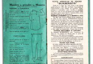
Burberrys and the Culture of the January Sale
In the early 20th century, January sales had begun to solidify in British retail culture, not as afterthoughts but as calendar events for discerning customers. Burberrys’ seasonal sale became a ritual among a well-heeled, primarily male clientele seeking robust garments that balanced status with function. These weren’t fashion victims; they were landowners, veterans, and newly mobile professionals, increasingly defined by a lifestyle of country leisure, city duty, and mechanical travel.
The sale catalogue, with its carefully itemized offerings and technical descriptions, reads less like a glossy pitch and more like a guidebook to refined practicality. Outerwear was king—trench coats, greatcoats, motor coats, and woolen suits featured prominently, each designed to meet the needs of modern life without fuss or frivolity.
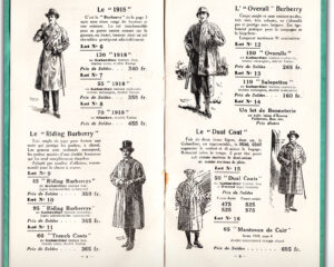
Objects of Purpose: Garments from the Interwar Market
The catalogue’s highlight is undoubtedly its selection of trench coats, reworked from Burberrys’ military contracts into garments suitable for peacetime distinction. Developed from the late 19th century and codified in WWI, the trench coat had by the 1920s become a badge of experience and masculine elegance, particularly for former officers navigating civilian life.
The catalogue offers these coats lined or unlined, in both gabardine and wool, with options for removable collars, buckled belts, and interior compartments—early examples of modularity in fashion. More than aesthetics, they represented adaptability.
Alongside them sit motoring coats—heavy, lined overgarments meant to protect drivers from wind and weather in open-top vehicles. These, too, reflect the shifting terrain of British masculinity: a move from stasis to mobility, machine-age thrill, and self-determined travel.
Tailored suits, often discounted to half price, present the other side of the Burberrys customer. While outerwear served the transitional, outdoor man, these suits represented his more civilized, institutional self—the banker, the barrister, the postwar civil servant. Sturdy but cut with refinement, they underscore Burberrys’ central proposition: you could be both serious and stylish, without sacrificing quality or purpose.
Marketing Without Excess: Design as Strategy
What makes this catalogue so powerful—even today—is its understated visual approach. There are no illustrations, no florid text, no emotional appeals. Just typography, clean lines, pricing columns, and product descriptors. The layout feels modern, almost Bauhaus-adjacent in its clarity and rhythm.
This restraint was not a failure of imagination. It was a design choice that mirrored the values of the garments themselves: clarity, integrity, and economy. In an age before branding was built on fantasy, Burberrys understood that trust was the ultimate luxury. You didn’t need to seduce customers with artifice—you needed to equip them.
Even the language reflects this ethos. The catalogue’s copy avoids hyperbole, using terms like “suitable for motor touring” or “popular with officers and landowners.” These phrases carry coded prestige but are rooted in real utility. They don’t flatter the buyer—they align with his needs.
Social Context: Class, Mobility, and the Modern Man
To fully understand the appeal of such a catalogue, one must view it within the interwar British class landscape. The 1920s saw significant shifts in male identity. The trauma of war, the rise of the automobile, the spread of suburban living—all contributed to a new ideal of masculinity: practical, self-possessed, transitional.
Burberrys positioned itself as the outfitter for this man. The catalogue reveals garments designed to bridge different terrains: from train stations to country lanes, from foggy city mornings to motor jaunts on the weekend. In short, it catered to the man on the move—in body, class, and aspiration.
Importantly, this customer base was expanding. While Burberrys retained its elite clientele, it was also courting a growing middle class, men who wanted the aura of military precision or aristocratic leisure without the social gatekeeping. The catalogue was democratic in tone. You didn’t need a club membership—you just needed the means, and an appreciation for intelligent design.
Print Culture and the Birth of Brand Identity
In today’s world, brand identity is sculpted across platforms—social media, influencers, retail experiences. But in the 1920s, it was print that carried tone, style, and strategy. This catalogue functioned as more than a shopping list—it was a manifesto.
The use of French in the title—“Grande Vente”—adds a layer of continental sophistication, hinting at an internationalism increasingly embraced by British brands in the postwar period. It positioned Burberrys not as a staid local outfitter but as a cosmopolitan authority, fluent in both British ruggedness and European elegance.
Its foldable format wasn’t just economical—it was symbolic. It showed that even a piece of ephemera could be well-designed, well-considered, and responsive to user experience. It was, in essence, interactive design before the screen.
Ephemeral Yet Enduring: The Catalogue Today
A century later, this Burberrys catalogue survives not just as a collector’s item but as a design artifact. It’s studied by fashion archivists, graphic designers, menswear historians, and brand strategists alike. It provides a window into a world where design was quiet, strategic, and deeply tied to function.
Modern luxury often strives for experiential novelty. But the enduring appeal of this catalogue is that it asks for nothing more than your attention. It doesn’t dazzle—it informs. It doesn’t overwhelm—it equips. And that’s the most profound lesson from this modest booklet: that intelligent design, rooted in purpose, outlasts trend.
Burberry’s commitment to detail, from the garment to the paper it was announced on, shows that luxury was once defined by clarity, consistency, and care. Not noise.
Impression
The 1920s Burberrys sale catalogue offers more than nostalgia. It proposes a timeless model for design thinking. One in which form follows function, communication reflects brand values, and every interaction with a customer—whether through clothing, paper, or post—is treated with respect and intention.
It’s a relic, yes—but one with contemporary relevance. In an age where digital overload often obscures clarity, this century-old document reminds us that restraint is powerful, and that great design is never flashy—it’s felt in use, remembered in impact, and folded carefully, precisely, into everyday life.