New NYC Subway Map Debuts After 46 Years—MTA Trades Geography for Simplicity in Bold Redesign
April 6, 2025
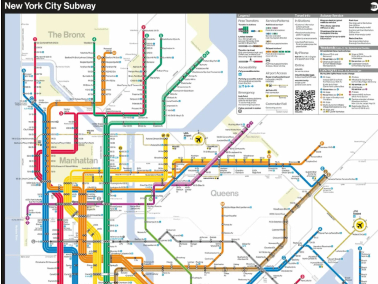
In a significant update, the Metropolitan Transportation Authority (MTA) has unveiled a new design for the New York City subway map, marking its first major overhaul since 1979. This redesign replaces the long-standing “spaghetti” map with a modern, diagrammatic representation aimed at enhancing readability and user experience.
Evolution of the Subway Map
The previous map, introduced in 1979 and designed by Michael Hertz, was characterized by its intricate, winding lines that closely followed the city’s geography. While it provided a geographically accurate depiction, the complexity often led to challenges in quickly discerning routes and connections. The new design adopts a more abstract approach, featuring bold, straight lines and simplified borough shapes, prioritizing clarity over strict geographical accuracy.
Key Features of the New Design
- Simplified Layout: The map utilizes straight lines and uniform angles, making it easier to follow routes across the system.
- Enhanced Accessibility Information: Stations equipped with accessibility features are prominently marked, aiding riders who require these facilities.
- Clear Transfer Points: Transfer stations are distinctly indicated, streamlining the process of planning multi-line journeys.
- Modern Aesthetic: The design pays homage to Massimo Vignelli’s 1972 map, known for its minimalist and abstract style, while incorporating contemporary elements for improved usability.
Public Reception and Critiques
The introduction of the new map has elicited a spectrum of reactions from the public. Some commuters appreciate the cleaner design and find it more user-friendly, especially newcomers and tourists unfamiliar with the system. However, others have expressed concerns:
- Geographical Distortion: Critics argue that the abstract representation sacrifices too much geographical context, potentially confusing users familiar with the city’s layout.
- Resource Allocation: Some riders question the prioritization of the map redesign over pressing issues such as service reliability and infrastructure improvements.
MTA’s Perspective
MTA officials assert that the redesign aligns with their commitment to providing a “21st-century customer experience.” They emphasize that the new map reflects system enhancements made over the years and aims to offer a more intuitive navigation tool for all users.
Impression
The MTA’s new subway map represents a bold shift in the visual communication of New York City’s transit system. While it strives to modernize and simplify the user experience, its reception underscores the challenges inherent in balancing innovation with the diverse preferences and needs of the city’s commuters.
For a visual overview of the changes, you can watch the following video: