Burberry Takes to the Beach for Summer 2025 Campaign
April 9, 2025
Burberry’s Summer 2025 campaign, “Burberry Takes to the Beach,” marks a strategic and visual departure from its traditionally urban aesthetic. Known for trench coats, heritage check, and British rain-soaked landscapes, Burberry stepping into a beach setting signals something deeper than a seasonal shift. It’s a reimagining of the brand’s relationship with Britishness, summer identity, and the changing definition of luxury.
This explication unpacks the campaign from multiple angles — brand narrative, visual language, cultural symbolism, and consumer psychology — to explore how Burberry is repositioning itself within the luxury fashion ecosystem.
A New British Fantasy
Traditionally, Burberry campaigns have leaned heavily into romanticized British archetypes — moody countryside, drizzly streets, sharp outerwear cutting through the fog. This campaign subverts that.
The beach, especially in a British context, evokes a different kind of nostalgia. It’s less aristocratic, more democratic. Think Brighton piers, windswept coasts, holiday postcards, and bucket hats. By taking the collection seaside, Burberry isn’t abandoning its British identity — it’s broadening it.
The message is clear: Britishness isn’t just trench coats and overcast skies. It’s also pebbled beaches, vintage swimwear, sun-bleached afternoons, and spontaneous joy. The brand is crafting a new version of summer — one that blends heritage with heat.
Visual Language: Light, Movement, and Ease
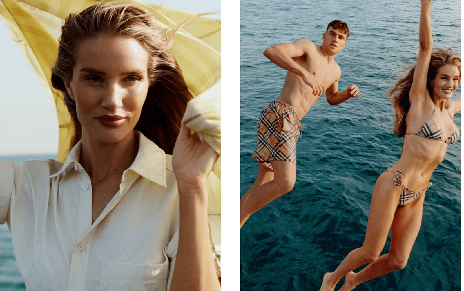
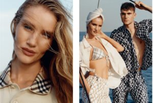
Photographed with natural lighting and framed by expansive skies and open shorelines, the Summer 2025 visuals favor movement and freedom over formality. Models walk barefoot on wet sand, trench coats billow in the breeze, swimwear is layered with classic tailoring. There’s contrast everywhere — polished design meeting untamed nature.
This juxtaposition is intentional. Burberry wants to show that elegance can exist outside of rigid styling. A trench coat over a swimsuit. A silk shirt half-unbuttoned, salt-kissed and sun-softened. It’s still luxury, but lived-in, relaxed, and coastal.
The color palette nods to seaside tones: sandy beige, shell white, maritime navy, coral pink, and storm grey. These hues suggest British summer without cliché — sophisticated and restrained, yet emotionally charged. The ocean is not just a backdrop; it’s a character in the campaign. The waves, skies, and textures echo through fabric choices and styling decisions.
Styling: Tailoring Meets Tides
Styling choices in the campaign carry deeper symbolism. Rather than fully embrace casual summerwear, Burberry blends tailored pieces with beachwear, suggesting that structure and spontaneity can coexist.
A cotton suit worn shirtless with sandals. A waterproof trench coat thrown over linen shorts. Swim trunks paired with a fine wool sweater. This is hybrid dressing — reflecting how people actually live now. Travel, leisure, and work are no longer confined to fixed wardrobes.
Burberry is not chasing trend here. It’s building a mood: considered, curious, slightly undone. The clothes feel touched by the environment — rumpled by wind, kissed by sunlight, washed in coastal hues. It’s the anti-editorial editorial — artfully imperfect.
Faces and Casting: Diversity in Mood and Identity
The casting of the campaign also speaks volumes. A range of faces — from high-fashion regulars to fresh British talent — appear with diverse skin tones, body types, and expressions. This isn’t the stiff, expressionless luxury model of the past. These are people who look like they belong in the scene, not placed into it.
They smile, run, lie on towels, look into the lens with quiet confidence. Some wear minimal makeup; others have tousled hair. There’s a democratic ease to it — as if Burberry is saying luxury belongs here, with you, in this moment.
This inclusivity, both visual and emotional, is a continuation of the brand’s recent pivot toward accessibility. Not price-point accessibility, but aspirational relatability. You don’t have to be royalty or an urban tastemaker. You just have to feel the sun, touch the fabric, step into the story.
Soundtrack and Cinematics: Summer as Feeling
If the campaign includes video (as most modern Burberry campaigns do), then the tone is likely soundtracked by something evocative but stripped down — perhaps a reworked classic British track, slowed and layered with ambient sounds of wind and waves. No dramatic orchestration. Just atmosphere. Warmth. Breath.
Visually, slow pans, low angles, and handheld camera movement mirror the human perspective. The audience isn’t watching a performance — they’re on the beach too, feeling the grit between their toes. It’s immersive. It’s transportive.
This direction mirrors the luxury market’s broader shift away from perfection and toward sensuality. Brands are focusing less on status symbols and more on sensory storytelling. Burberry taps into this by creating a campaign you don’t just see — you feel.
The Evolution of Burberry: Heritage Without Stagnation
This campaign is not just a vibe shift — it’s a strategy.
Since its inception in 1856, Burberry has gone through several reinventions. From military outfitter to fashion staple, from outerwear icon to runway player, its identity has always walked a line between tradition and innovation.
The Summer 2025 campaign builds on that balance. It respects the trench, the check, the Britishness — but brings them into a new context. The beach, once an unlikely setting for the brand, becomes a canvas for this reinvention.
This is heritage without museumification. A brand that honors its DNA but refuses to stay still. It’s not about discarding the past — it’s about reinterpreting it for now.
Cultural Timing: Escapism as a Need, Not a Luxury
There’s a broader cultural current that makes the beach concept feel especially timely.
After years of post-pandemic adjustments, political unease, and climate anxiety, people are craving escape — not just physical, but emotional. They want softness, nature, water, and rest. They want permission to relax. Not through excess, but through experience.
Burberry’s beach campaign taps into that yearning. It offers a fantasy that feels attainable. Not jet-setting to exotic islands, but embracing the beauty of home — the British seaside, in all its weathered charm.
It’s a luxury fantasy for a more grounded generation. And in doing so, Burberry stays emotionally relevant.
Environmental Undertones: Fashion in Nature
While not overtly activist, the campaign’s natural setting subtly raises environmental consciousness. Placing high fashion in nature — especially a vulnerable setting like the beach — suggests a respect for the world we live in.
It invites reflection: What does it mean to wear well-made clothes outdoors? How can luxury exist in harmony with nature, not in opposition?
If Burberry includes sustainable materials or messaging in this collection (as many brands are doing), the campaign visuals support that narrative. Natural fibers. Earthy tones. Reusable styling. These quiet decisions amplify the message: luxury can be responsible.
Marketing Strategy: Global Appeal, Local Roots
From a business perspective, this campaign is a smart play. Summer collections are often harder to anchor — they lack the drama of fall/winter or the buzz of resort. But Burberry’s decision to tie summer to a place — the beach — gives the collection a grounded theme and emotional hook.
It’s also globally resonant. Beaches are universal. Whether you’re in Brighton or Bondi, Malibu or Margate, the campaign’s vibe translates. It’s aspirational but familiar. That’s a powerful sweet spot for a global brand.
At the same time, the British identity keeps it anchored. It doesn’t try to be everything to everyone. It’s not a Mediterranean fantasy or a tropical escape. It’s a uniquely British summer — slightly moody, quietly beautiful, endlessly stylish.
Symbolism: Water, Sand, and Time
On a symbolic level, the beach is a rich setting. Water represents renewal. Sand represents time. Sun represents clarity. Wind represents change. Burberry, by placing its models and garments in this landscape, is participating in that symbolism.
The trench coat, often rigid and structured, becomes fluid in the sea air. The body, often posed and postured, becomes free in the water. These symbols work beneath the surface to communicate transformation.
It’s as if the brand is saying: we know where we came from — but we’re not afraid to move with the tides.
More Than a Campaign
“Burberry Takes to the Beach” is not just a seasonal lookbook. It’s a statement of brand intent. It repositions Burberry not just as a fashion house, but as a cultural narrator. One that listens, adapts, and responds with grace.
The campaign embraces lightness — not just in fabric, but in feeling. It doesn’t chase noise. It cultivates presence. It doesn’t sell status. It sells serenity.
In an industry increasingly cluttered with spectacle, this kind of calm, elegant storytelling stands out. It tells us Burberry knows its identity, but isn’t afraid to evolve it. It knows its audience, but invites them into something deeper.
Burberry doesn’t just take to the beach — it takes us with it. And for a moment, we believe in a summer that’s simple, beautiful, and free.