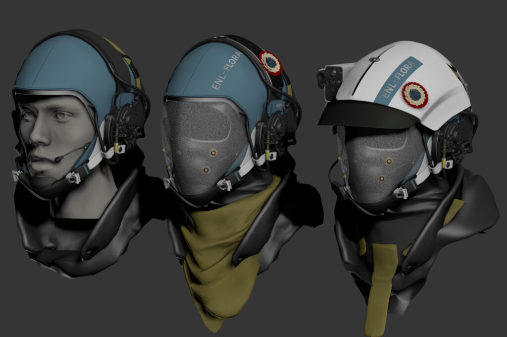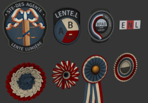
Every ambitious worldbuilding project is marked by what doesn’t survive. Black Sky Monarchy, a dieselpunk fantasy RPG still in development, is no exception. Recently released 3DsMax viewport sketches—now officially scrapped—offer a rare look behind the curtain at the game’s visual evolution. Labeled internally as “too cartoony,” these early designs have been retired, but not forgotten.
They represent an alternate aesthetic vision, one where the fantastical leaned into whimsy rather than corrosion, where regality was ornate rather than oppressive. While these concepts never made it past early prototyping, they tell a story of experimentation, misalignment, and course correction.
This editorial explores the artistic and narrative implications of these unused concepts, examining how tonal clarity emerges through trial and error—and how even discarded visions contribute to the lore of a world still taking shape.
Cartoonish Charms vs. Gritty Demands
The rejected sketches span a curious aesthetic spectrum: exaggerated armor proportions, wide-eyed monarchs, theatrical villainy. Visually inventive but tonally conflicted, they reflect a stage in Black Sky Monarchy’s development where the project had not yet fully aligned its visual identity with its thematic core.
The final aesthetic—a dieselpunk wasteland steeped in ruin and regality—demands a different language: rust, asymmetry, heavy silhouette, and subdued menace. The earlier designs, by contrast, flirted with levity and polish, introducing stylistic contradictions that risked undermining the world’s intended atmosphere.
The “Jester’s Crown” Concept
A particularly revealing sketch features a monarch crowned with a twisted, circus-inspired headpiece. The crown’s points curl like stylized horns—almost playful, almost grotesque. Its implications are fascinating: rulership as performance, power as absurdity.
But despite the symbolic potential, the design is a tonal outlier. The monarch’s exaggerated features and buoyant proportions read more like a villain from Borderlands than a figure from a decaying dynasty. In wireframe form, the design feels light—almost comedic—when the project demands visual weight and gravitas.
This is the paradox of early development: what works conceptually may still fail when rendered in full.
Villainous Caricatures
Another cluster of cut material centers on a rogue’s gallery of antagonists: one with a mace taller than his own body, another with a perpetual grin stretched wide across a mask-like face. These characters had character—but too much of it in the wrong direction.
According to internal notes, some designs were deemed “too Overwatch”—a shorthand for hyper-stylization, bright silhouettes, and playful menace. In a setting defined by grime and moral collapse, these villains came across as cosplay-ready caricatures. Their weapons looked impractical, their postures theatrical.
They were fun, perhaps even iconic, but belonged in a different game.
Scrapping with Intent—Design as Curation
What makes these discarded sketches especially revealing is that they weren’t abandoned due to poor execution. They were the result of skilled modeling, original silhouettes, and clear visual goals. What caused their removal was something more fundamental: tonal incompatibility.
As Black Sky Monarchy progressed, the creative team began to articulate a stricter design language—one rooted in thematic consistency and atmospheric coherence. This involved a conscious pivot away from color-saturated spectacle and toward grim industrial decay.
Consistency Over Innovation
An ornate throne rendered in early drafts featured animated gargoyle servitors with expressive, almost googly eyes. Technically impressive and full of personality, the throne was visually rich—but wrong for the setting. The humor it implied diluted the sense of dread the throne was meant to project.
This illustrates an essential principle of worldbuilding: not all clever ideas serve the whole. In a world like Black Sky Monarchy, cleverness can be corrosive if it pulls focus from the emotional core of the setting.
From Steampunk to Dieselpunk
The early visual identity bore traces of steampunk optimism—clean brass fittings, symmetrical designs, and whimsical contraptions. But the final direction rejected those elements in favor of something more grounded and brutal.
The retained designs show a shift toward mechanical asymmetry, battle-worn textures, and low-saturation palettes. Crowns became heavier. Armor was reshaped for intimidation, not elegance. Characters started to wear their suffering, rather than mask it.
The discarded sketches represent a visual language that spoke too softly—or too cheerfully—for a world meant to be grim, regal, and unforgiving.
Unused Concepts as Internal Mythology
Though scrapped, these sketches now form a kind of internal mythology—a comprehensive record of alternate possibilities. They are fossils of the world’s development, remnants that hint at versions of the game that might have been.
Aesthetic DNA
Many of the early character designs seem to draw from a steampunk-adjacent lineage, with some pieces resembling unused concepts from franchises like Arcanum, Thief, or Dishonored.
While the influences are clear, they remain superficial in their integration. A villain’s overly ornate mechanical gauntlet, for instance, suggests flair more than fear. Another queenly figure appears almost regal in a fairytale sense, her expression calm, her armor delicate.
Such designs were likely informed by fantasy tropes the project would later reject. Their removal sharpened the tone by subtraction.
The Cultural Remix That Missed the Mark
One ambitious concept fused Edo-period samurai armor with Victorian tailoring, worn by a queen wielding a stylized executioner’s axe. Visually arresting, yes—but tonally dissonant.
While the design was intricate, it felt like it belonged to a different cultural narrative. The proportions evoked Alice in Wonderland, the stance evoked Soulcalibur. It was an exciting experiment—but not a match for a setting more grounded in decay and post-industrial power.
These sketches show how easy it is for worldbuilding to become overloaded by cultural pastiche. Fusion is not enough—coherence is everything.
Terminology Reflection: In a project like Black Sky Monarchy, the term render operates on two planes. Technically, it refers to the visualization process in 3D software. But emotionally, it marks the final moment when an idea either solidifies into canon—or dissolves into the archive of things that almost were.
Comparative Study: Visual Evolution in Other IPs
Looking at similar franchises helps contextualize these creative decisions. Dishonored, for example, faced similar challenges. Its stylized characters and twisted architecture nearly veered into caricature, but the game’s cold lighting, oppressive tone, and harsh sound design reined in the whimsy.
Black Sky Monarchy made a different choice: rather than try to balance whimsy and darkness, it eliminated whimsy altogether. Where Borderlands leans into absurdism and Overwatch into charm, BSM seeks something heavier—more Sable than Fortnite, more Berserk than Final Fantasy IX.
That kind of weight demands visual discipline. The rejected sketches may have worked in a lighter game. Here, they became liabilities.
The Literature of What Couldn’t Be
The discarded sketches of Black Sky Monarchy serve as more than just development debris. They are artifacts of process—evidence that building a cohesive world means defining what doesn’t belong as much as what does.
These images chart the game’s evolving identity. They reveal hesitation, experimentation, misalignment—and ultimately, a deepening commitment to tone. Even in their rejection, they contribute to the world’s internal logic. They are the ghosts of paths not taken.
For fans and critics alike, these discarded designs offer something rare: an honest window into creative struggle. A reminder that great worldbuilding doesn’t emerge fully formed—it emerges through a thousand small decisions, some of which require letting go of ideas that are beautiful, but wrong.
And in that sense, these scrapped sketches are not failures. They are part of the story.

