The Subtle Redesigning of Google’s Search Homepage
January 23, 2026
For more than two decades, Google Search has been defined by a near-monastic visual restraint. A white page. A multicolored logo. A single input field. Sparse links. The design language became so universal that “Google it” felt synonymous not only with searching the web but with encountering a specific aesthetic philosophy: neutrality, clarity, and invisibility.
Now, Google appears to be probing the limits of that minimalism.
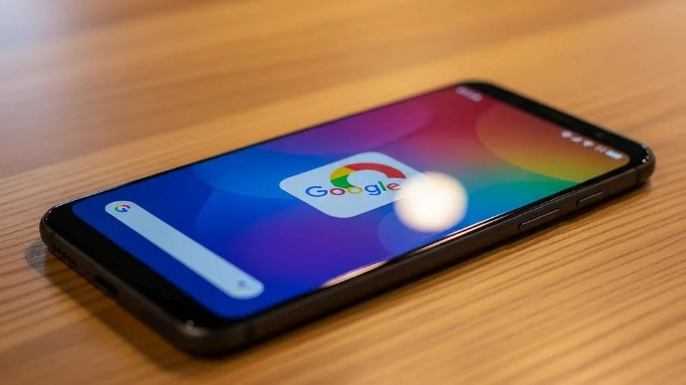
In a newly observed experiment dubbed “Color Your Search,” the company is testing a feature that introduces subtle but noticeable color personalization to the Search homepage and surrounding interface elements. Rather than replacing Google’s iconic simplicity, the test layers in tonal accents—soft gradients, background hues, or thematic color palettes—that respond to user preferences, behaviors, or broader contextual cues.
It is a small shift visually, but a potentially significant one strategically. At a time when Google faces rising competition from AI-driven discovery tools, social platforms that double as search engines, and increasingly customized digital environments, the experiment hints at a broader recalibration: Search as a space not just for information retrieval, but for emotional resonance, identity expression, and ambient personalization.
stir
While Google has not formally launched or publicly detailed the feature, early reports and interface sightings indicate that “Color Your Search” is being tested as an optional or experimental setting.
The premise is straightforward: users may be offered the ability to select a color theme—or have one automatically applied—to subtly tint their Search homepage. This could include:
-
faint background gradients behind the search bar
-
colored highlights around interface modules
-
tonal shifts in header areas or footer zones
-
seasonal or mood-based palettes
-
dynamic color schemes linked to wallpapers or system settings
Importantly, the feature does not appear to overhaul Search’s layout or readability. Text remains high-contrast, links stay legible, and results lists preserve their familiar structure. The color is additive rather than transformative—an atmospheric layer rather than a redesign.
That restraint is classic Google. The company has historically rolled out visual experiments incrementally, testing whether aesthetic flourishes improve engagement without undermining usability or performance.
flow
The timing of “Color Your Search” is unlikely to be accidental.
Search is in the midst of its most significant transformation in years. Generative AI features, conversational summaries, and multimodal queries are reshaping how people interact with information. At the same time, younger users increasingly turn to platforms like TikTok, Instagram, Reddit, or Discord for discovery—spaces that are highly visual, personalized, and culturally coded.
In that landscape, a stark, utilitarian homepage may begin to feel emotionally flat.
Personalization has become a default expectation across digital products. Music services adapt to moods. Phone lock screens shift colors with the time of day. Browsers sync themes across devices. Operating systems allow deep aesthetic customization. Even productivity software now offers color-coded dashboards and visual skins.
By introducing gentle visual variation into Search, Google may be signaling that the product is no longer just a neutral conduit to the web, but a space that can reflect user identity and preference—however lightly.
🎨 Google : c’est quoi ce nouveau bouton « palette » sur le moteur de recherche ? 👀 #Google #GoogleSearch ➡️ https://t.co/MMRXzDcfQ5 pic.twitter.com/xqT0nfoKmi
— 01net (@01net) January 22, 2026
fwd
One cannot discuss Google and color without referencing Material You, the design system introduced in Android 12 that dynamically adapts interface colors based on a user’s wallpaper.
Material You marked a philosophical shift for Google: from fixed brand palettes to user-driven chromatic systems. Buttons, toggles, menus, and backgrounds all inherit hues from the phone’s chosen image, creating a cohesive and personalized visual environment.
“Color Your Search” feels like a conceptual cousin to that system.
If Search eventually integrates with account-level theming—drawing from Android devices, Chrome settings, or Google account preferences—it could become part of a larger ecosystem where Google products share a consistent, personalized visual identity across screens.
Such cohesion would reinforce Google’s platform strategy: Search, Gmail, Maps, and Docs not as isolated utilities, but as components of a single, adaptable environment.
style
Color personalization also raises practical questions about accessibility.
Search must remain readable for users with visual impairments, color blindness, or sensitivity to contrast. Any theme system has to meet strict guidelines for legibility, focus states, and information hierarchy.
Google has historically invested heavily in accessibility research, and it is likely that “Color Your Search” is constrained by guardrails that prevent problematic combinations. Past theming systems in Chrome and Android already limit palettes to ensure sufficient contrast ratios.
If the feature expands, expect it to offer curated theme options rather than unrestricted color pickers—balanced combinations tested for usability rather than infinite customization.
cover
Perhaps the most interesting implication of “Color Your Search” is conceptual rather than technical.
For much of its life, Search has been framed as a gateway—a thin interface between the user and the rest of the web. Its job was to disappear. Increasingly, however, Google is positioning Search as a destination in itself: a place where answers, summaries, shopping decisions, trip planning, and creative exploration all occur without leaving the page.
In that context, atmosphere matters.
Just as streaming platforms design homepages to feel cozy or energetic depending on content, Search may be evolving into a space with a tone—a digital room whose lighting can be adjusted to suit the occupant.
Color personalization, then, is not frivolous. It is a signal that Google is thinking about Search as an environment rather than merely a function.
small
On the surface, “Color Your Search” is modest: a hint of gradient here, a tinted panel there. But symbolically, it nudges at one of Google’s most enduring traits—its visual restraint.
In doing so, the experiment reflects broader currents in technology design: personalization as default, interfaces as emotional spaces, and utility products that increasingly acknowledge users’ desire for individuality.
Whether or not the feature becomes permanent, its existence suggests that Google is actively re-examining what Search should feel like in a world where information is abundant, AI is ubiquitous, and digital environments compete not only on accuracy but on atmosphere.
For a company whose homepage once prided itself on being almost blank, even a little color can speak volumes.
For more than two decades, Google Search has been defined by a near-monastic visual restraint. A white page. A multicolored logo. A single input field. Sparse links. The design language became so universal that “Google it” felt synonymous not only with searching the web but with encountering a specific aesthetic philosophy: neutrality, clarity, and invisibility.
Now, Google appears to be probing the limits of that minimalism.
In a newly observed experiment dubbed “Color Your Search,” the company is testing a feature that introduces subtle but noticeable color personalization to the Search homepage and surrounding interface elements. Rather than replacing Google’s iconic simplicity, the test layers in tonal accents—soft gradients, background hues, or thematic color palettes—that respond to user preferences, behaviors, or broader contextual cues.
It is a small shift visually, but a potentially significant one strategically. At a time when Google faces rising competition from AI-driven discovery tools, social platforms that double as search engines, and increasingly customized digital environments, the experiment hints at a broader recalibration: Search as a space not just for information retrieval, but for emotional resonance, identity expression, and ambient personalization.
idea
While Google has not formally launched or publicly detailed the feature, early reports and interface sightings indicate that “Color Your Search” is being tested as an optional or experimental setting.
The premise is straightforward: users may be offered the ability to select a color theme—or have one automatically applied—to subtly tint their Search homepage. This could include:
-
faint background gradients behind the search bar
-
colored highlights around interface modules
-
tonal shifts in header areas or footer zones
-
seasonal or mood-based palettes
-
dynamic color schemes linked to wallpapers or system settings
Importantly, the feature does not appear to overhaul Search’s layout or readability. Text remains high-contrast, links stay legible, and results lists preserve their familiar structure. The color is additive rather than transformative—an atmospheric layer rather than a redesign.
That restraint is classic Google. The company has historically rolled out visual experiments incrementally, testing whether aesthetic flourishes improve engagement without undermining usability or performance.
fin
The timing of “Color Your Search” is unlikely to be accidental.
Search is in the midst of its most significant transformation in years. Generative AI features, conversational summaries, and multimodal queries are reshaping how people interact with information. At the same time, younger users increasingly turn to platforms like TikTok, Instagram, Reddit, or Discord for discovery—spaces that are highly visual, personalized, and culturally coded.
In that landscape, a stark, utilitarian homepage may begin to feel emotionally flat.
Personalization has become a default expectation across digital products. Music services adapt to moods. Phone lock screens shift colors with the time of day. Browsers sync themes across devices. Operating systems allow deep aesthetic customization. Even productivity software now offers color-coded dashboards and visual skins.
By introducing gentle visual variation into Search, Google may be signaling that the product is no longer just a neutral conduit to the web, but a space that can reflect user identity and preference—however lightly.