Steven D. Gagnon, Hope. Progress., 2011: Serial Form and the Conditions of Optimism
March 20, 2026
struct
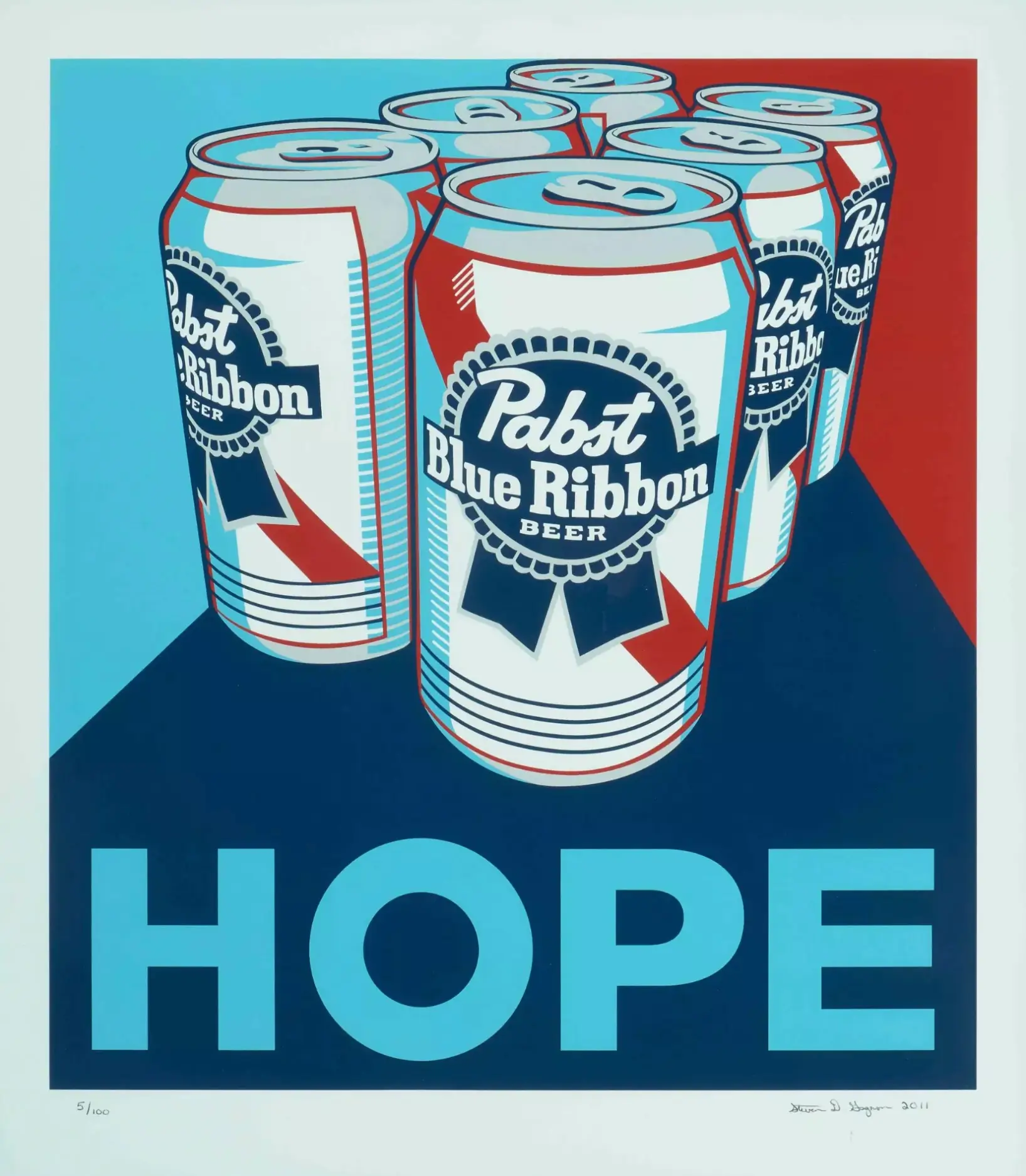
In the early years of the 2010s—an era marked by both economic recalibration and cultural reinvention—artists across disciplines began to reengage with optimism as a visual language. Not naïve optimism, but one that was deliberate, constructed, and often quietly defiant. Within this context, Hope. Progress. (2011), a paired set of color serigraphs by Steven D. Gagnon, emerges as a succinct yet resonant articulation of that sentiment.
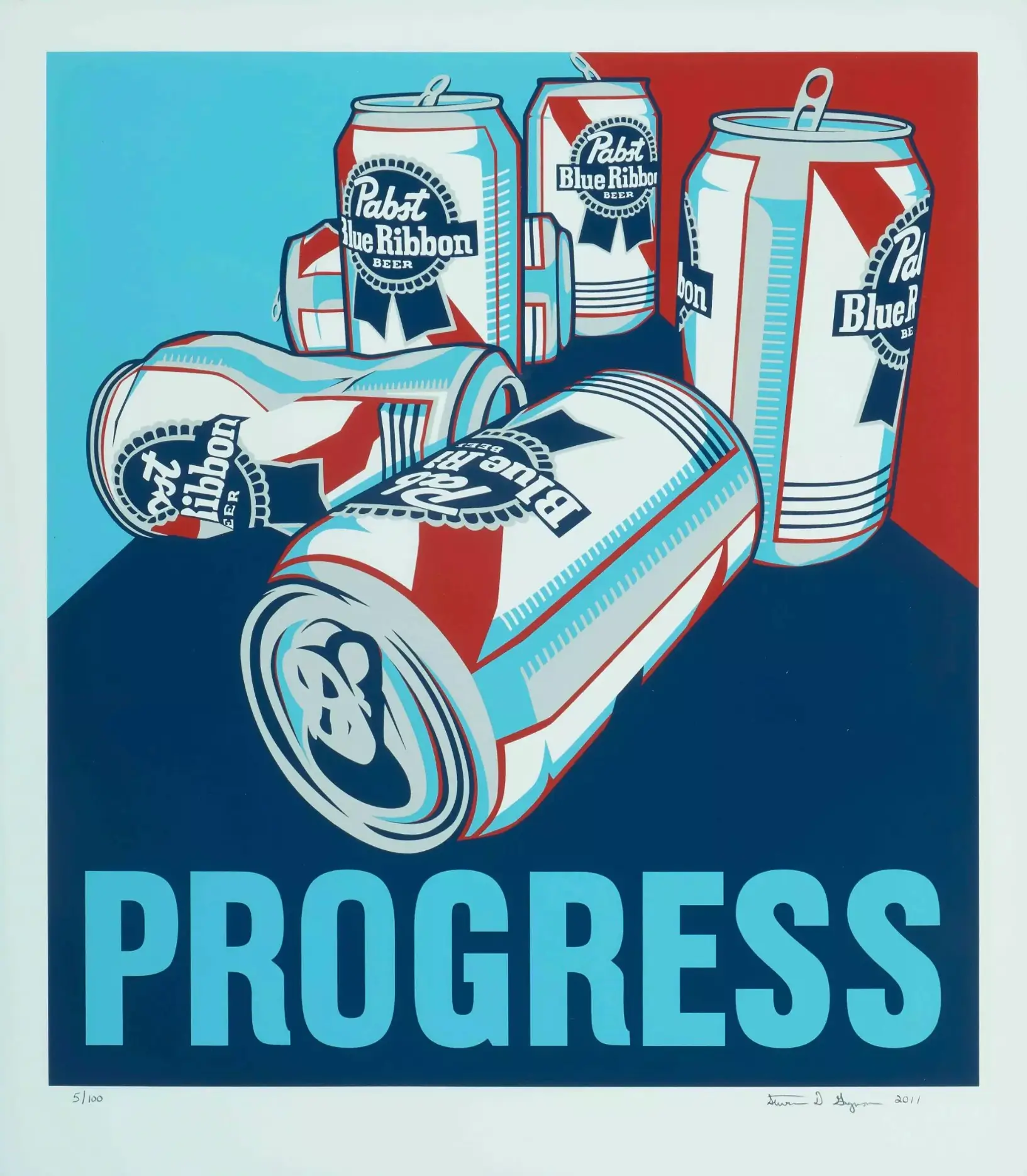
Born in Miami Beach in 1973, Gagnon’s work is shaped by a geography that is itself a study in contrast: light and shadow, surface and depth, artificial vibrancy and natural calm. His practice, particularly in printmaking, reflects a sensitivity to these dualities. In Hope. Progress., this duality becomes explicit—not only in title but in form. Two works, conceived together, printed in edition (5/100), signed and dated in pencil at the lower right, each measuring 75 x 66 cm, framed and preserved in notably strong condition.
What might initially read as decorative color fields or abstract compositions reveals itself, upon closer inspection, as a disciplined exploration of emotional architecture.
flow
Serigraphy—often referred to as screen printing—occupies a unique position within contemporary art. It bridges fine art and graphic design, reproducibility and individuality. In Gagnon’s hands, the medium becomes a site of control and nuance.
Each layer of color in a serigraph is applied sequentially, requiring precision in alignment and an acute awareness of how pigments interact. The result is not simply an image but a constructed surface. In Hope. Progress., this construction is evident in the clarity of edges, the saturation of tones, and the deliberate pacing of visual elements across the page.
The edition number—5/100—signals both accessibility and limitation. It situates the work within a broader circulation while preserving its status as a collectible object. The pencil signature and date, placed discreetly at the lower right, reinforce this balance between multiplicity and authorship.
The physical condition of the works further underscores their integrity. The sheets remain in very good condition, with only minimal edge wear—“Ränder minimst bestossen”—a detail that speaks to both careful handling and the resilience of the materials used. The partial mounting of the verso to a backing board suggests a conservation-minded approach, ensuring stability without compromising the visual field.
stir
The decision to present Hope and Progress as a pair is not incidental. It transforms the works from isolated statements into a conversation.
A diptych inherently invites comparison. It asks the viewer to move between two images, to consider relationships, contrasts, and continuities. In this case, the titles themselves provide a conceptual framework. “Hope” implies potential, anticipation, a forward-looking gaze. “Progress” suggests movement, development, the realization—or at least the pursuit—of that potential.
Yet Gagnon resists literal illustration. There are no overt symbols of aspiration or advancement. Instead, these ideas are embedded in the formal qualities of the prints. Color becomes emotion. Composition becomes trajectory.
One might observe a shift in palette between the two works—perhaps a movement from softer, more tentative tones to more assertive, saturated hues. Or a change in spatial organization, where forms become more defined, more directional. These are not definitive readings but possibilities, and it is precisely this openness that gives the diptych its power.
The works do not dictate meaning; they propose it.
deco
Color, in Gagnon’s practice, is not an afterthought. It is the primary vehicle of expression.
In Hope. Progress., color operates on multiple levels. At a surface level, it attracts the eye, creating an immediate visual impact. But beneath that, it structures the viewer’s experience. Warm tones may evoke intimacy or urgency, while cooler tones introduce distance or reflection. The interplay between these registers creates a dynamic tension that sustains engagement.
Importantly, Gagnon’s use of color avoids excess. There is a restraint, a sense that each hue has been chosen not for spectacle but for necessity. This restraint aligns with broader trends in contemporary abstraction, where clarity and precision often replace gestural exuberance.
At the same time, the works retain a sense of accessibility. They do not alienate the viewer with opacity. Instead, they invite a personal response. The titles act as entry points, guiding interpretation without constraining it.
influ
To understand Gagnon’s work, it is useful to consider the influence of his birthplace. Miami Beach is a city defined by light—intense, reflective, ever-changing. It is also a place where surface is paramount, where color and architecture interact in ways that are both aesthetic and functional.
This environment inevitably shapes an artist’s sensibility. In Gagnon’s case, one can trace a sensitivity to luminosity and contrast. The crispness of his serigraphs echoes the sharp delineation of light and shadow in coastal settings. The vibrancy of his palette recalls the saturated tones of tropical surroundings.
Yet there is also a counterbalance. Where Miami Beach might suggest excess, Gagnon introduces control. Where the environment is fluid, his compositions are structured. This tension between influence and interpretation is central to the work’s identity.
artifact
In the context of art collecting, condition is not merely a technical detail; it is part of the work’s narrative.
The description of Hope. Progress. notes that the sheets are in “very good condition,” with only minimal edge wear. This suggests that the works have been preserved with care, maintaining their visual integrity over time. The fact that both are framed adds another layer of protection, as well as a presentation context that enhances their presence.
The partial mounting of the verso to a backing board is a common conservation practice. It stabilizes the sheet while allowing for reversibility, ensuring that future interventions remain possible. For collectors and institutions alike, such details are significant. They indicate not only the current state of the work but its potential longevity.
culture
Editioned works occupy a unique space in the art world. They democratize access while maintaining a connection to the artist’s hand.
In the case of Hope. Progress., the edition of 100 places the works within reach of a broader audience, while the specific number—5/100—adds a layer of distinction. Early numbers in an edition are often valued for their proximity to the initial printing, though this is as much a matter of perception as it is of material difference.
More importantly, the edition format allows the work to circulate. It enables multiple viewers, across different contexts, to engage with the same image. In doing so, it extends the life of the work beyond its immediate physical presence.
relev
More than a decade after their creation, Hope. Progress. remains relevant. The themes embedded in the titles—aspiration, movement, possibility—are not confined to a specific historical moment. They are recurring concerns, resurfacing in different forms as circumstances change.
In today’s context, where uncertainty and transformation continue to shape cultural discourse, the works take on renewed significance. They do not offer solutions, but they provide a framework for thinking about change. They suggest that progress is not linear, that hope is not static, and that both are constructed through ongoing engagement.
fin
Hope. Progress. (2011) by Steven D. Gagnon is not a work that demands attention through scale or spectacle. Its impact is quieter, more deliberate. It operates through precision, through the careful calibration of color and form, through the subtle interplay between two images that are at once distinct and interconnected.
As a pair, the serigraphs form a cohesive statement—one that reflects both the discipline of the medium and the conceptual clarity of the artist. They remind us that optimism, when approached with rigor, can be a powerful tool. Not as a superficial gesture, but as a considered, structured response to the complexities of contemporary life.
In this sense, Gagnon’s work does not merely depict hope and progress. It enacts them—layer by layer, color by color, print by print.