Review: Off-White 10×10: Rewriting the Codes Through Collective Authorship
March 27, 2026
a system
There is a particular tension in revisiting icons—especially when those icons were never meant to be fixed. With the 10×10: Off-White Icons Reimagined Project, Off-White resists the idea of preservation as stasis. Instead, it proposes something more fluid: a reopening of its visual language to external authorship.
The framework is deceptively simple—ten creatives, ten icons—but the intent is more expansive. Rather than reinforcing brand codes, the project tests their elasticity. Can symbols like the industrial belt or diagonal stripes still hold meaning when removed from their original context? Or do they evolve into something else entirely?
This is not a retrospective. It is a recalibration.
View this post on Instagram
abloh’s
To apprehend the stakes, it helps to revisit the methodology of Virgil Abloh. His practice operated less like traditional fashion design and more like cultural editing. He sampled, reframed, and annotated—treating garments as surfaces for ideas rather than endpoints.
Off-White’s core motifs reflect that thinking. The diagonal stripes recall industrial hazard markings, suggesting movement, restriction, and direction. The quotation marks destabilize language, turning objects into self-aware statements. The zip tie, originally utilitarian, becomes both signature and commentary—part authenticity marker, part conceptual gesture.
Through collide with entities like Nike, these symbols entered global circulation, functioning as both branding and critique. Abloh’s key insight was that meaning could remain open—even at scale.
The 10×10 project builds directly on that premise. It treats the icons not as heritage assets, but as editable code.
View this post on Instagram
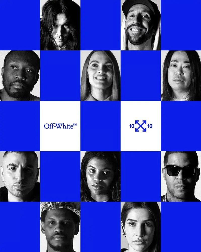
ten
The strength of the project lies in its refusal to impose uniformity. The selected creatives—spanning art, design, architecture, and image-making—approach the icons from radically different angles.
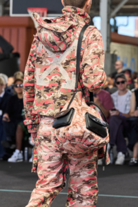
Some interpretations are materially grounded. The industrial belt is stripped of function and rebuilt as sculptural form, emphasizing line, tension, and space. Others are conceptual, using quotation marks to interrogate branding itself—what does it mean to label something “authentic” in an era defined by replication?
The diagonal stripes undergo perhaps the most expansive transformations. In certain works, they extend into architectural frameworks; in others, they fragment into digital distortions, echoing the instability of contemporary image culture.
What emerges is not cohesion but plurality. Each piece stands alone, yet collectively they map the range of what Off-White’s language can become when released from internal control.
flow
At the center of the 10×10 project is a shift in how branding operates. Off-White’s symbols do not behave as static identifiers. They function more like interfaces—structures that invite interaction and reinterpretation.
The zip tie becomes a prompt rather than a detail. The quotation marks operate as a lens, reframing meaning rather than fixing it. The diagonal stripes signal movement, but never dictate direction.
This logic mirrors digital culture, where images and symbols are constantly remixed. Recognition does not depend on consistency alone, but on adaptability. Off-White’s icons succeed because they can absorb change without losing identity.
By opening them up to external creatives, the brand leans into this dynamic. It acknowledges that relevance today is less about control and more about participation.
View this post on Instagram
abstract
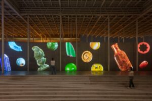
A notable aspect of the project is its movement beyond wearability. Many reinterpretations exist as installations, objects, or digital constructs rather than garments.
The industrial belt, for instance, is no longer constrained to the body. It becomes spatial—stretched, suspended, or abstracted. The zip tie is enlarged or rendered unusable, its meaning shifting from utility to symbol.
This detachment from function reframes Off-White as more than a fashion label. It positions the brand within a broader cultural field, where ideas circulate independently of products.
It also raises a quiet question: if the icon can exist without the garment, what defines the brand? The answer, increasingly, is language rather than object.