Criminal Damage Bleached Plaid Shirt: A Controlled Breakdown of the Familiar
March 28, 2026
8 hours ago
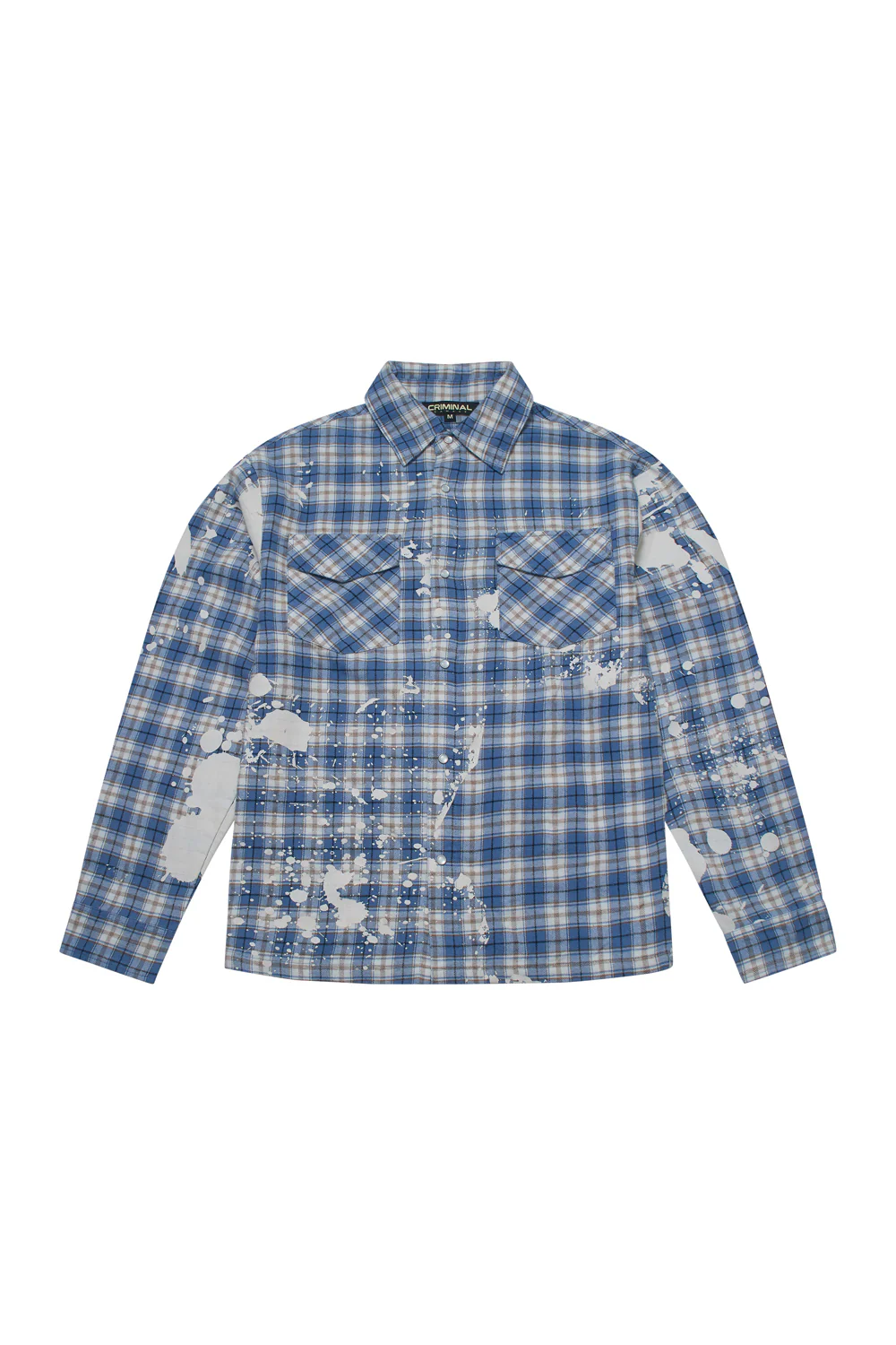
The Bleached Plaid Shirt by Criminal Damage does not attempt to reinvent the flannel. It interrogates it. What emerges is not a departure from the familiar, but a deliberate disturbance of it—one that understands the visual weight of plaid and chooses to interrupt rather than replace.
At first glance, the shirt reads as standard: a blue check pattern, dual chest pockets, snap closures. But the longer it holds your attention, the more the surface begins to shift. The grid loosens. The uniformity fractures. And what seemed predictable becomes something else entirely—less about tradition, more about intervention.
struct
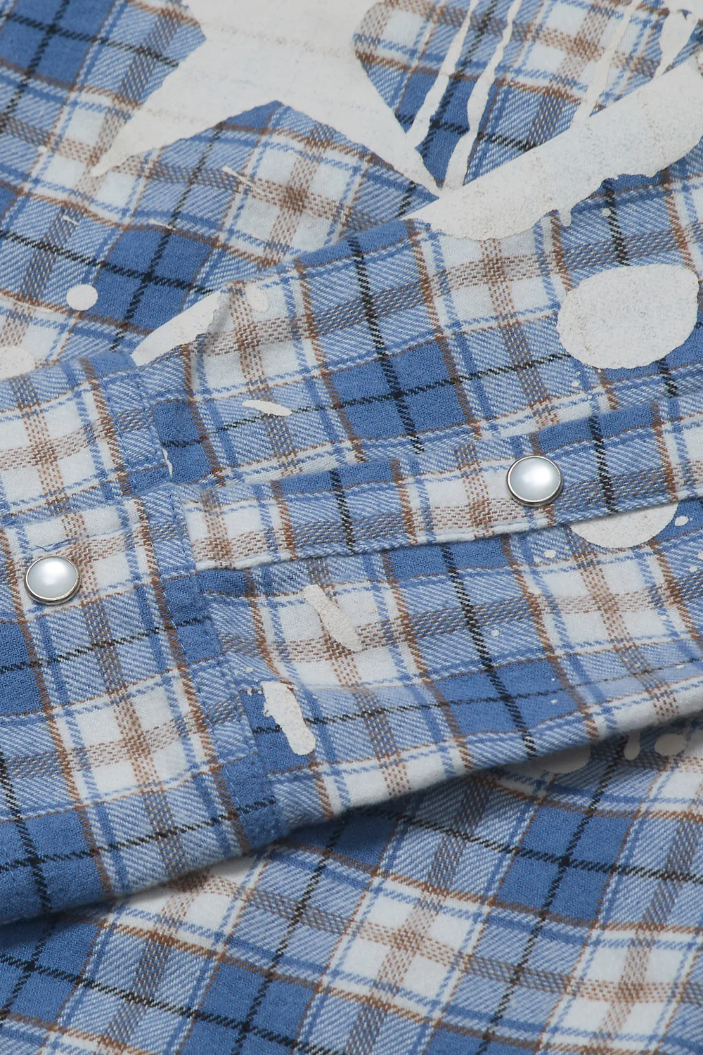
The foundation is important. Criminal Damage builds this piece on a workwear template that has remained largely unchanged for decades. The silhouette is slightly relaxed, cut to sit just off the body without leaning oversized. It’s a shape that allows layering without excess—practical, considered, and grounded.
The collar holds its structure without stiffness. The chest pockets are symmetrical, functional rather than decorative. Snap buttons replace traditional fastenings, offering both durability and ease. These details are not new, but they are precise. They establish the shirt as something reliable before anything else happens.
Because what follows depends on that reliability.
stir
Plaid is built on repetition. Its logic is visual order—lines intersecting at predictable intervals. The bleached treatment disrupts that order without erasing it. White splashes spread across the surface in irregular formations, cutting through the pattern in ways that feel immediate but controlled.
This is not a washed garment. It is marked. The difference is subtle but critical. A wash suggests uniformity; these marks suggest action. They appear almost incidental—like something that happened rather than something that was designed—but their placement tells a different story.
The distribution is uneven by design. One side carries heavier saturation, while other areas remain relatively untouched. Sleeves become focal points, with larger splatter formations drawing the eye outward. The torso balances this with smaller, scattered interruptions that keep the composition from feeling weighted.
What results is a tension between structure and distortion. The plaid still exists, but it no longer behaves as expected.
flow
There is a tendency in streetwear to rely on graphics as the primary vehicle of expression. Here, the surface does much of that work before any logo is introduced. The bleaching becomes the narrative device—suggesting process, wear, and transformation without resorting to overt storytelling.
It carries a certain ambiguity. Is it destruction, or is it refinement? The shirt does not answer. It exists somewhere in between, allowing the wearer to project meaning onto it rather than dictating one outright.
This ambiguity is where the piece finds its strength. It avoids the trap of over-definition. Instead, it offers a texture that feels lived-in, without actually being worn down.
type
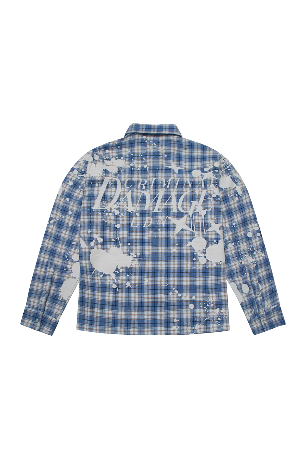
Turn the garment around, and the tone shifts. The “Criminal Damage Eden” graphic anchors the back panel, cutting through the plaid with a clarity that contrasts the front’s fragmentation. It is bold, but not aggressive—integrated into the composition rather than sitting on top of it.
The typography carries a slight irregularity, echoing the bleached surface without mimicking it directly. It feels connected, but not redundant. The scale is intentional: large enough to define the piece from behind, restrained enough to avoid overwhelming the garment’s structure.
This is where branding enters, but it does so with control. It does not compete with the fabric treatment. It completes it.
material
Up close, the material reveals its intent. The fabric retains the softness associated with flannel, but with enough density to hold its shape. It is not overly brushed or exaggerated. Instead, it sits somewhere balanced—comfortable without feeling delicate.
The snap buttons are clean, slightly reflective, offering a contrast to the matte fabric. Cuffs are structured but not rigid, allowing for natural movement. Stitching is consistent, reinforcing the idea that despite its distressed appearance, the garment is carefully constructed.
This duality—between perceived wear and actual durability—is central to the shirt’s identity.
pos
Criminal Damage has long operated in a space that merges accessibility with attitude. The Bleached Plaid Shirt reflects that balance. It is not conceptual in the traditional sense, but it is thoughtful. It understands the codes of streetwear—distress, graphic, proportion—and applies them with restraint.
There is no attempt to overcomplicate the piece. It does not rely on layering excessive elements or introducing unnecessary variation. Instead, it focuses on a single idea and executes it clearly: take something familiar, and disrupt it just enough to make it feel new.
This approach places the shirt in a broader conversation about contemporary streetwear’s direction. As the market moves away from overt branding and toward subtler forms of expression, pieces like this begin to feel more relevant. They offer identity without requiring explanation.
wear
Despite its visual impact, the shirt remains highly wearable. The color palette—blue, white, muted brown—anchors it within a neutral spectrum that pairs easily with denim, black trousers, or layered outerwear. The bleaching adds contrast without limiting versatility.
It functions as both a statement piece and a layering component. Worn open over a tee, it reads relaxed. Buttoned up, it becomes more defined. The adaptability is built into its design.
This is not a garment that demands attention at all times. It allows for moments of subtlety, which ultimately makes it more enduring.
sum
The Bleached Plaid Shirt by Criminal Damage succeeds not because it transforms the flannel beyond recognition, but because it knows where to stop. It disrupts without erasing, marks without damaging, and asserts without overwhelming.
It is a piece built on control—of material, of surface, of proportion. And in that control, it finds its identity.
Not loud. Not minimal. But precisely calibrated somewhere in between.