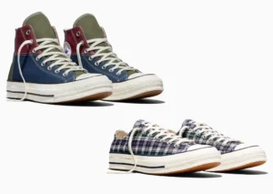
Noah x Converse Chuck 70 “True Blue”: A Classic Rewritten Through Coastal Memory
March 29, 2026
2 hours ago
There’s a certain clarity to the Noah x Converse Chuck 70 “True Blue” that doesn’t ask for attention so much as it holds it. In a landscape where collections often rely on exaggeration—layering references, materials, or logos until the product feels over-explained—this one moves in the opposite direction. It edits. It refines. It trusts the original.
That instinct has long defined Noah. Rather than chasing novelty, the brand works through continuity—taking familiar forms and adjusting them just enough to shift how they’re read. The Chuck 70, already one of the most culturally resilient shoes ever made, becomes an ideal canvas for that approach.
flow
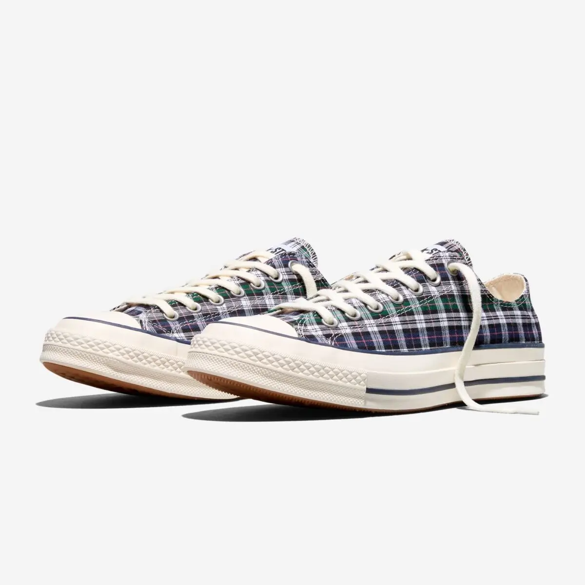
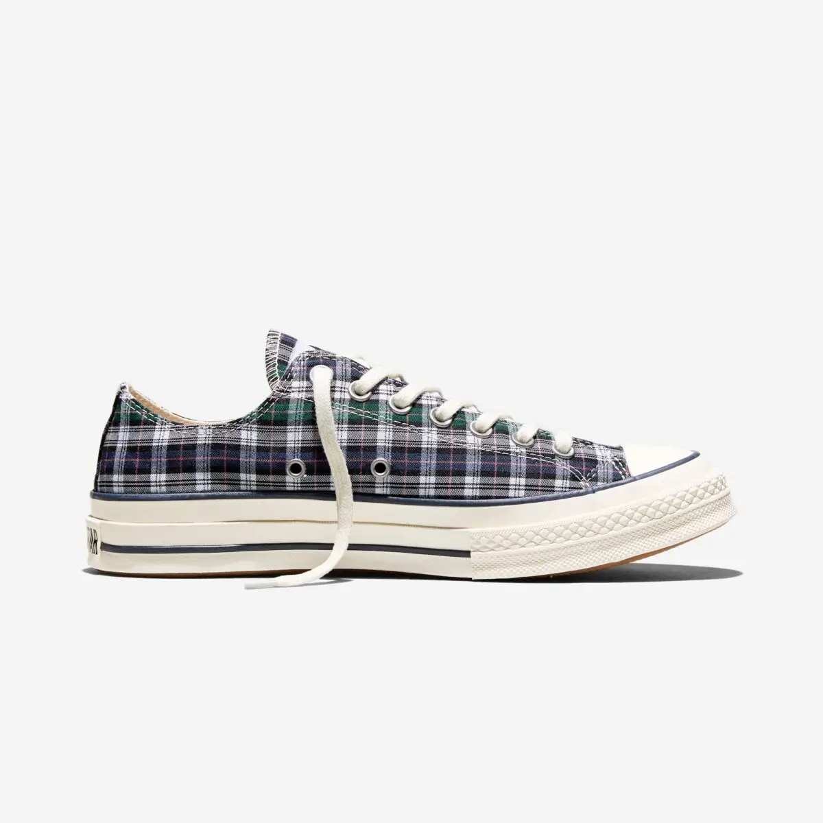
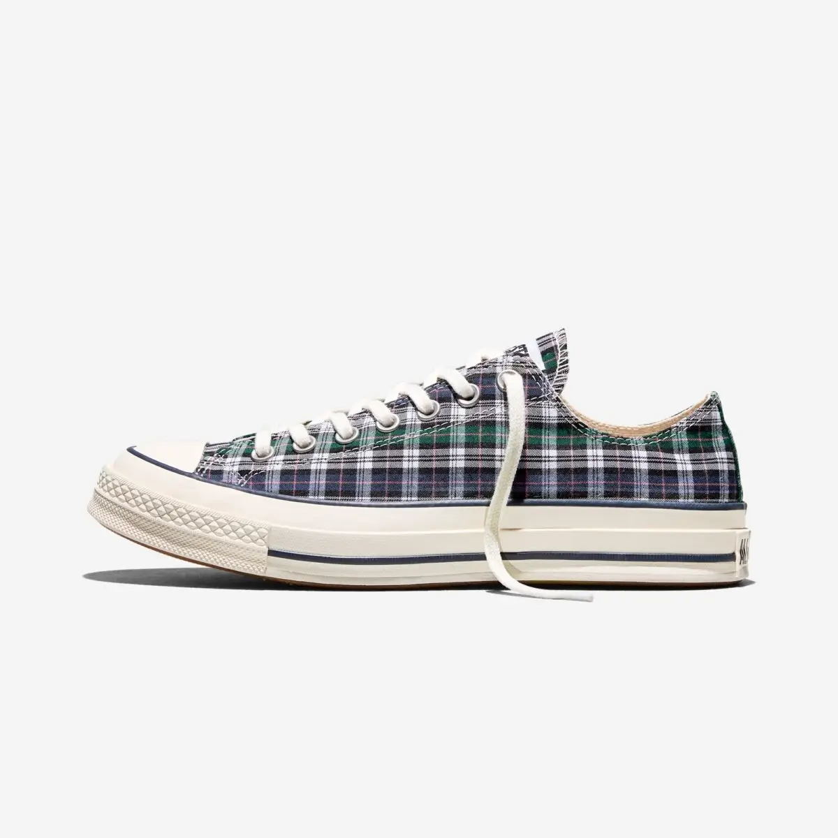
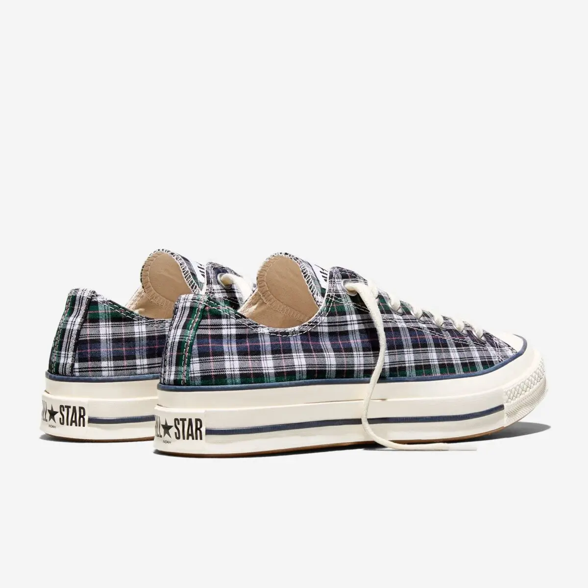
“True Blue” is not a bright, declarative blue. It’s closer to something weathered—somewhere between maritime navy and sun-softened indigo. The kind of tone that feels like it’s already been worn, already exposed to salt air and long afternoons rather than fluorescent retail lighting.
That distinction matters. Color here is not decorative; it’s narrative. It suggests a life beyond the object, positioning the sneaker as something that belongs to movement—coastlines, sidewalks, transitions between environments—rather than a static display.
The canvas upper reinforces that idea. There’s a density to it, a slightly heavier hand feel than standard iterations, eliciting the color to sit with more depth. Over time, it’s the kind of material that will crease, fade, and evolve, turning the shoe into a record of use rather than a preserved artifact.
View this post on Instagram
transition
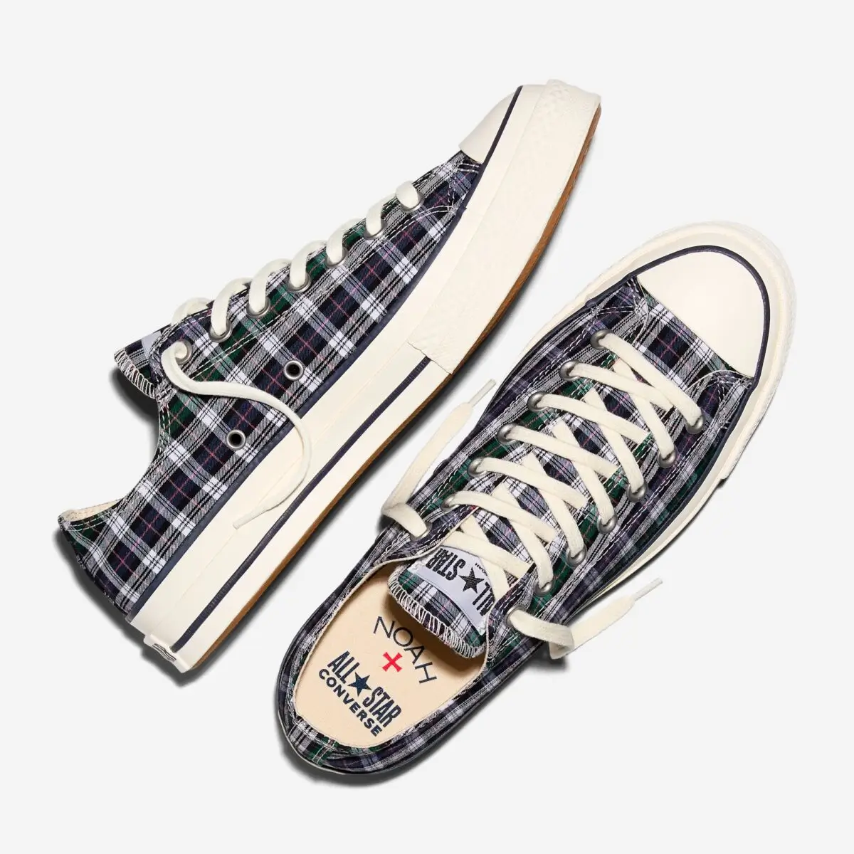
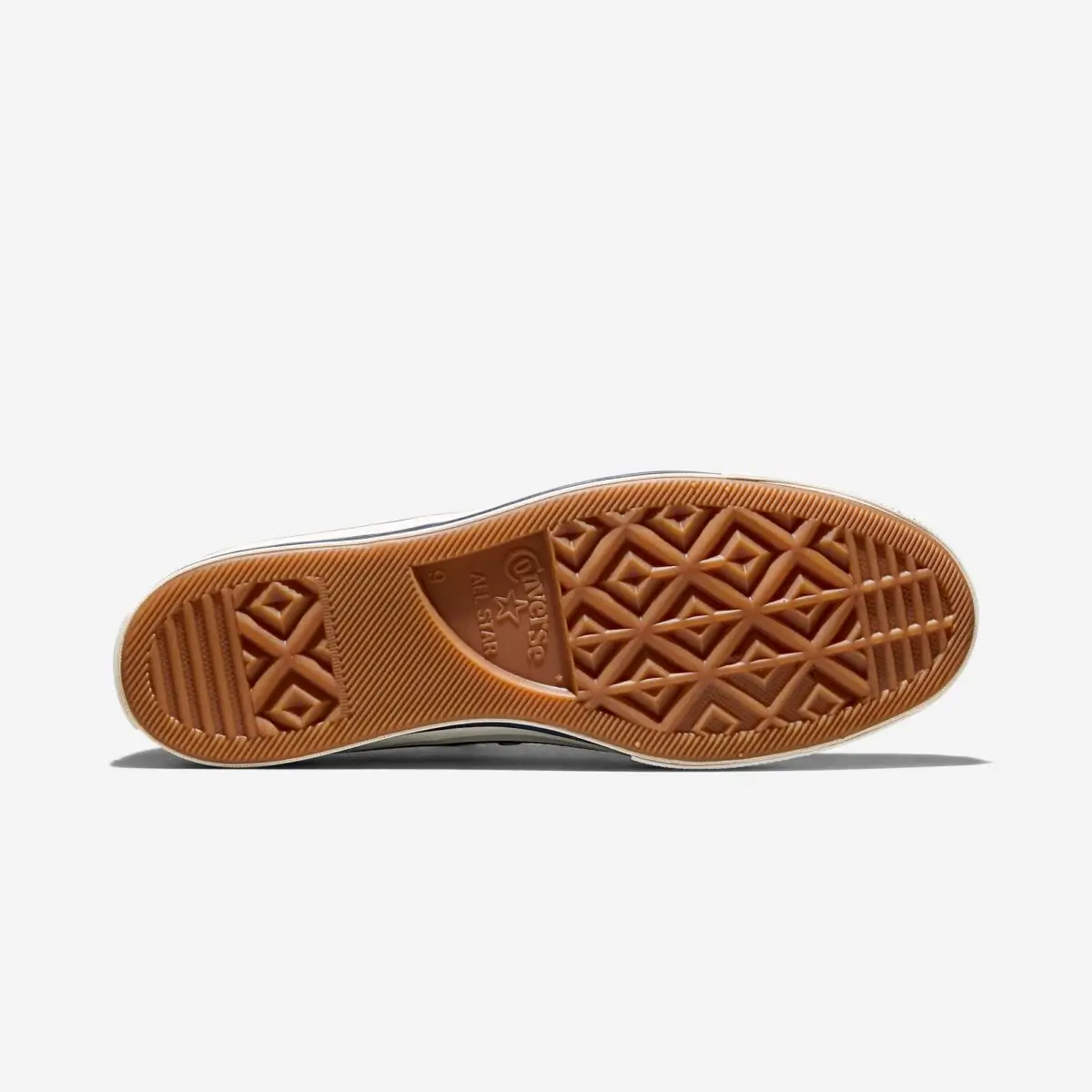
The strength of this collide lies in what it doesn’t change. The Chuck 70’s architecture—higher rubber foxing, reinforced canvas, cushioned insole—remains fully intact. These are not elements to be redesigned; they’re the reason the silhouette continues to matter.
Noah’s intervention is quieter. Slightly sharper stitching against the blue upper. A midsole that leans warm off-white rather than stark white, softening the overall palette. Subtle co-branding that doesn’t interrupt the visual flow.
Even the iconic ankle patch feels less like branding here and more like punctuation—something that completes the sentence rather than defines it.
show
Noah’s identity has always existed between geographies. Rooted in New York, but consistently referencing surf culture, sailing, and a broader coastal sensibility, the brand operates in a kind of dual register. The “True Blue” embodies that tension.
On one hand, it reads as a city shoe—clean, versatile, easy to integrate into everyday rotation. On the other, it carries a quiet suggestion of the coast. Not in a literal way, but in its palette, its material choices, and its relationship to wear.
This duality is what makes the shoe feel complete. It doesn’t belong to a single context, and because of that, it adapts effortlessly. A sidewalk in Lower Manhattan, a boardwalk further east, a late evening somewhere in between—the shoe holds its own without needing to shift identity.
idea
There’s an important distinction between shoes designed to age and as designed to stay pristine. The “True Blue” is firmly in the former category.
Everything about it invites use. The canvas will soften. The rubber foxing will pick up marks. The blue will shift slightly with exposure. None of this feels like degradation—it feels like completion.
In this sense, the wearer becomes part of the design process. The shoe is not finished at purchase; it evolves through repetition. This is a subtle but meaningful departure from the collectible mindset that dominates much of footwear culture, where value is often tied to condition rather than experience.
Noah’s approach reframes that entirely. Value here is in accumulation—of wear, of memory, of context.
stark
Minimalism can sometimes read as emptiness if it isn’t anchored by intention. That’s not the case here. Every restraint feels deliberate.
There are no unnecessary overlays. No experimental materials introduced for novelty. No aggressive branding competing for attention. Instead, the focus remains on proportion, color, and texture—the foundational elements that define the Chuck 70 in the first place.
This is a kind of design confidence that doesn’t need to announce itself. It assumes the viewer will notice the differences, even if they’re subtle.
culture
The Chuck 70 has lived multiple lives—on basketball courts, in music scenes, across subcultures that rarely intersect. Its adaptability is what keeps it relevant.
What Noah adds is not a new identity, but a recalibration. The “True Blue” feels like it could have existed decades ago, and that’s precisely the point. It extends the silhouette’s timeline rather than interrupting it.
In doing so, it aligns with a broader shift in how unions are being approached. Instead of treating heritage as something to be disrupted, there’s a growing interest in working within it—finding new expressions that feel organic rather than imposed.
fin
In a release calendar saturated with high-visibility drops, the Noah x Converse Chuck 70 “True Blue” operates differently. It doesn’t rely on spectacle. It doesn’t need to.
Its impact is cumulative rather than immediate. The more you look at it, the more it reveals—through its color, its materials, its proportions. It’s the kind of shoe that grows on you, rather than demanding instant recognition.
And that may be its most defining quality. It trusts time—both in how it will be worn and in how it will be understood.
Not everything needs to be new to feel relevant. Sometimes, it just needs to be seen again, slightly differently.