Adam Lister x Hello Kitty: Rebuilding a Global Icon Through Fragment
April 10, 2026
49 minutes ago
There is something quietly radical about taking one of the most globally recognized figures in visual culture and refusing to draw her as she is. Not stylizing her further, not exaggerating her features, not even parodying her. Instead—reducing her. Fragmenting her. Rebuilding her as a series of measured planes and deliberate omissions.
This is where Adam Lister enters the frame, and where Hello Kitty becomes something else entirely.
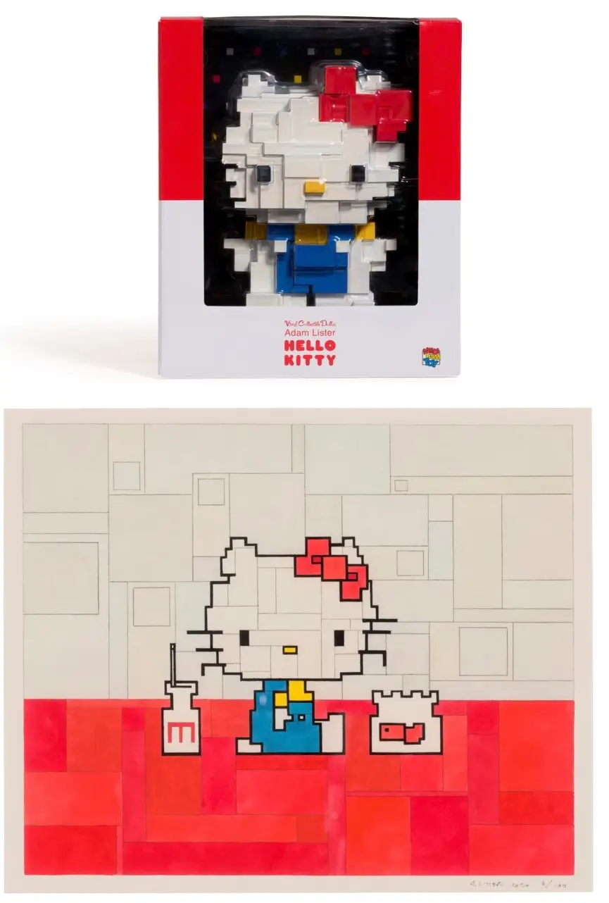
The 2020 collaboration between Lister and Medicom Toy doesn’t operate like a traditional artist-brand partnership. It isn’t about novelty, nor is it about reintroducing Hello Kitty to a new audience. That work was done decades ago by Sanrio, whose creation has existed as both product and emotional shorthand since 1974.
What Lister does instead is interrogate familiarity itself. He asks a deceptively simple question: what remains when recognition is pushed to its threshold?
flow
Lister’s view lang has always existed somewhere between early digital memory and painterly restraint. His work is often described as “8-bit,” but that shorthand misses the point. His compositions are not nostalgic recreations of retro gaming—they are translations of cultural memory into structural fragments.
Each painting is built from flat, angular shapes. Edges are softened by watercolor bleed, but the forms remain precise, almost architectural. Faces become planes. Expressions become alignment. Emotion is suggested through arrangement rather than detail.
Applied to characters like Hello Kitty, this approach becomes particularly potent.
Because Hello Kitty herself is already a study in reduction.
She has no mouth. Her features are minimal. Her emotional resonance comes not from expression but from projection—the viewer fills in the gaps. Lister doesn’t disrupt that system; he compounds it. He reduces the already reduced, creating a double-layered abstraction where identity hovers between presence and disappearance.
And yet, unmistakably, she remains.
stir
Created by Sanrio in 1974, Hello Kitty is less a character than a system. She is a vessel for emotion, commerce, identity, and cultural translation. Her lack of a mouth—often cited as her most defining trait—allows her to mirror the feelings of the person looking at her. Happiness, sadness, neutrality—all are projected onto her blank surface.
Over decades, she has been everything: a children’s mascot, a fashion motif, a symbol of Japanese soft power, a collectible object, a lifestyle signifier. She has appeared on everything from school supplies to high-fashion collaborations.
This elasticity is what allows Lister’s reinterpretation to function without resistance.
Because Hello Kitty is not fixed.
She is already designed to be reinterpreted.
rare
The involvement of Medicom Toy is not incidental—it is foundational.
Medicom has spent decades positioning itself at the intersection of art, design, and collectible culture. Through platforms like BE@RBRICK, the company has transformed familiar characters into modular canvases for artists, designers, and brands.
By placing Lister’s Hello Kitty within this ecosystem, the collaboration becomes more than an artwork. It becomes an object of circulation, a collectible artifact that exists simultaneously as art print and design commodity.
This duality matters.
Because Lister’s work already sits between fine art and reproducibility. Watercolor, historically associated with singularity and fragility, is here translated into a format that can be editioned, distributed, and owned.
Medicom provides the infrastructure for that translation.
idea
The year 2020 cannot be ignored in reading this collaboration.
It was a year defined by isolation, by digital mediation, by a sudden and global recalibration of attention. Screens became primary environments. Physical movement was restricted. Memory and nostalgia gained new weight as forms of psychological grounding.
Lister’s work, with its resemblance to early digital graphics, felt unusually aligned with that moment. His paintings evoke a time when images were simpler, when resolution was limited, when recognition required participation.
At the same time, Hello Kitty offered a form of emotional continuity—a symbol that had persisted unchanged through decades of technological and cultural shifts.
Together, they formed a kind of visual refuge.
Not escapism, exactly, but a reconfiguration of familiarity into something contemplative.
theory
At first glance, Lister’s Hello Kitty appears almost incomplete.
The bow is there, but angular. The face is there, but divided into planes. The eyes—those small, oval anchors—are reduced to minimal shapes that barely assert themselves. The whiskers, often a defining detail, may be implied rather than explicitly drawn.
And yet, the mind resolves it instantly.
This is where the work becomes psychological.
Recognition does not depend on detail—it depends on pattern. Lister leverages this by stripping away everything that is not structurally necessary, leaving just enough for the brain to complete the image.
In doing so, he shifts the act of viewing into an act of participation.
You are not just looking at Hello Kitty.
You are reconstructing her.
show
Lister’s palette in this series tends toward softness. Reds are muted. Whites are broken into subtle tonal variations. Backgrounds are often left open, allowing the figure to float rather than anchor.
This restraint is critical.
Hello Kitty’s traditional palette is bold and immediate—clean white, bright red, high contrast. Lister softens this into something quieter, more introspective. The character becomes less of a product and more of a presence.
Watercolor, with its inherent unpredictability, introduces slight variations in tone and edge. No line is perfectly hard. No fill is entirely uniform. This introduces a human element into an otherwise highly structured composition.
The result is a tension between control and fluidity.
Between system and gesture.
style
There is an interesting duality at conjure in this collide: childhood iconography filtered through systems thinking.
Hello Kitty belongs to a visual language of innocence, accessibility, and emotional immediacy. Lister’s work, by contrast, introduces distance. It asks for interpretation. It resists immediate consumption.
When combined, these two approaches do not cancel each other out—they complicate each other.
The character becomes less about nostalgia and more about structure. The artwork becomes less about abstraction and more about memory.
This is where the collaboration finds its depth.
It does not simply repackage Hello Kitty for an art audience.
It reframes how recognition itself operates.
balance
As with many Medicom collisions, there is an unavoidable question: is this art, or is it product?
The answer is, deliberately, both.
Lister’s work exists within the gallery system, but it also circulates through online platforms, print editions, and collaborations. Hello Kitty exists as a mass-produced icon, but also as a cultural symbol with deep emotional resonance.
Medicom sits between these worlds, facilitating their overlap.
The 2020 release functions as a collectible object—limited, desirable, positioned within a market. But it also functions as a conceptual exercise, asking viewers to reconsider how images are constructed and remembered.
The tension between these roles is not a flaw.
It is the point.
exent
There is a broader cultural reading available here as well.
Hello Kitty has long been understood as a form of Japanese soft power—a character that carries cultural influence across borders without friction. She is approachable, adaptable, endlessly reproducible.
Lister’s intervention introduces friction.
Not aggressive, not disruptive—but present. The edges are harder. The forms are less immediately legible. The viewer must engage, must slow down, must look again.
In this sense, the collaboration becomes a subtle negotiation between accessibility and complexity.
Between global icon and individual interpretation.
how
Six years after its release, the Adam Lister x Hello Kitty collaboration continues to circulate—not just in resale markets, but in visual culture itself.
This endurance is not driven by hype.
It is driven by clarity.
Lister’s approach distills Hello Kitty to her structural essence, revealing how little is actually required for recognition. In doing so, he creates a version of the character that feels both familiar and newly considered.
The work does not age because it is not tied to trend.
It is tied to perception.
fin
What remains, finally, is a version of Hello Kitty that exists in pieces but reads as whole.
A character that has been taken apart and put back together without losing herself.
A collision that does not rely on spectacle, but on precision.
And an artist who understands that sometimes, the most effective way to see something clearly is to remove everything that seems essential—until only the essential remains.