Anti-design: The Rule-Breaking Aesthetic Revolution Challenging Creative Orthodoxy
May 2, 2025
It’s easy to believe, in our current age of endlessly recycled visual cues, that we’ve seen it all. Minimalism gave way to maximalism, which became bold minimalism, which then flirted with brutalism, before swinging back to something like organic utopia. And yet, emerging from the fray, comes a trend—or more accurately, an anti-trend—whose name itself challenges categorization: anti-design.
With its jarring colors, broken grid systems, intentionally clunky interfaces, and an almost punk disregard for visual harmony, anti-design feels like a tantrum against decades of design etiquette. It defies ease, challenges taste, and often appears to ask: “What if we made it bad—on purpose?” And yet, what was once dismissed as digital detritus or postmodern irony has steadily gained traction, particularly among Gen Z creatives, niche brands, and underground visual cultures. Anti-design is no longer fringe—it’s a cultural statement.
But what exactly is anti-design? Where does it come from? What does it want? And more importantly, should brands—especially those obsessed with coherence and legibility—embrace it?
The Aesthetic of Rebellion: What Is Anti-Design?
Anti-design is not simply “bad design.” It is a conscious rejection of traditional design principles such as hierarchy, harmony, consistency, and legibility. It favors visual anarchy over alignment, rawness over refinement. Think clashing typefaces, chaotic layering, irregular spacing, and interfaces that purposefully make you work a little harder.
In the digital world, anti-design often manifests in glitchy animations, pixelated graphics, low-resolution photography, and layouts that subvert expected navigation patterns. It’s the aesthetic of the broken internet, of ‘90s zines, of bootleg posters duplicated one too many times. But more than visual tactics, anti-design is a mindset—one that calls into question who gets to define good taste and why.
A Brief History: From Radical Italian Furniture to Tumblr Core
The origins of anti-design can be traced back to the Italian Radical Design movement of the 1960s and ’70s, particularly the works of collectives like Superstudio and Archizoom. These designers eschewed function and embraced provocation, producing pieces that were intentionally unlivable, grotesque, or wildly impractical—anti-furniture, if you will. Their philosophy? Design should provoke, not just solve problems.
Fast forward to the late ’90s and early 2000s, and you find new iterations of anti-design within early internet culture: GeoCities pages with flashing gifs, glitter cursors, rainbow Comic Sans titles—all existing in joyous defiance of coherence.
Then came Tumblr. From 2010 to 2015, Tumblr artists and moodboard curators mined this aesthetic chaos for emotional effect. Suddenly, broken typography, cyberpunk distortion, and vaporwave glitches weren’t just kitschy—they were expressions of disillusionment, alienation, and nostalgia. This period birthed visual subcultures like seapunk, net art, and post-internet aesthetics.
Today’s anti-design pulls from all of these histories—fusing political critique, tech fatigue, and a relentless desire to rupture the homogeneity of modern branding.
A Reaction to Aesthetic Perfection
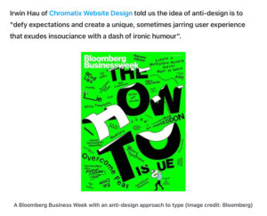
One reason anti-design is thriving now is because it arrives in opposition to something else: the omnipresence of “good design.” Apple’s white-space utopia. Airbnb’s pastel harmony. Instagram’s grid-based everything. We live in a world saturated with visual templates, governed by algorithms, and optimized for engagement. From Canva’s homogenizing templates to UX guidelines that dictate user flow, the web has never looked more polished—or more uniform.
Anti-design intervenes. It restores friction where everything had been smoothed over. It revives confusion in an age obsessed with clarity. If good design wants you to stay, anti-design dares you to decide.
There’s a politics to this too. Anti-design questions the capitalist function of design as a persuasive, user-converting tool. By refusing to “sell,” it exposes how much of modern design is simply aestheticized marketing.
Who’s Using It?
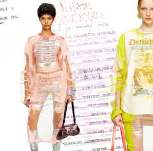
While anti-design remains too chaotic for most mainstream brands, it’s become a dominant language in underground scenes, indie fashion, art publications, experimental music, and niche tech startups.
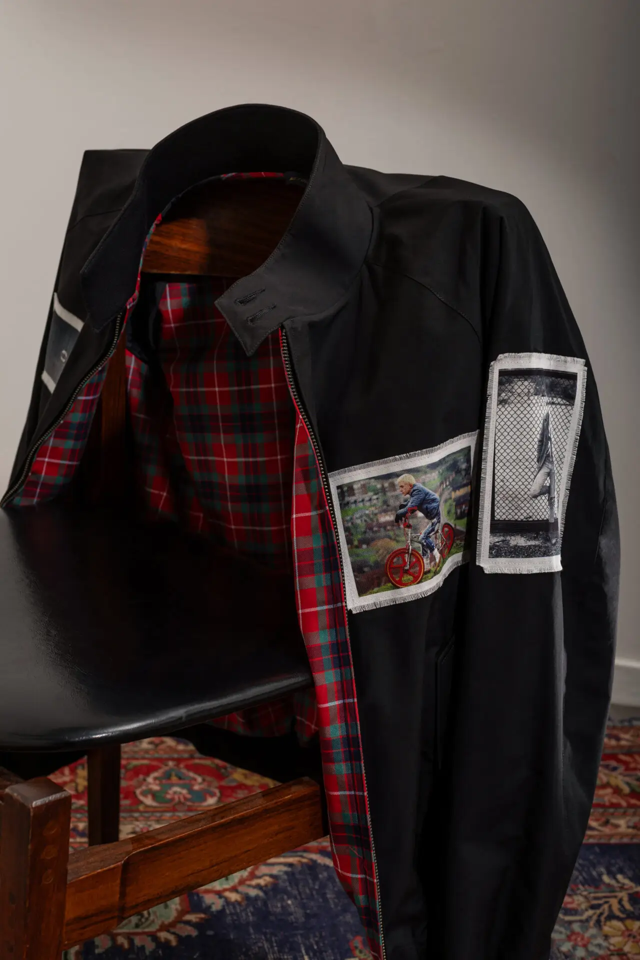
Brands like Balenciaga have dipped their toes in this space—its 2021 website refresh mimicked a late-’90s PC interface, complete with low-res icons and broken flows. Heaven by Marc Jacobs routinely uses chaotic type and discordant layouts in its campaign work, evoking teenage bedroom walls, angsty collages, and pre-social media internet detritus. MSCHF, the internet-prank-art collective behind viral drops like the “Big Red Boots,” also deploys anti-design in its site launches—making users click, scroll, and decipher rather than passively absorb.
Meanwhile, online spaces like Are.na, Neocities, and a resurgence of HTML-first personal blogs show a return to pre-optimized digital identity, where design is more experimental, less polished, and defiantly personal.
In music, labels like PAN or artists like Arca and Yves Tumor extend the aesthetic into album art, press visuals, and digital environments that feel feral, glitchy, anti-commercial. These are not “bad” designs—they are designs that reject your assumptions about what design should be.
Anti-Design in the Age of TikTok and Templates
Paradoxically, anti-design’s rise coincides with the dominance of platforms that encourage sameness. TikTok, Instagram Reels, and mass-market design tools like Canva or Squarespace offer frictionless templates that anyone can use. While these tools democratize access to design, they also encourage aesthetic repetition—flattening creativity in the name of scale.
Anti-design, then, becomes a rebellion not only against taste but against algorithmic predictability. It says: if everyone’s playing by the same rules, maybe it’s time to rip up the rule book.
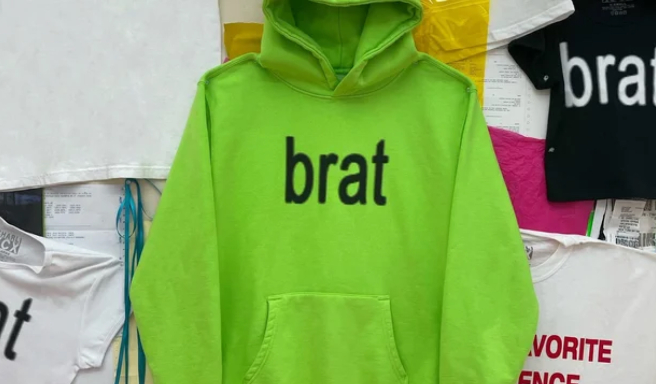
Gen Z, in particular, has gravitated toward this ethos. For a generation raised on slick interfaces and flattened brand personalities, anti-design offers something raw and real—even if it’s jarring. It’s a digital moodboard for burnout, irony, glitch, rebellion. It’s not about looking “good.” It’s about feeling true—even if that truth is disorganized, dystopian, or deliberately abrasive.
Should Brands Embrace It?
For major brands, anti-design remains a risk. It challenges usability, legibility, and brand coherence—three sacred cows in corporate design. But for those with the right audience and positioning, it can be revelatory.
To use anti-design well, a brand must have deep self-awareness. It must understand that the goal isn’t aesthetic confusion for confusion’s sake—it’s the creation of new emotional frequencies. It’s the visual equivalent of post-punk: raw, unresolved, and deliberately uncomfortable.
Brands targeting youth subcultures, countercultural niches, or digital art spheres can benefit from anti-design, especially when used sparingly or in specific campaign bursts. But it can’t be faked. The moment anti-design is co-opted as just another trend to sell products, it loses its charge.
Authenticity, in this space, is non-negotiable.
The Future of Anti-Design
Like all movements born of rebellion, anti-design will evolve. Its aesthetic grammar may change. Its visual cues may morph. But its spirit—a refusal to conform, a joy in rupture, a distrust of polish—will persist.
As AI-generated content continues to flood our screens, and templated visuality becomes even more the norm, anti-design may serve a new purpose: as a human signature. An imperfect, glitch-ridden, emotionally coded visual fingerprint that says: a person made this. Not a system. Not a brand deck. Not an AI. A real, messy, emotive person.
And in a world yearning for that kind of connection, anti-design might not just be a reaction—it might be a necessity.