BAPE by KidSuper — Art, Energy, and Identity Collide
April 9, 2025
When two cult-favorite forces in streetwear come together, it’s rarely quiet — and the new BAPE by KidSuper campaign is no exception. This isn’t just a collaboration between brands. It’s a creative collision between two distinct philosophies: BAPE’s legacy of bold, graphic-forward streetwear and KidSuper’s offbeat, art-driven storytelling.
The result is a campaign — and collection — that feels alive: expressive, chaotic, visual, and entirely modern. But underneath the graphic-heavy pieces and the surreal photo shoots, there’s a story about where streetwear is going, how creativity functions as currency, and why collaboration is more than just co-branded logos in 2025.
This explication unpacks the visual strategy, the energy behind the designs, and the cultural meaning embedded in this high-impact partnership.
Context: The Players
A Bathing Ape (BAPE)
Founded in 1993 by NIGO in Tokyo, BAPE (A Bathing Ape) has been one of streetwear’s defining brands for over three decades. Known for its camouflage patterns, Shark hoodies, BAPE STA sneakers, and collaborations with everyone from Kanye West to Coca-Cola, BAPE is a symbol of hype culture and fashion exclusivity.
It’s a brand that made streetwear collectible — turning graphic hoodies into status items and store drops into cultural events.
KidSuper
KidSuper is the brainchild of Colm Dillane, a Brooklyn-based designer, artist, and creative director known for his colorful, hand-drawn aesthetic and chaotic visual storytelling. KidSuper blends fashion with fine art and childlike wonder, pulling inspiration from cartoons, youth culture, sports, and the surreal.
Dillane’s work often feels like a visual diary — messy, raw, personal, and weirdly sincere. His rise through the fashion world has been unconventional, and that’s part of his charm.
Why This Collaboration Matters
On the surface, BAPE and KidSuper may seem like natural collaborators — both love graphics, color, and cultural mashups. But they operate with different tones. BAPE is sleek and iconographic. KidSuper is emotional and unpredictable.
This campaign doesn’t just blend those tones — it creates a new one. BAPE brings its legacy; KidSuper brings disruption. Together, they’re responding to an increasingly chaotic cultural moment where personal identity, online aesthetics, and street culture are colliding in strange, electric ways.
This campaign isn’t just a showcase — it’s a vibe. And that matters in an industry now dominated by content, not just clothing.
Visual Aesthetic: Surrealism Meets Streetwear
The campaign imagery is loud. Not in the sense of volume, but in visual energy. Imagine surreal photo sets layered with graffiti, paint splatters, oversized cartoon props, and collaged cityscapes.
Models pose mid-motion, as if caught inside a dream. The backgrounds are over-saturated, distorted, or illustrated. Clothes melt into murals. Sneakers float. Walls bend. It’s not just fashion photography — it’s visual storytelling through chaos.
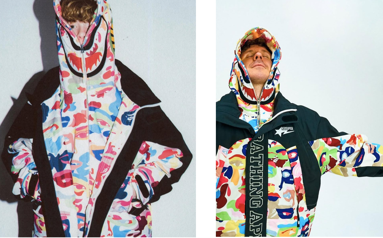
KidSuper’s fingerprints are all over this: from the use of hand-drawn elements to abstract color-blocking and unexpected humor. Meanwhile, BAPE’s influence holds everything together with bold branding, recognizable camo, and the Shark motif appearing in fresh ways.
It feels like a moving sketchbook — part animation cell, part magazine editorial, part art school experiment.
Color and Pattern Play
Color is the language of this campaign. We’re not just looking at neutrals with pops of contrast — this is a full-on riot of palette. Pastel camo prints clash with solid primaries. Spray-paint gradients blend into brushed textures. Every piece feels custom-made, even when mass-produced.
The patterns don’t sit still. BAPE’s signature camo appears in new forms: abstracted, warped, faded, or layered under KidSuper’s illustrated motifs. Shark teeth become almost mythic — printed, sketched, or hidden in places you don’t expect.
This kind of pattern experimentation suggests a desire to break format — not just remix old icons but reinvent them entirely. It’s a sign of where streetwear is heading: less about clean logos, more about expressive overload.
Styling and Garment Design
What makes this collection land is its function-meets-fantasy approach. Yes, the visuals are wild — but the pieces themselves remain wearable.
We see:
- Reworked varsity jackets with asymmetrical paneling
- Hybrid hoodies that blend illustration and embroidery
- Relaxed cargo pants with playful pockets
- Boxy tees with layered prints
- Sneakers with mismatched laces or split colorways
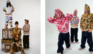
Silhouettes are oversized, echoing both Japanese streetwear and KidSuper’s relaxed, playful shapes. Materials range from classic cotton and fleece to satin and mesh — tactile and eye-catching.
There’s also layering — and not just with clothes. The models are layered with accessories, visuals, and props. Every look becomes part of the set, like a 3D collage. It’s fashion-as-performance, not just product.
Casting and Mood: Characters, Not Models
The casting follows KidSuper’s signature style: diverse, expressive, and a little strange in the best way. These aren’t stoic fashion models — they’re characters. Each person looks like they stepped out of a graphic novel or a downtown comic strip.
Facial expressions are exaggerated. Postures are casual, offbeat, or animated. It’s clear that the campaign doesn’t want to project coolness — it wants to project creative energy.
This choice makes the campaign feel personal. These aren’t unattainable icons. They’re part of a shared art world. The message: “You can wear this, you can create in this, you can play in this.”
Narrative Layer: Youth, Rebellion, and Art as Escape
If there’s a narrative running through the campaign, it’s one of creative rebellion. The kind of joyfully chaotic expression you get from sketching in notebooks during class, building skate ramps in your garage, or printing T-shirts with your friends in a basement.
This is streetwear as a creative outlet — not just something you buy, but something you participate in. The imagery suggests movement, freedom, and a certain low-key anarchy. Draw outside the lines. Rip it up. Paint over it. That’s the spirit of the collection.
And in a moment when many luxury brands are leaning into clean minimalism and quiet luxury, this collaboration feels like a loud, defiant “no thanks.” It reminds the fashion world of streetwear’s DIY, artistic roots.
Branding: Co-Ownership, Not One-Sided
A common trap in collaborations is imbalance — one brand overpowers the other. But here, BAPE and KidSuper split the visual language almost 50/50.
The BAPE camo and Shark motif are present, but often reimagined in KidSuper’s line-drawing style. Similarly, KidSuper’s signature art prints appear on classic BAPE silhouettes like hoodies and joggers.
Logos are merged, layered, or playfully obscured. Instead of treating logos as sacred, they’re painted over, distorted, or handwritten — reinforcing the creative freedom that defines this collection.
This shows trust between brands. Neither feels like the “guest.” It’s a conversation, not a takeover.
Streetwear in 2025: Collaboration as Storytelling
The BAPE x KidSuper campaign reflects a deeper truth about the state of streetwear in 2025: it’s no longer about clothing as a standalone object. It’s about the full world around it.
Consumers don’t just want a hoodie. They want:
- The story behind it
- The feeling it gives
- The people who made it
- The culture it references
- The emotion it taps into
This campaign delivers on all five. It invites you into a shared world — one that’s weird, raw, and alive with color and personality.
It’s not just style. It’s art that wears back.
Cultural Relevance: Internet Aesthetics and Gen-Z Mentality
The campaign also fits seamlessly into Gen Z’s visual ecosystem — a space defined by collage culture, glitch art, nostalgic layering, and post-irony aesthetics.
This is the generation that grew up remixing visuals online — from Tumblr to TikTok — where memes, fashion, and art all blur. The BAPE x KidSuper campaign taps into this fluidity. It doesn’t explain itself. It just is — messy, expressive, nonlinear.
And that works. In fact, it’s exactly what younger audiences respond to: not polish, but personality. Not traditional luxury, but chaotic joy.
Impression
The BAPE by KidSuper campaign is more than a product launch. It’s a creative declaration. A reminder that streetwear is — at its best — a mix of art, rebellion, humor, and identity.
It’s a celebration of color, collaboration, and youthful chaos in a fashion world that sometimes takes itself too seriously. It feels like a sketchpad come to life. A cartoon world you want to live in. A clothing line you want to create with, not just wear.
This isn’t about selling hoodies. It’s about making you feel something — weird, energized, inspired, seen.
And in 2025, that’s the most valuable thing a brand can do.