BAPE® Spring/Summer 2026 Golden Era: GLITCH Woodland Camo, Music-Led Campaign & Archive
April 7, 2026
2 hours ago

the loop, not the throwback
The idea of a “golden era” is often treated as something fixed—an untouchable past sealed in memory, replayed only through reference. A Bathing Ape has never subscribed to that static definition. For Spring/Summer 2026, the Golden Era isn’t framed as nostalgia, but as a loop—something that can be remixed, distorted, and reintroduced with different energy each time it returns.
This season, BAPE® positions music not as an accessory to the collection, but as its architecture. The campaign doesn’t simply borrow visual cues from sound culture—it behaves like it. Scenes transition like tracks. Outfits layer like samples. Motifs repeat, but never identically. The result is less about presenting garments and more about constructing a rhythm that moves through them.
There’s an understanding here: streetwear has always been tied to sound. From hip-hop to underground scenes, from Tokyo’s Harajuku to global subcultures, clothing has functioned as both uniform and amplifier. BAPE® doesn’t attempt to narrate this connection—it assumes it, then builds from it.
stir
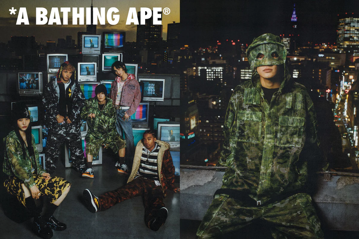
The campaign opens in a space that feels almost too specific to be accidental—a Japanese-style room, intimate and enclosed, transformed into a BAPE® fan’s sanctuary. It’s not styled like a showroom or a curated archive. Instead, it feels lived in, accumulated over time.
Garments hang beside posters. Objects overlap. Graphics coexist across surfaces. There’s a sense that nothing here was placed all at once. It was collected, absorbed, layered gradually—like taste itself.
This interior setting functions as more than a visual backdrop. It establishes a starting frequency. The stillness of the room contrasts with the movement that follows, but it also grounds the collection in something personal. Before the street, before the spectacle, there is the individual—the collector, the listener, the wearer who builds meaning through accumulation.
The room is quiet, but not passive. It hums with memory.
move
From that contained interior, the campaign shifts outward. The transition isn’t abrupt—it feels like stepping outside mid-track, where the energy changes but the rhythm continues. Streets replace walls. Motion replaces stillness.
Here, the clothing begins to behave differently. Pieces that felt archival in the room now feel immediate, almost kinetic. Layering becomes more dynamic. Silhouettes move with intent.
There’s a rawness to these scenes—not chaotic, but unfiltered. BAPE® doesn’t overly stylize the street. It allows it to remain textured, imperfect, real. The garments don’t dominate the environment; they exist within it, responding to its pace.
This duality—interior reflection versus exterior motion—forms the backbone of the campaign. It’s not a contrast meant to divide, but one meant to connect. The wearer moves between these spaces constantly, carrying elements of both.
an evolution
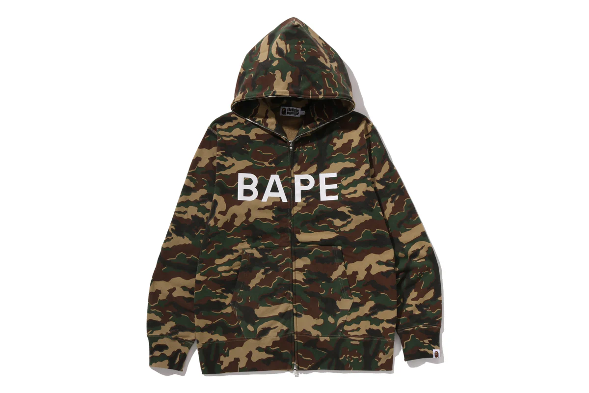
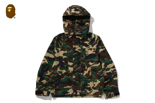
At the center of Spring/Summer 2026 sits GLITCH WOODLAND CAMO—a reinterpretation of one of BAPE®’s most defining visual signatures. Camo, in its original function, is about concealment. In streetwear, it has always done the opposite. It signals.
What GLITCH WOODLAND CAMO introduces is instability. The pattern fractures. Edges blur. Familiar shapes pixelate and reassemble. It feels less like a print and more like a disrupted signal—something partially corrupted, but still legible.
This distortion isn’t aesthetic for its own sake. It reflects the way cultural memory operates now. Nothing remains untouched. Archives are constantly revisited, altered, recontextualized through new technologies and perspectives.
The camo doesn’t reject its origins—it complicates them. It asks what happens when something iconic refuses to remain fixed.
There’s also a subtle commentary embedded here. In a landscape where heritage brands often rely on exact reproductions of past successes, BAPE® chooses mutation. GLITCH WOODLAND CAMO acknowledges the archive while refusing to preserve it unchanged.
View this post on Instagram
flow
The silhouettes themselves don’t attempt to reinvent BAPE®’s core vocabulary. Hoodies, tees, outerwear—these remain consistent. But consistency here isn’t stagnation. It’s a foundation.
What shifts is context.
Layering becomes more deliberate, but also more instinctive. Pieces are styled in ways that feel personal rather than prescribed. There’s an ease to the combinations—an understanding that the wearer, not the brand, completes the look.
Color blocking leans into contrast without excess. Whites anchor the palette. Blacks define structure. Reds punctuate. The result is sharp but wearable—visually distinct without becoming overwhelming.
There’s also a noticeable restraint. The collection doesn’t rely on volume or exaggeration to communicate relevance. Instead, it focuses on refinement—on adjusting proportions, textures, and interactions between pieces.
This approach aligns with the broader shift in streetwear: away from overt statement-making, toward quieter, more controlled expressions of identity.
idea
Many campaigns use music as atmosphere. BAPE® uses it as logic.
The pacing of the visuals mirrors the structure of a track. There are slower moments—interior, reflective—followed by faster, more dynamic sequences. Repetition occurs, but with variation. Motifs return, slightly altered.
This isn’t accidental. It’s a recognition that contemporary audiences consume fashion similarly to how they consume music: in fragments, loops, and remixes.
The campaign doesn’t ask for linear attention. It allows for entry at any point. Each scene functions independently, but also contributes to a larger rhythm.
This modularity reflects how style itself operates now. Outfits aren’t constructed once—they’re assembled, disassembled, and reassembled continuously.
theory
BAPE®’s Golden Era has always been tied to its archive—graphics, motifs, cultural moments that defined its early influence. But Spring/Summer 2026 avoids turning that archive into a museum.
Instead, it treats it as raw material.
Past elements are not preserved; they’re processed. Graphics are reinterpreted. Patterns are distorted. References are layered with new ones.
This approach prevents nostalgia from becoming static. It keeps the Golden Era active—something that can still produce new outcomes.
There’s an implicit understanding here: cultural relevance isn’t maintained by repetition alone. It requires transformation.
indie
One of the more subtle shifts in this campaign is the role of the wearer. Rather than dictating a singular vision, BAPE® leaves space for interpretation.
The styling suggests possibilities, not rules. Pieces are shown in combination, but never locked into a single configuration. The emphasis is on adaptability.
This reflects a broader cultural shift. Consumers are no longer passive recipients of fashion narratives. They’re editors—selecting, modifying, and personalizing.
BAPE® acknowledges this by reducing prescription. It offers components, not conclusions.
stall
There’s a noticeable absence of urgency in Spring/Summer 2026. The collection doesn’t push for attention through excess. It doesn’t rely on shock or novelty.
Instead, it operates with confidence.
This restraint feels intentional. In a landscape saturated with constant drops and rapid cycles, slowing down becomes a statement in itself.
BAPE® doesn’t attempt to compete for immediacy. It builds something that can exist over time—something that doesn’t expire as quickly as the feed it appears in.
cont
The phrase “Golden Era” implies something complete. But BAPE® treats it as ongoing.
Spring/Summer 2026 doesn’t attempt to define what that era was. It focuses on what it can become. It extends the narrative rather than concluding it.
This approach avoids the pitfalls of heritage branding. It prevents the past from becoming a limitation.
Instead, the Golden Era becomes a framework—flexible, adaptable, capable of absorbing new influences while maintaining its core identity.
sum
By the end of the campaign, there’s no singular image that defines the collection. Instead, there’s a sequence—a series of moments that accumulate into a feeling.
This is intentional.
BAPE® doesn’t present Spring/Summer 2026 as a fixed statement. It presents it as something in motion—something that continues beyond the campaign itself.
The Golden Era isn’t behind us. It isn’t even fully visible. It’s something that plays, loops, distorts, and re-emerges.
And like any track worth replaying, it doesn’t resolve. It lingers.