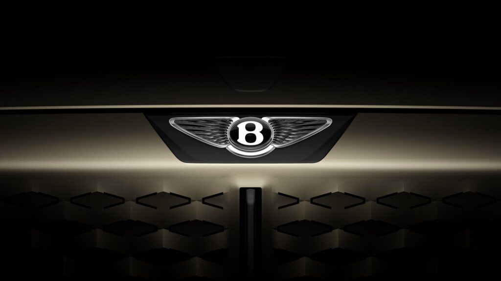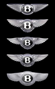
When a brand as storied as Bentley decides to update its logo, it signals more than a mere aesthetic adjustment; it marks a philosophical shift, an evolution of its identity, and a roadmap for the future. In 2025, Bentley revealed a simplified version of its iconic Winged B emblem, only the fourth rebrand in its more than 100-year history.
This new emblem is the first glimpse into what the marque calls “a new era of Bentley design language.” Set to debut on a concept car unveiled next week, this redesigned logo is both a nod to the brand’s rich heritage and a bold step into its future.
A Century of the Winged B
The Winged B has been synonymous with Bentley since the company’s founding in 1919 by W.O. Bentley. Originally conceived as a symbol of speed, haute, and engineering excellence, the emblem quickly established itself among the most recognizable automotive marks in the world.
The earliest versions of the Winged B were ornate and detailed, reflecting the elaborate craftsmanship that defined early 20th-century haute vehicles. As the decades passed, the logo underwent a few refinements — in 1931 following Bentley’s acquisition by Rolls-Royce, in the 1990s during its modernization phase, and in 2002 to reflect the brand’s rebirth under Volkswagen Group ownership.
Yet through each change, the core elements remained constant: the bold, upright B flanked by stylized wings, a symbol of both grace and raw power.
Robin Page’s Vision: Simplicity as a Statement
Under the guidance of director of design Robin Page, Bentley’s latest update strips back the ornamentation in favor of a cleaner, more streamlined look. Page, known for his minimalist yet emotive design language at Volvo and now Bentley, approached the emblem as more than a badge. For him, it is a vessel of brand values and an emblematic introduction to Bentley’s next century.
The new Winged B is noticeably flatter and more graphic, replacing traditional three-dimensional shading with crisp lines and uniform proportions. The wings are more abstract, evoking motion and flight without relying on intricate feather detailing. The B remains strong and dignified, but it now feels more approachable, signaling Bentley’s desire to reach new audiences and resonate with contemporary sensibilities.
A New Era of Design Language
According to Bentley, the redesigned emblem is not just a logo update — it is a visual manifesto for the future. The upcoming concept car, which will be the first to wear this new badge, embodies a “new era of Bentley design language” that prioritizes modern luxury, sustainability, and digital integration.
The streamlined logo reflects these priorities. In an age where clarity and recognizability across digital platforms are crucial, the new Winged B performs beautifully. On a car bonnet, a digital display, or a mobile screen, it remains instantly recognizable and elegant.
Page has described the design process as an exercise in “progressive reduction” — each line and curve evaluated for necessity and emotional impact. This mirrors a broader movement in opulent design, where minimalism and storytelling are replacing traditional markers of opulence.
Symbolism: From Wings to Wingspan
The original Winged B was conceived during a time when speed itself was an aspiration. In the roaring 1920s, Bentley’s Le Mans victories and record-setting runs demanded a badge that evoked dynamism and aeronautical inspiration.
In this new iteration, the simplified wings extend more horizontally, suggesting a broader wingspan and conveying a sense of effortless glide rather than aggressive propulsion. This subtle shift hints at Bentley’s future trajectory: moving from pure mechanical power to a blend of sustainable performance and refined, quiet haute.
Digital Age Adaptation
One of the most critical reasons behind the rebrand is the shift to digital interfaces. In the early 20th century, a car badge was primarily a physical object: a sculpted metal ornament mounted proudly on a grille. Today, a brand’s logo lives across an entire ecosystem — from illuminated grilles to smartphone apps, from augmented reality interfaces to social media profiles.
The new Winged B is designed to be adaptable without losing impression. It works as a physical sculpture on the front of a Mulliner-crafted bespoke model and as a sleek, two-dimensional icon on an app loading screen. This versatility is central to Bentley’s mission of integrating traditional craftsmanship with futuristic experiences.
The Influence of Electric and Autonomous Futures
Bentley has openly declared its plans to become a fully electric haute carmaker by 2030, a transformative pledge that fundamentally reshapes its identity. The new logo quietly acknowledges this shift. Its flatter, more simplified design echoes the aesthetics of electric vehicles and digital-native brands, suggesting cleanliness, forward-thinking, and environmental mindfulness.
Moreover, as vehicles become increasingly autonomous, brand elements must communicate even when the driver is no longer the primary interface. The emblem must become a beacon of trust and sophistication that remains visible and emotive even when human interaction fades into the background.
Heritage Without Nostalgia
Perhaps the greatest challenge Bentley faced was balancing modernity with respect for heritage. Automotive brands often become custodians of nostalgia, and changes to iconic logos can provoke passionate reactions.
Bentley’s approach, however, feels respectful rather than revisionist. The core essence of the Winged B is intact — it remains a symbol of motion, elegance, and performance. But by stripping away unnecessary flourishes, the new design allows these qualities to shine even more clearly. It is not an erasure of history but an evolution of it.
Comparisons: Bentley Among Its Peers
In recent years, several luxury automotive brands have reimagined their logos for the digital age. BMW flattened its iconic roundel in 2020, removing the black ring and opting for a transparent version that emphasized openness. Volkswagen followed a similar path, simplifying its classic VW badge for greater legibility and digital friendliness.
Bentley’s new Winged B sits comfortably among these transformations. But while other brands have leaned toward geometric or even slightly playful interpretations, Bentley’s design maintains a sense of regal gravitas. It conveys a quiet confidence rather than shouting for attention.
Consumer Reactions and the Power of Symbolism
Initial reactions to Bentley’s rebrand have ranged from enthusiastic acclaim to cautious skepticism. Loyalists often see the old logo as an unchanging symbol of British craftsmanship and automotive excellence. However, younger audiences — the very demographic Bentley hopes to capture with its electric future — have responded positively to the cleaner aesthetic and its modern appeal.
Symbols matter. In an era of increasingly fragmented brand loyalty, emblems act as shorthand for heritage, quality, and aspiration. By refreshing its most recognizable symbol, Bentley is essentially reintroducing itself to the world, inviting both long-time enthusiasts and new admirers to rediscover what it stands for.
A Sneak Peek at the Concept Car
Though full details of Bentley’s upcoming concept car remain under wraps, insiders suggest it will embody the brand’s shift toward electrification and sustainablity. Expect a vehicle that fuses traditional hand-finished materials with cutting-edge technology, embodying the spirit of the new Winged B.
This concept car will not merely display the new badge; it will bring its philosophy to life, illustrating how Bentley’s past can inform a more conscious, forward-thinking future. From quiet electric propulsion to an interior designed around digital serenity rather than analog opulence, the car will likely set the tone for the next generation of Bentley vehicles.
The Future of Bentley: Beyond Metal and Mechanics
In some ways, the logo is just the beginning. Bentley’s broader brand vision extends beyond metal and mechanics, positioning itself as a purveyor of experiences rather than mere machines. This could include immersive digital services, personalized luxury travel experiences, and partnerships that redefine what automotive luxury can mean in the 21st century.
The new Winged B, then, is less about a single product and more about a holistic shift in brand philosophy. It suggests a future where Bentley’s craftsmanship continues, but under new priorities: sustainability, digital elegance, and broader inclusivity.
A Winged B for a New Century
In updating its iconic Winged B emblem, Bentley has not only refreshed its visual identity but signaled its intention to evolve gracefully into a future shaped by sustainability, technology, and changing luxury paradigms.
This is not a brand running from its past but one building on it — respecting over a century of excellence while preparing for the challenges and possibilities of the next hundred years.
As the new Winged B prepares to make its debut on Bentley’s upcoming concept car, it invites all of us to consider the balance between heritage and innovation, tradition and transformation. In doing so, Bentley offers a masterclass in how legacy brands can remain vital, relevant, and inspiring in a rapidly changing world.

