Brooklyn Museum’s New Visual Identity: Design, Legacy, and Modernity
September 9, 2024
2 years ago
In an era where branding and identity are as critical to cultural institutions as they are to corporations, the Brooklyn Museum’s unveiling of a new visual identity marks a significant step in its ongoing evolution. The introduction of a fresh logo, color palette, and typography doesn’t just signify aesthetic change; it represents the museum’s efforts to modernize while honoring its rich history and its role within both the global art world and the local Brooklyn community. As one of New York City’s most cherished cultural institutions, this rebranding project is more than a cosmetic update—it reflects a deeper dialogue between past, present, and future.
The New Logo: Honoring the Past, Embracing the Future
At the heart of any visual identity is the logo, and the Brooklyn Museum’s new design is a study in thoughtful symbolism. The museum’s decision to incorporate the gray hues of its iconic limestone building not only acknowledges the institution’s physical presence but also roots the identity in the very fabric of its architecture. The Brooklyn Museum’s building, with its grand Beaux-Arts facade, is one of the most recognizable structures in the borough, and the logo’s gray tones are a nod to the museum’s permanence and stature within Brooklyn’s cultural history.
Yet, the logo doesn’t remain tethered solely to the past. The introduction of brighter, vibrant colors speaks to Brooklyn’s energy and diversity—a reflection of the borough’s dynamic population and the museum’s commitment to inclusivity. This balance between historic reverence and contemporary vibrancy is critical to the logo’s success. It recognizes the museum’s longstanding role as a cultural cornerstone while signaling its openness to new ideas, artists, and communities.
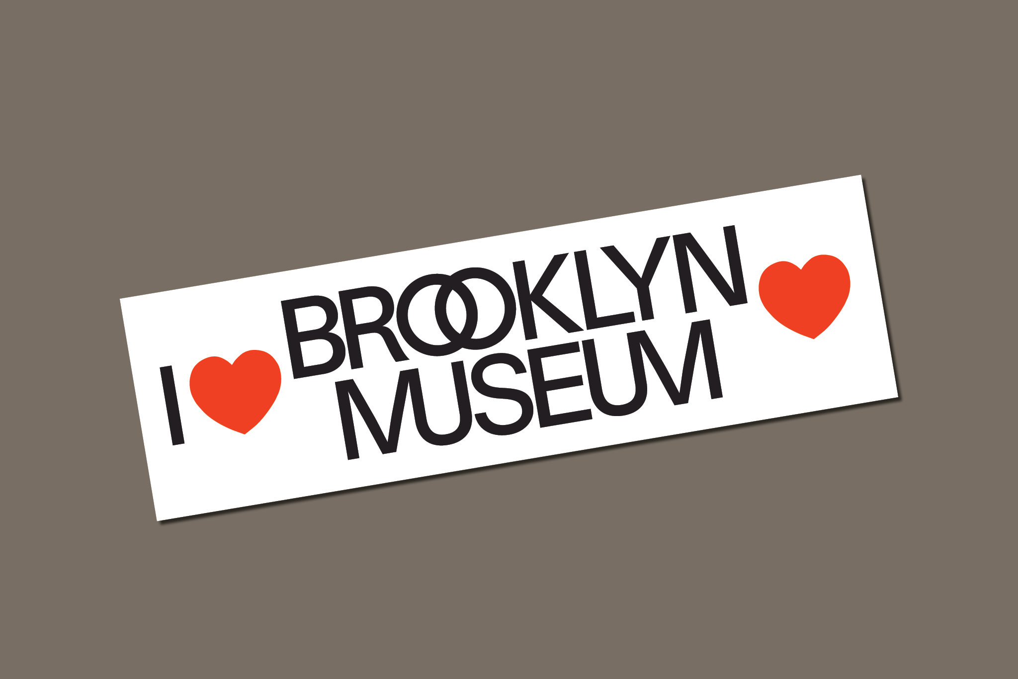
Perhaps the most interesting visual feature of the new logo is the interplay of the letters within the word “Museum.” The intertwining of M’s and U’s subtly evokes a sense of connection and flow, a visual metaphor for the museum’s role as a bridge between different artistic disciplines, histories, and perspectives. The museum is not just a space where art is displayed—it is a meeting point for cultures, ideas, and dialogues. The double O’s in “Brooklyn” further enhance this message. These circles, echoing the dots on the museum’s facade, bring in a deeper layer of symbolism tied to ancient philosophers, playwrights, and poets—figures who were instrumental in shaping the intellectual and cultural history that informs so much of the museum’s mission today.
This subtle allusion to ancient thought, combined with the modern design sensibility, speaks to the Brooklyn Museum’s unique position: it is at once a guardian of the past and an incubator for contemporary expression. The reference to historical figures on the building’s exterior is given new life in the logo, reminding visitors that the museum is a space where old ideas meet new forms of creativity.
Color Palette: A Bold Blend of Tradition and Modernity
The Brooklyn Museum’s decision to blend the muted grays of its building with brighter, more playful hues is an inspired one. The gray tones, as mentioned, anchor the museum’s identity in its physical and architectural history, but the introduction of vibrant colors adds a distinctly Brooklyn flavor—bold, diverse, and unapologetically contemporary.
Brooklyn is known for its creative energy, its multicultural vibrancy, and its role as a hub for innovation in the arts. The new color palette reflects this identity, bringing in a sense of playfulness and inclusivity that aligns with the museum’s mission to engage a broad and diverse audience. These colors are more than just decorative; they carry with them connotations of accessibility, creativity, and openness. By using this mix of colors, the museum is making a statement that it is a living, evolving institution, one that is attuned to the energy of its community.
The colors also play into the museum’s commitment to intersectionality in the arts. Just as Brooklyn itself is a melting pot of cultures and perspectives, so too is the museum a space where different artistic voices—across cultures, mediums, and disciplines—come together. The vibrant palette reflects this plurality, offering a visual representation of the museum’s dedication to celebrating a wide range of artistic expressions.
Typography: Balancing Boldness with Elegance
Typography is often an overlooked aspect of design, yet it plays a crucial role in conveying the tone and personality of a brand. In the case of the Brooklyn Museum’s new visual identity, the typography strikes a delicate balance between boldness and elegance. The typeface is modern and clean, with strong lines that convey confidence and clarity. At the same time, it is approachable, reflecting the museum’s desire to be a space for everyone—not just the art world elite.
The choice of typography also complements the logo’s design. The clean, contemporary typeface works in harmony with the intertwined letters and circles, reinforcing the idea of connectivity and flow. The typography is legible and straightforward, but it also carries a sense of sophistication that aligns with the museum’s status as a major cultural institution. In this way, the typeface helps to communicate the duality of the museum’s identity: it is both a place of serious artistic inquiry and a welcoming space for visitors of all backgrounds.
A Global Institution with Local Roots
One of the most compelling aspects of the Brooklyn Museum’s new visual identity is how it captures the institution’s unique position within the art world. As one of New York City’s major museums, the Brooklyn Museum is a global player, attracting visitors and artists from around the world. However, it is also deeply rooted in the local community, and its new visual identity reflects this duality.
The museum’s homage to its beginnings as a library is a particularly significant element of the new identity. Libraries, like museums, are spaces for knowledge, exploration, and discovery, and by referencing its origins, the Brooklyn Museum reminds us of its commitment to education and intellectual engagement. The museum’s mission is not only to showcase art but to foster a deeper understanding of the world through the lens of creativity and culture.
At the same time, the museum’s commitment to intersectionality in the arts is reflected in its new identity. The Brooklyn Museum has long championed diverse voices, from contemporary artists of color to women and LGBTQ+ artists whose work has historically been marginalized. The new identity reinforces this commitment, positioning the museum as a forward-thinking institution that is engaged with the social and political issues of our time.
A Fresh Look for a Timeless Institution
The Brooklyn Museum’s new visual identity is a testament to the power of design in shaping how we perceive cultural institutions. Through its carefully considered logo, color palette, and typography, the museum has successfully created a brand that honors its history while embracing the future. The new identity speaks to the museum’s role as a global institution with local roots, a space where art, culture, and history converge in ways that are both innovative and accessible.
By blending tradition with modernity, the Brooklyn Museum’s new visual identity is more than just an aesthetic update—it is a reflection of the museum’s evolving mission and its commitment to inspiring and engaging visitors for generations to come. As the institution moves forward, this fresh look will undoubtedly play a key role in shaping how the museum continues to connect with its audience and contribute to the cultural landscape of both Brooklyn and the world.