CDG: The Gateway to Rei Kawakubo’s World Through Outerwear and Typography
April 11, 2026
13 hours ago
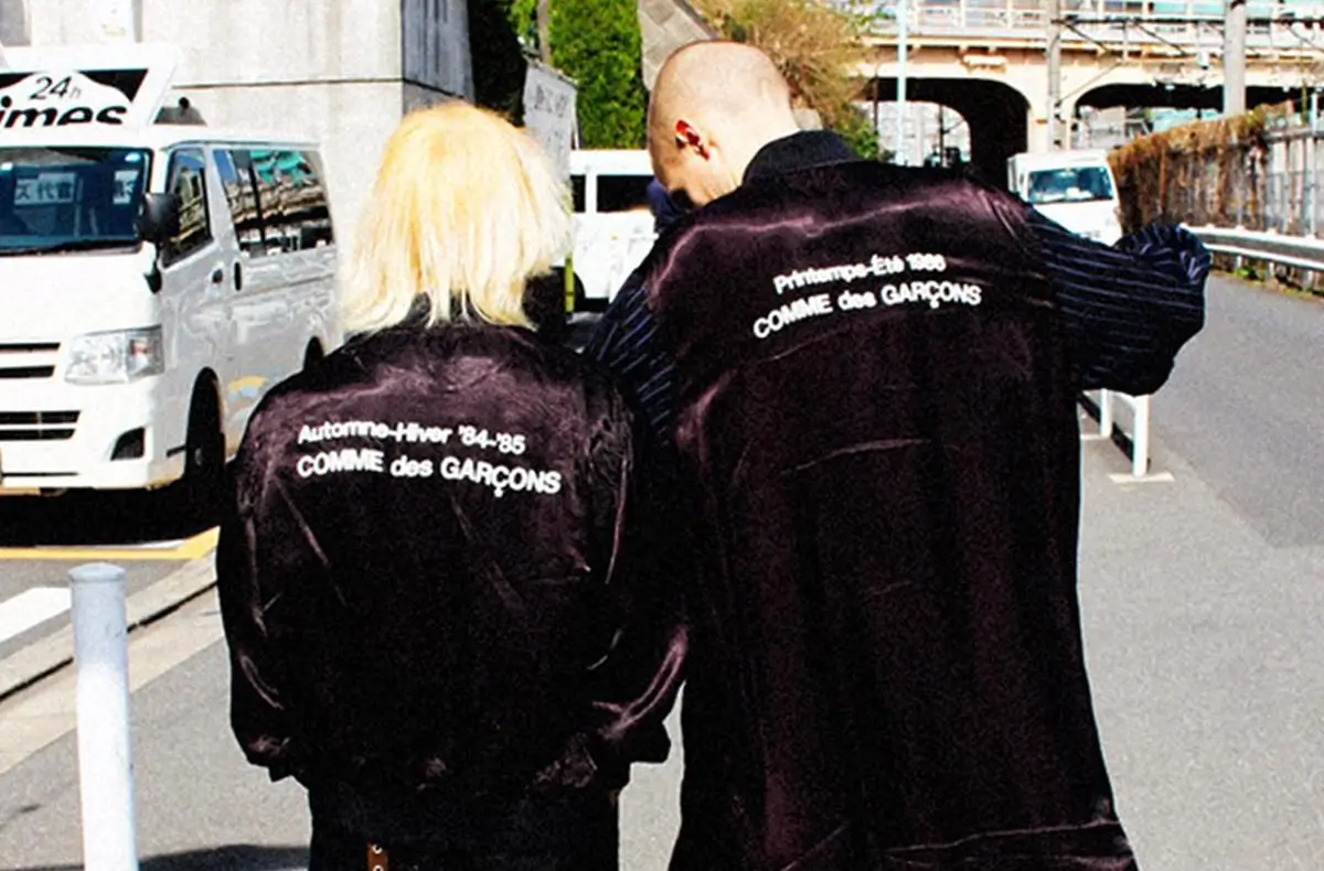
There is a reason Comme des Garçons often reads less like a fashion brand and more like a closed language system. From the beginning, Rei Kawakubo positioned clothing not as product, but as proposition—something to question, destabilize, and reassemble rather than refine. The result is a body of work that resists casual entry. It asks something from the viewer before it gives anything back.
For decades, this distance has been part of the appeal. Comme des Garçons is not meant to be easily worn, nor easily understood. Its silhouettes distort, its fabrics interrupt, its collections operate through absence as much as presence. The wearer does not simply put on a garment—they negotiate with it.
So when CDG was introduced in 2018, the expectation might have been dilution. A simplification. A concession to scale.
That is not what happened.
CDG did not simplify Kawakubo’s ideas. It rerouted them.
View this post on Instagram
idea
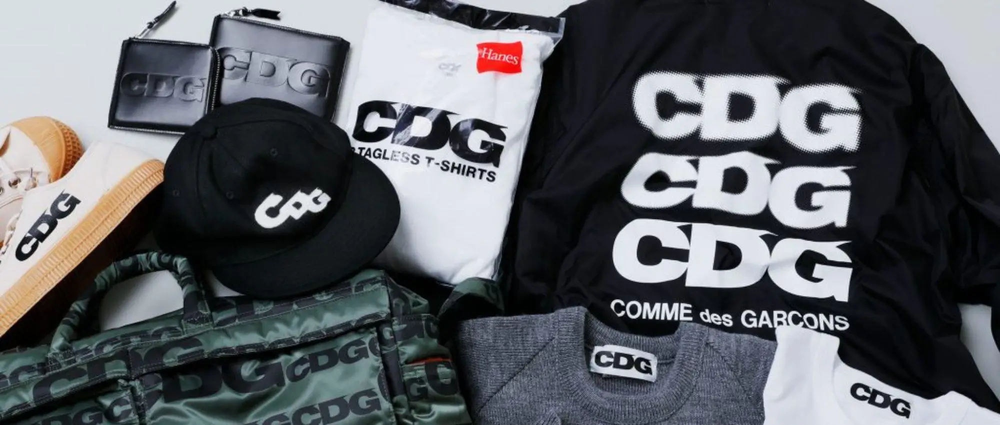
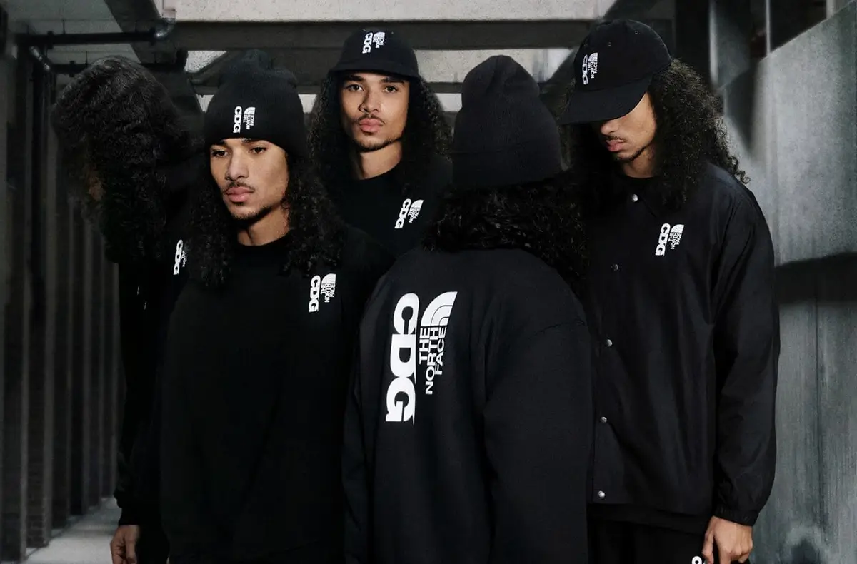
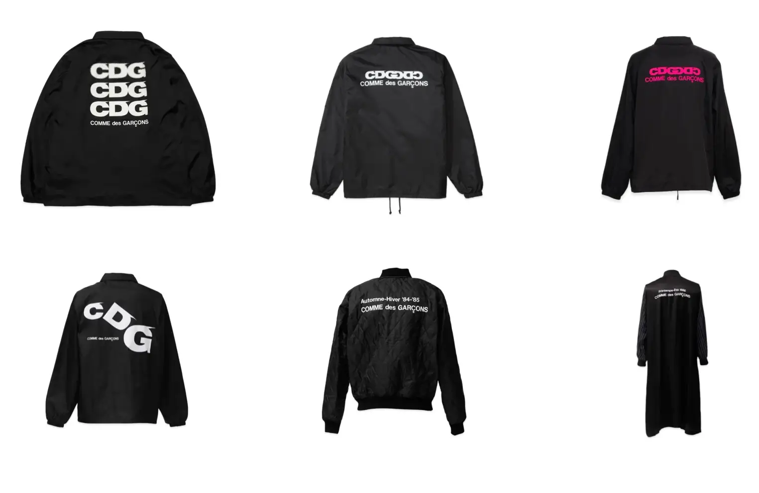
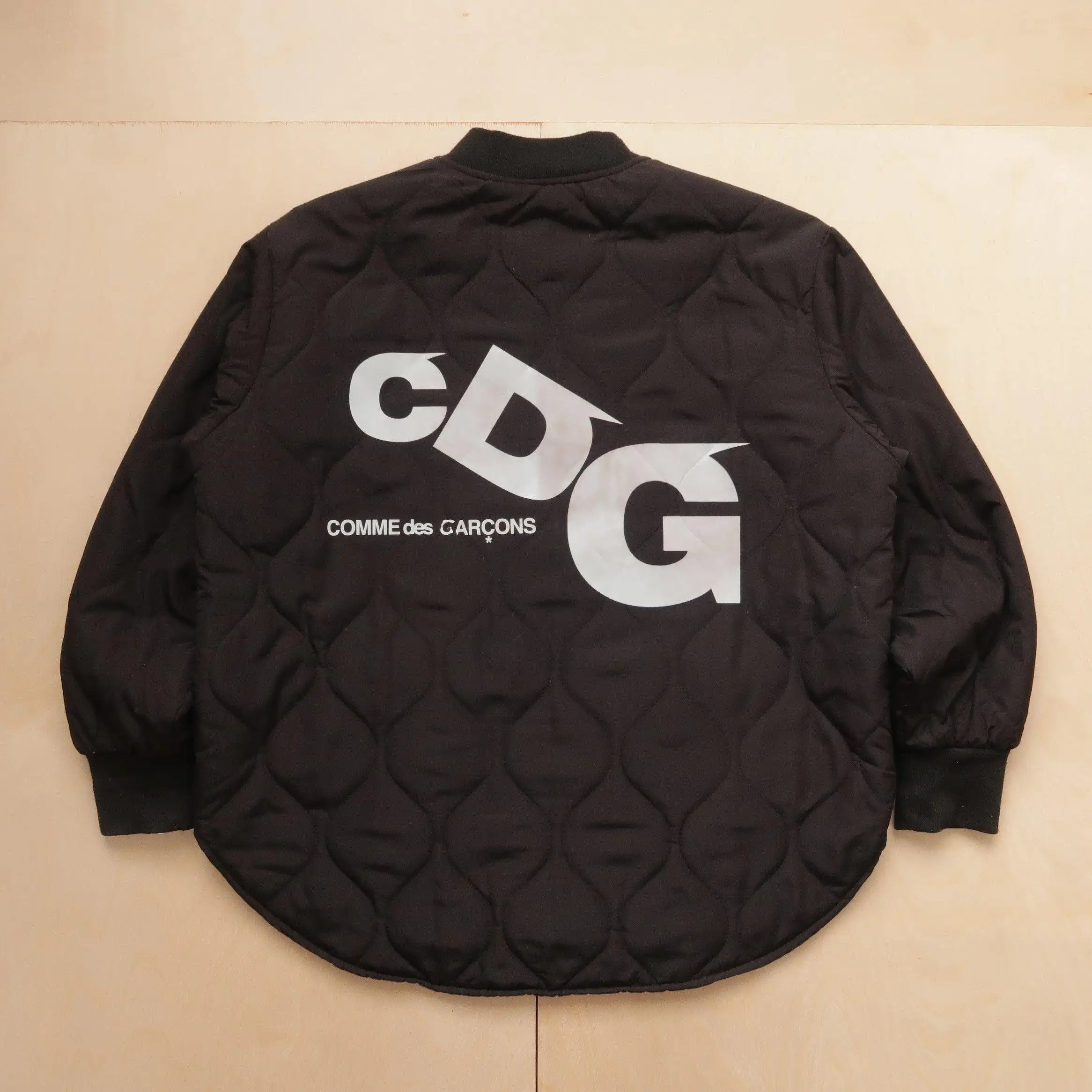
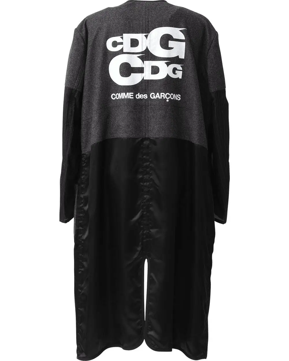
The mainline Comme des Garçons collections operate across multiple axes at once: construction, proportion, material, concept, staging. CDG removes most of those variables and condenses the brand’s identity into one dominant element—typography.
Three letters: C, D, G.
Repeated, enlarged, fragmented, repositioned.
What emerges is not branding in the commercial sense, but a system of visual rhythm. The logo is not there to be recognized; it is there to be experienced. Its scale disrupts proportion. Its repetition creates cadence. Its placement shifts the balance of the garment.
Typography becomes structure.
In this way, CDG maintains the conceptual integrity of Kawakubo’s work while removing the need for complex construction. The intellectual weight remains, but it is redistributed across the surface.
This is why CDG feels immediate. It communicates before it explains.
flow
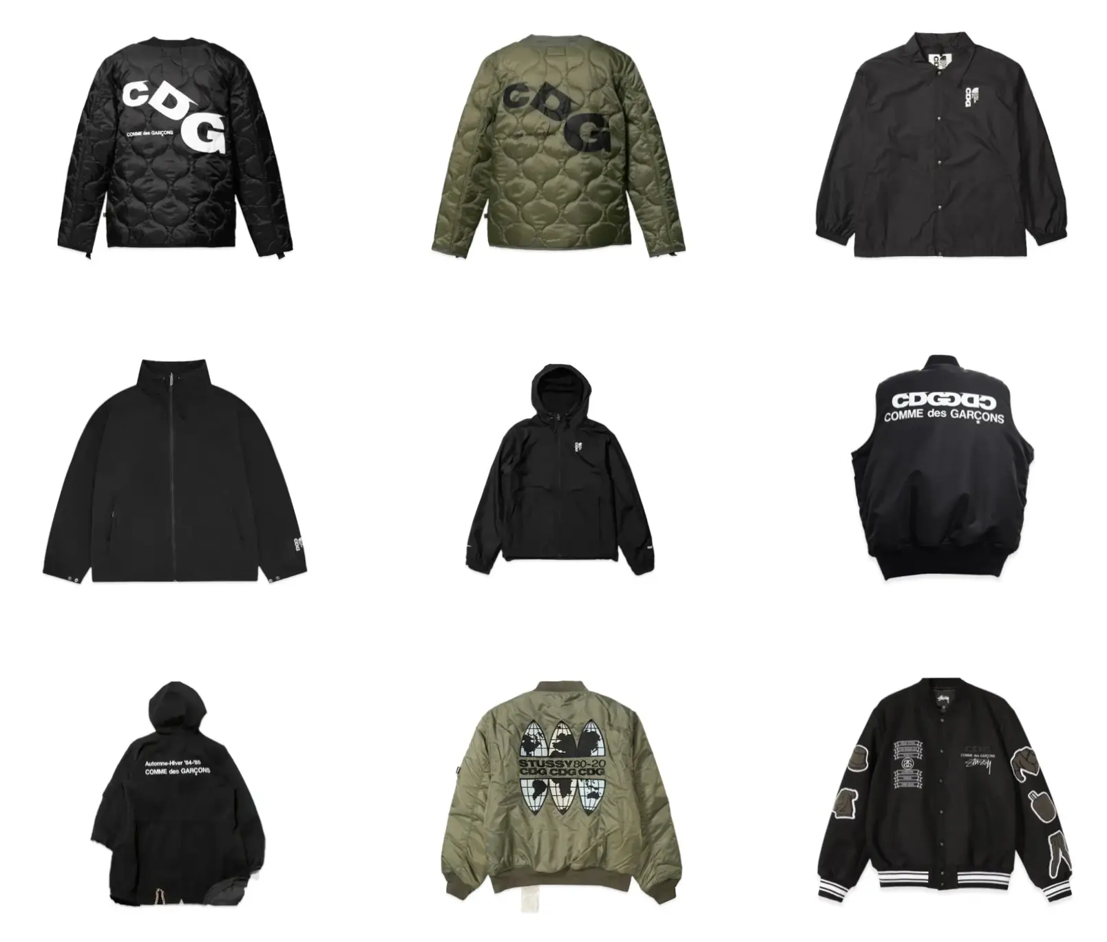
If CDG is a system of compression, outerwear is its most effective interface.
Jackets, coats, and hooded forms exist at the boundary between the individual and the environment. They are the first layer seen, the last layer removed. They operate publicly.
CDG uses this position strategically. By placing its most legible elements—logo, contrast, scale—on outerwear, it ensures that the brand’s identity is always visible, always active.
But more importantly, outerwear allows CDG to engage with familiarity.
A coach jacket is already understood. A hoodie requires no explanation. A bomber carries cultural memory. By working within these established forms, CDG creates a stable base from which its more abstract elements can operate.
The wearer does not need to learn a new silhouette. They only need to register a shift in meaning.
jacket
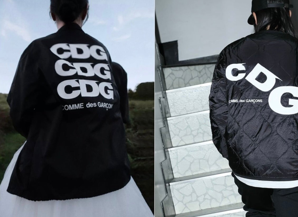
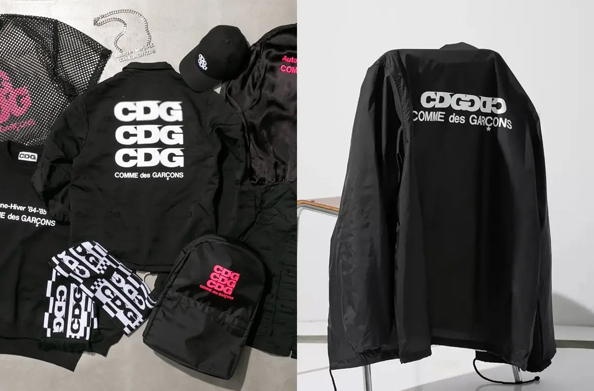
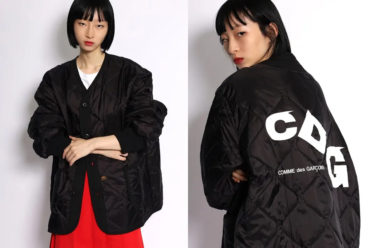
Among all CDG outerwear, the coach jacket stands as the clearest articulation of the line’s intent.
Its origins are practical—lightweight nylon, snap closures, elastic cuffs. It belongs to a lineage of American sportswear defined by utility and ease. There is nothing inherently conceptual about it.
CDG changes that through scale.
The logo, often placed across the back, expands beyond decoration. It becomes the defining feature of the garment, turning the wearer into a moving field of typography. The back is no longer a passive surface; it is an active plane of communication.
What is striking is how little else changes. The silhouette remains intact. The materials remain functional. There is no attempt to reengineer the form.
All transformation occurs at the level of surface.
This restraint is what gives the coach jacket its power. It demonstrates that a single intervention—if applied with precision—can alter the entire reading of a garment.
For many, this is where the CDG journey begins.
a hoodie
If the coach jacket projects outward, the hoodie pulls inward.
It is a garment associated with comfort, anonymity, and routine. CDG disrupts this familiarity not through form, but through repetition.
The logo appears once, then again, then again—stacked, aligned, multiplied. The effect is less about emphasis and more about rhythm. The eye does not settle on a single point; it moves across the surface, following the pattern.
This movement creates a different kind of engagement. The wearer becomes aware of the garment not as a static object, but as something that unfolds visually over time.
Material plays a role here as well. The softness of cotton, the weight of fleece, the tactile immediacy of the hoodie all contrast with the abstract nature of the typography. The body feels one thing, the eye registers another.
This duality—comfort versus concept—is central to CDG.
It allows the garment to function on multiple levels simultaneously.
stir
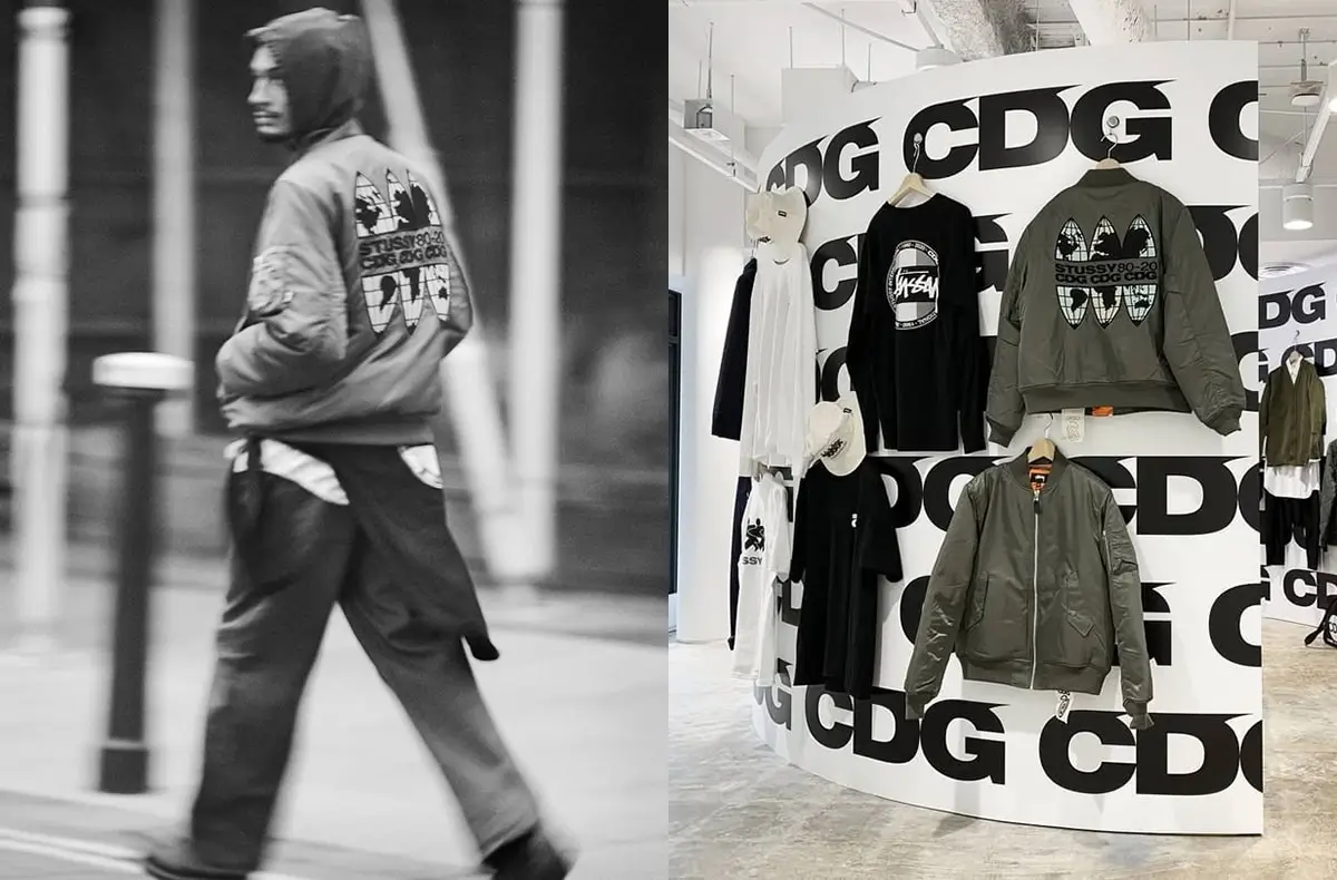
The bomber jacket introduces a shift in emphasis.
Where the coach jacket and hoodie rely heavily on graphic intervention, the bomber often reduces it. Logos shrink. Placement becomes secondary. In some cases, branding is nearly absent.
What remains is form.
The bomber’s volume—its rounded shoulders, its cropped waist, its inherent bulk—creates a silhouette that carries its own weight. CDG recognizes this and steps back, allowing the structure to speak.
This restraint is not a departure from the line’s philosophy; it is an extension of it. Kawakubo’s work has always involved knowing when to remove as much as when to add.
In the bomber, CDG demonstrates that identity does not always require declaration. It can exist in proportion, in balance, in the way a garment occupies space.
For those moving deeper into the Comme des Garçons universe, this is a critical shift. It signals a transition from surface-driven engagement to form-based understanding.
overcoat
Here, the language of the line approaches silence. Logos, if present, are minimal—small, precise, almost hidden. The emphasis shifts almost entirely to silhouette and proportion.
The overcoat aligns more closely with traditional tailoring, but never fully conforms. There is always a slight deviation—a shoulder that sits differently, a length that feels just off, a proportion that resists full normalization.
This is where CDG comes closest to the mainline ethos of Comme des Garçons.
Not through overt experimentation, but through subtle destabilization.
The overcoat does not announce itself. It reveals itself slowly, through wear, through movement, through the accumulation of small differences.
It is not the obvious entry point. But for those attuned to nuance, it may be the most meaningful.
accessibile
It is easy to frame CDG as “entry-level” Comme des Garçons. The term is convenient, but incomplete.
Entry suggests hierarchy. It implies that CDG sits below the mainline, offering a simplified version for a broader audience.
What CDG actually offers is lateral access.
It does not reduce Kawakubo’s ideas; it relocates them. Instead of operating through construction, it operates through surface. Instead of challenging the body directly, it engages the eye first.
This distinction matters because it preserves the integrity of the original vision.
CDG is not a compromise. It is a different expression.
inclus
One of the most significant shifts CDG introduces is the inversion of understanding and participation.
Traditional avant-garde fashion often requires a level of intellectual engagement before it can be worn. The viewer must first interpret, then decide.
CDG removes that barrier.
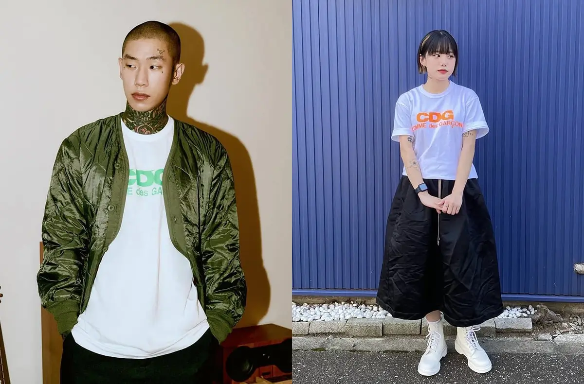
You can wear a CDG hoodie without knowing anything about Kawakubo. You can buy a coach jacket because it looks right, because it fits into your existing wardrobe, because it feels immediate.
And yet, over time, something changes.
The repetition of the logo, the precision of placement, the subtle shifts in proportion begin to register. The wearer starts to notice patterns, to question choices, to engage more deeply with what they are wearing.
Participation leads to understanding.
Not the other way around.
mundane
In the broader context of contemporary fashion, CDG occupies a specific position.
It sits within the space often labeled “streetwear,” but resists many of its conventions. There are logos, yes—but they do not function as status markers in the traditional sense. There is accessibility—but it is not driven by trend cycles.
Instead, CDG operates with a kind of internal consistency. Its visual language remains stable even as collections shift. Its focus on typography creates continuity across seasons.
This stability is what allows it to function as a gateway.
In a landscape defined by rapid change, CDG offers a fixed point—something that can be returned to, reinterpreted, and worn across contexts.
sum
In the end, CDG succeeds because it does not attempt to resolve the tension at the heart of Comme des Garçons.
It does not make the brand easier. It makes it reachable.
There is a difference.
To step into CDG is to step into a space where meaning is present, but not fully defined. Where garments communicate, but do not explain. Where the wearer is invited to engage, but not instructed on how to do so.
This is the essence of Kawakubo’s work.
Not clarity, but possibility.
CDG holds that possibility at the threshold—compressed, legible, and ready to be worn.
And for many, that is enough to begin.