Review: Chupa Chups Tests Your Patience With the Impossible Wrapper Before Launching a Simpler One
March 8, 2026
For decades, the brightly wrapped lollipops of Chupa Chups have been instantly recognizable across the world. Their cheerful colors, distinctive stick design, and famous daisy-shaped logo—famously created by Salvador Dalí—turned the candy into a pop-culture staple rather than just another sweet. Now the Spanish confectionery brand has launched a new campaign that revisits one of the most familiar moments in the Chupa Chups experience: opening the wrapper.
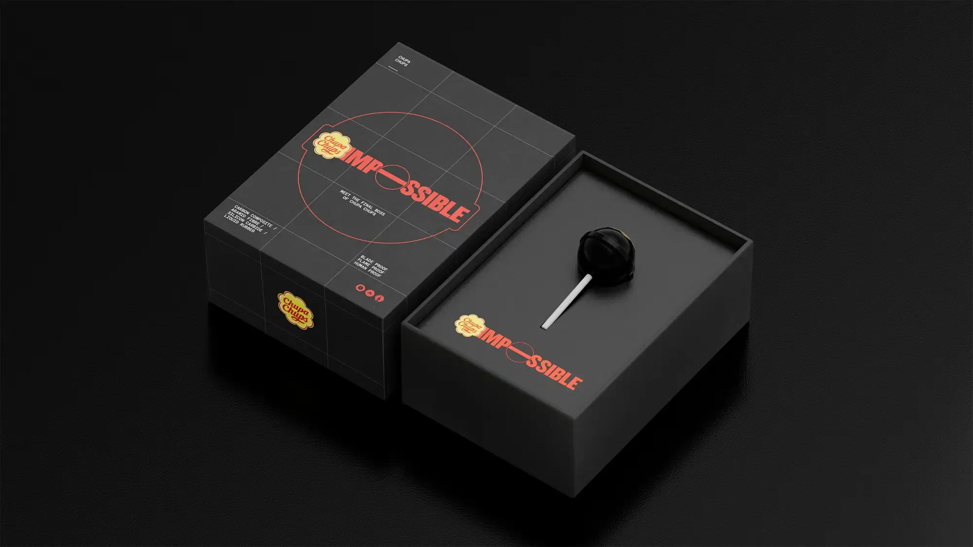
Instead of simply announcing a practical packaging update, the company introduced the idea with humor. Before consumers get access to the newly improved, easier-to-open wrapper, they are invited to battle what the brand calls the “Chupa Chups Impossible.” Designed as a deliberately frustrating piece of packaging, it functions like the final boss of candy wrappers.
The campaign cleverly dramatizes the everyday struggle of opening tightly twisted wrappers while turning a minor packaging redesign into a playful narrative.
stir
Most people have experienced the tiny challenge of opening a tightly wrapped lollipop. The plastic can cling to the candy, the twist around the stick can tighten rather than loosen, and sometimes the wrapper tears unevenly. These moments are rarely serious problems, but they are familiar enough to be universally understood.
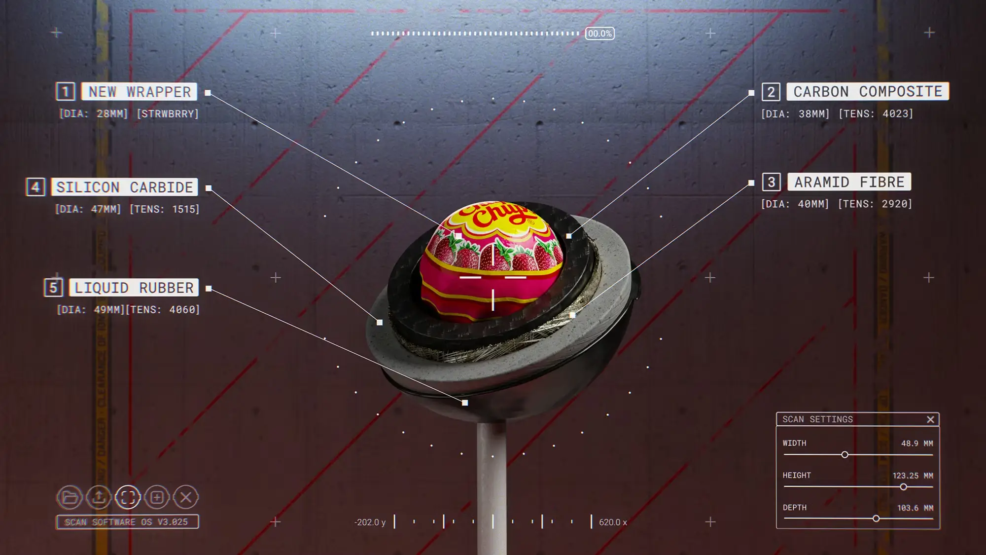
Chupa Chups took that shared frustration and exaggerated it into a humorous concept. The “Impossible” wrapper is intentionally designed to be difficult to open, layering folds and twists in a way that feels almost puzzle-like.
In the language of gaming culture, this wrapper becomes the “final boss.” Players—or in this case, candy lovers—must defeat the challenge before reaching the reward.
That reward is the brand’s actual innovation: a new wrapper engineered to open far more easily.
By framing the packaging improvement as a playful challenge, Chupa Chups transforms a simple design change into a memorable story.
idea
Behind the humorous campaign lies real product development.
The new wrapper introduces subtle engineering adjustments intended to make opening the candy smoother and more intuitive. While traditional twist wrappers rely heavily on pulling and peeling, the redesigned packaging incorporates controlled tear points that allow the wrapper to separate more cleanly.
The material itself has also been refined. By modifying the plastic film used in the wrapper, the packaging releases more easily from the candy surface, preventing the sticking or tearing that sometimes occurs with conventional designs.
Importantly, the visual identity remains unchanged. The vibrant colors, playful graphics, and recognizable logo still define the appearance of Chupa Chups. What has changed is the tactile interaction—the moment when consumers unwrap the candy.
It is a reminder that even the smallest elements of product design can shape how people experience a brand.
the ha
Chupa Chups has always embraced a sense of coltishness. Since its founding in Spain in 1958, the company positioned its lollipop as more than just a sweet treat. The candy was originally designed so children could enjoy sugar without sticky hands, thanks to the stick holding the candy.
Over the years, that simple idea evolved into a brand identity built on fun, creativity, and bold visual culture.
The Impossible wrapper campaign continues that tradition by leaning into humor rather than avoiding frustration. Instead of pretending that wrappers have always been easy to open, the brand exaggerates the problem to absurd levels.
In doing so, Chupa Chups turns a small inconvenience into a joke that audiences can instantly relate to.
Self-aware humor like this resonates strongly in modern advertising. Audiences tend to engage more with brands that acknowledge everyday realities rather than presenting flawless corporate messaging.
culture
The campaign’s use of the “final boss” metaphor reflects the influence of gaming culture on contemporary marketing.
In video games, the final boss represents the ultimate challenge at the end of a level or story. Defeating it signals victory and completion. By borrowing this structure, Chupa Chups reframes opening a candy wrapper as a playful mini-quest.
This reference resonates particularly well with younger audiences who are fluent in gaming language. The metaphor is simple, humorous, and instantly recognizable.
It also lends itself perfectly to social media storytelling. Consumers attempting to open the Impossible wrapper can film their reactions, share their struggles, or celebrate their victory once the wrapper finally gives way.
In a digital environment driven by short, shareable moments, this kind of concept naturally invites participation.
xp
Packaging design often sits quietly in the background of product development. Yet it plays a powerful role in shaping consumer perception.
The texture of a wrapper, the sound it makes when opened, and the ease with which it reveals the product all contribute to the overall experience.
For Chupa Chups, the wrapper is particularly significant. The candy itself is simple: a small sphere of flavored sugar on a stick. Much of its personality comes from the colorful packaging that surrounds it.
By refining the wrapper while keeping its recognizable look intact, the brand balances innovation with familiarity.
Consumers still see the same iconic lollipop they know—but interacting with it becomes smoother and more satisfying.
leg
More than sixty years after its creation, Chupa Chups continues to evolve while maintaining its identity.
The brand’s longevity comes from a careful balance between tradition and reinvention. Its visual symbols remain consistent, but its marketing campaigns regularly experiment with contemporary ideas.
The Impossible wrapper campaign demonstrates how even a minor product update can become an opportunity for creative storytelling.
Instead of presenting the new wrapper as a technical improvement, the brand transforms it into a narrative of challenge and reward.
fin
This campaign delivers a simple message. After confronting the deliberately complicated Chupa Chups Impossible wrapper, the new packaging feels refreshingly easy, as the contrast makes the improvement more noticeable and memorable.
In the end, the experience reflects the essence of Chupa Chups itself: fun, colorful, and slightly mischievous. What could have been a quiet packaging redesign becomes a small adventure—one that begins with a stubborn wrapper and ends with a sweet victory.


No comments yet.