Color, Perception, and Control: Kenneth Noland’s Purkinje Effect and the Politics of Seeing
May 14, 2025
11 months ago
In the chromatic universe of 20th-century American abstraction, Kenneth Noland is often positioned as the quiet purist—a minimalist of maximum intention, a color-field painter whose canvases vibrated not with expressionist turmoil but with calibrated optical presence. Yet within this seemingly meditative territory, Noland probed some of the most essential questions about visual cognition, phenomenology, and art’s capacity to reshape our sense of reality.
One of his most curiously titled and intellectually layered works, Purkinje Effect, stands as a sophisticated inquiry into not only color and form, but the conditions under which we see.
The Painter and His Epoch
Kenneth Noland (1924–2010) emerged as a central figure in the Color Field movement that flourished in the 1950s and ’60s, alongside artists like Morris Louis, Helen Frankenthaler, and Jules Olitski. A student of Josef Albers at Black Mountain College, and briefly influenced by the theories of Paul Klee, Noland’s foundational education in modernist color theory would forever shape his artistic output. But unlike the gestural histrionics of Abstract Expressionism, Noland’s work abstained from overt emotion. Instead, his career became a meditation on restraint and a challenge to the very frame of the canvas. He dissolved the brushstroke into the surface itself, soaking pigment directly into raw, unprimed canvas, often relying on symmetrical motifs like targets, chevrons, and stripes to anchor the viewer’s gaze.
It was not just an aesthetic choice. At a time when America was asserting cultural dominance through its avant-garde, Noland’s work—deeply American in its formal clarity, forward momentum, and cool empiricism—offered a homegrown alternative to European art traditions. In this context, Purkinje Effect becomes a key, if cryptic, artifact—connecting physiological phenomena with postmodern perception and the shifting identity of postwar American art.
The Meaning of the Title
The “Purkinje Effect” refers to a well-documented optical phenomenon: in low-light conditions, human vision becomes more sensitive to blue and less sensitive to red, causing cooler colors to appear more vivid than warmer hues. This effect, named after Czech anatomist Jan Evangelista Purkyně, is rooted in the behavior of rod and cone cells in the human eye. While cones dominate color perception in bright light, rods—more sensitive to low light—skew the visual field toward blues and violets.
Noland’s decision to title a painting after such a phenomenon immediately signals a conceptual preoccupation with perception—not in a metaphorical or emotional register, but in a neurophysiological one. This was not uncommon in mid-century modernism, which often intersected with science and psychology, but Purkinje Effect suggests a particularly cerebral interrogation of how color behaves—and more importantly, how we behave when confronted with color.
The title invites the viewer to look twice, to question whether what is seen is actually present, or a condition of the environment, the lighting, or the eye itself. It subtly destabilizes the fixed nature of aesthetic “truth,” replacing it with contingency. This epistemological doubt—this tension between objectivity and sensation—is where the rigor of Noland’s practice quietly but forcefully asserts itself.
Acrylic and the Edge of Innovation
Technically, Noland’s use of acrylic paint—specifically, the early Magna acrylics developed by Leonard Bocour and used by Color Field painters—plays a crucial role in the optical precision of Purkinje Effect. Acrylic allowed for a smoother, more even application than oil, drying rapidly and soaking into raw canvas like dye into fabric. This created a seamlessness between form and ground, color and support.
In Purkinje Effect, the acrylic medium does more than provide vivid hues; it sets the stage for an atmospheric perception of color that mimics the effect described in the title. Viewers are often uncertain whether they are responding to the literal colors on the canvas, or to an internal adjustment their eyes are making. This optical ambiguity is precisely the point. Noland isn’t painting to replicate the Purkinje effect—he’s painting to evoke it, even under gallery lights.
Thus, the materiality of the medium becomes part of the phenomenological experiment. The use of acrylic is not incidental; it is inseparable from the experience of time and attention, the way viewers adjust their gaze and reframe their expectations in real-time. Noland’s canvas becomes less a picture and more an instrument of seeing.
Spatial Structure and Compositional Discipline
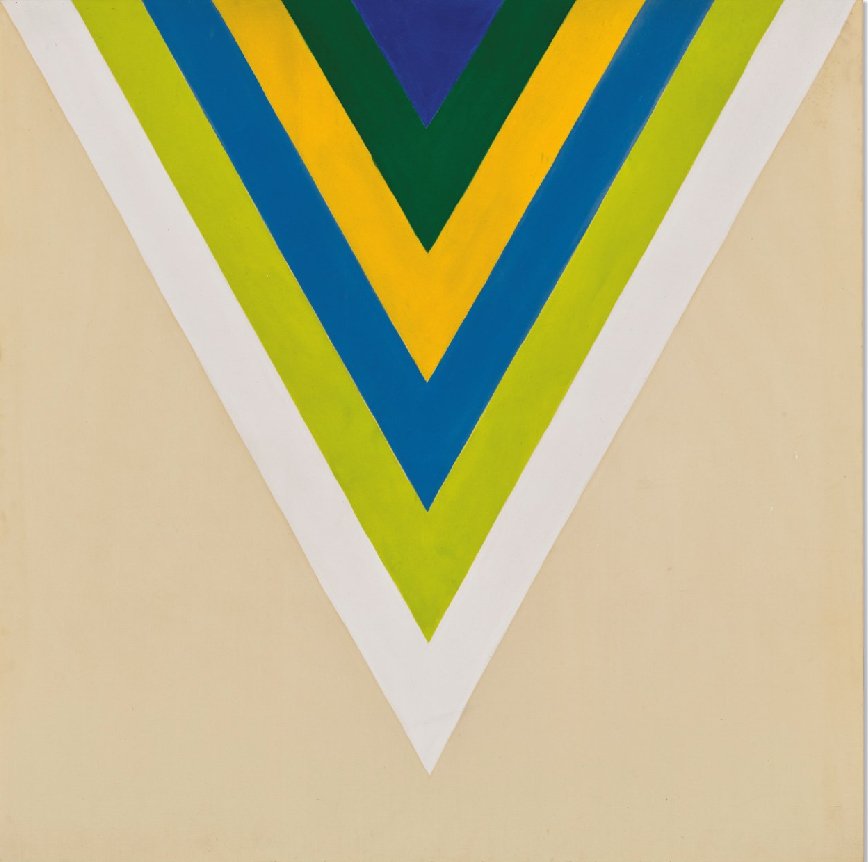
Like many of his contemporaries, Noland was fascinated by symmetry and structure. Purkinje Effect likely falls into one of his core compositional series—target, chevron, or stripe—each acting as a visual scaffold for chromatic inquiry. The geometry is never gratuitous; it serves as a disciplined framework for color to unfold with precision.
In the target series, concentric rings radiate from the center, creating both harmony and optical vibration. In chevrons, V-shaped bands funnel the eye inward or outward, mimicking movement or directional force. Stripes, on the other hand, create horizon-like fields that suggest expansion, temporality, or stasis.
Whichever schema Purkinje Effect adopts, the logic is consistent: form is not the subject, but the vehicle. The simplicity of the structure provides a neutral field against which color can resonate fully. Yet this neutrality is deceptive—it is as carefully tuned as the color relationships themselves. In the context of a painting named after a shift in visual sensitivity, the compositional framework becomes a test pattern, inviting the viewer to experience their own perceptual limits.
The Philosophical Stakes of Seeing
To understand Purkinje Effect is to engage with the postmodern condition of artmaking in the late 20th century. Where earlier painters sought to depict the world, and Abstract Expressionists sought to embody the self, Noland’s generation posed a more difficult question: What does it mean to see? In this regard, his work aligns more closely with philosophy than with autobiography.
Purkinje Effect stands as an index of a broader cultural turn—away from narrative and symbolism, and toward cognition, phenomenology, and process. In a sense, Noland’s work prefigures the discourse of conceptual art, but without abandoning visual pleasure. His canvases are deeply sensual—lush with saturation, radiant in hue—but they are also laboratories of looking. They ask not just what we see, but how we see, when we see, and under what conditions.
This is where Noland’s practice intersects with the politics of attention. In a society increasingly shaped by media saturation and visual overload, his paintings demand slowness. They cannot be consumed in passing or reduced to a photographic reproduction. They insist on the viewer’s presence—on time, light, and phenomenological awareness—as prerequisites for experience. In this way, Noland’s quiet aesthetic becomes a form of resistance: a demand for consciousness in a world of reflex.
Legacy and Influence
The intellectual rigor and optical clarity of Purkinje Effect remain influential in contemporary art practice. From James Turrell’s explorations of light and perception to the chromatic minimalism of Anne Truitt and Sarah Crowner, echoes of Noland’s legacy are widespread. But perhaps his most enduring impact lies not in his formal influence, but in his philosophical one.
At a time when much contemporary art flirts with irony, spectacle, or sociopolitical commentary, Noland’s work offers a reminder of a different kind of radicalism—one rooted in the sanctity of looking, the integrity of form, and the spirituality of attention. Purkinje Effect, in particular, illustrates how even the most stripped-down abstraction can open a portal to the complexity of human perception.
Final Reflections
In many ways, Purkinje Effect resists traditional art historical interpretation. It does not narrate, it does not dramatize, it does not depict. Instead, it stages an encounter—between color and cognition, surface and sensation. In doing so, it accomplishes what few works dare to: it makes the viewer the subject of the painting. Not in the egotistical sense, but in the epistemological one.
Kenneth Noland may have worked in the language of geometry and restraint, but his project was anything but cold. Purkinje Effect reveals the human eye not as a passive receptor, but as an active participant in the creation of visual meaning. The canvas is a foundation. The light is a variable. And perception, far from being fixed or objective, becomes a dynamic process—an unfolding drama of experience that each viewer must navigate on their own terms.
In a world increasingly defined by image manifesting and algorithmic perception, Noland’s meditation on the fragility and beauty of human vision feels more vital than ever.