Connie Costas: Bootleg Semiotics and the Rewiring of Corporate Streetwear
April 11, 2026
12 hours ago
Stockholm’s view discipline—pared-back, functional, and quietly precise—forms the underlying architecture for Connie Costas. The city’s fashion lang avoids excess, favoring clarity in silhouette and restraint in palette. Within that framework, Connie Costas introduces disruption not through form, but through surface. Logos become the intervention point. They appear familiar, almost corporate in their authority, yet subtly distorted. This slight deviation shifts the entire reading of the garment.
The brand does not oppose Scandinavian minimalism; it inhabits it. The tension emerges only upon closer inspection, when recognition begins to slip.
View this post on Instagram
frame
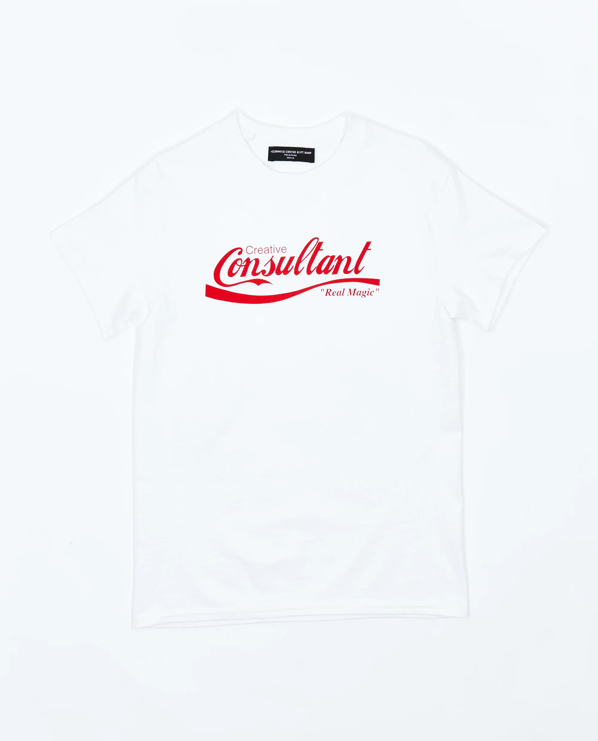
Bootleg culture has long existed as an informal counter-system—replicating, remixing, and redistributing view identities outside official channels. Connie Costas extracts the aesthetic language of that tradition and relocates it within a controlled design process.
These are not accidental distortions or low-fidelity reproductions. They are intentional misalignments. Typography is nearly correct. Spacing feels precise, but not exact. Logos echo something globally familiar without directly referencing it.
The result is a refined bootleg—less about imitation, more about observation. The garments do not copy; they comment.
idea
Corporate branding is built on repetition and consistency. It is engineered to be instantly recognizable, frictionless, and universal. Connie Costas treats this system as raw material.
By introducing minor disruptions—an altered letterform, an unfamiliar phrasing, a shift in proportion—the brand interrupts the seamlessness of corporate identity. What is normally absorbed without thought becomes view.
This is where the label’s tone settles: subtle, analytical, and slightly ironic. The humor is not performative. It exists in the moment of realization, when the viewer recognizes the deviation.
flow
The silhouettes remain intentionally neutral—hoodies, T-shirts, outerwear stripped of excess. This restraint directs attention to the graphic layer. The clothing becomes a surface for language rather than an exercise in construction.
There is a clarity to this approach. No exaggerated tailoring, no unnecessary detailing. The garment functions as an interface, eliciting the altered branding to carry the conceptual weight.
In this way, the wearer becomes part of the system—moving through public space as both participant and observer of view culture.
satiety