Deconstructing an Icon: How Nine Entertainment Company Rebuilt Its Identity Through Design
April 19, 2025
A New Era in Australian Media
In 2018, the merger between Nine Entertainment Co and Fairfax Media sent shockwaves through Australia’s media landscape. It wasn’t just a business move—it was the creation of a media juggernaut. The newly formed Nine would become home to an entire ecosystem of legacy and emerging platforms: television studios, national radio networks, digital publications, print journalism, and streaming services.
But behind the boardroom headlines was a quieter challenge: How do you bring together thousands of staff, dozens of brands, and generations of distinct cultural identities under a single roof—and make it feel like home?
For Nine, the answer was not only about architecture. It was about design thinking—specifically, the kind that extends beyond logos and slogans. The company enlisted Frost*collective, one of Australia’s most respected design studios, to create a graphic, wayfinding, and environmental signage system that would define the future of work inside Nine’s new headquarters. The result is a masterclass in how brand, space, and people can be united through visual intelligence.
The Brief: Unity Without Uniformity
The task ahead of Frost*collective wasn’t about slapping signage on walls. It was a cultural exercise, a strategic intervention into how people experience a space—how they feel in it, move through it, and connect within it.
The challenge was multilayered:
- Bring together employees from different legacy companies with long histories (and in some cases, rivalries).
- Represent a vast network of brands—from Channel Nine and The Sydney Morning Herald to 2GB radio and Stan streaming.
- Build pride and a sense of shared ownership within a brand-new headquarters, a place with no existing emotional resonance.
What Frost* saw was not a problem—it was an opportunity. An opportunity to design a living system that connected people not only to place, but to each other.
The Concept: Line and Dot
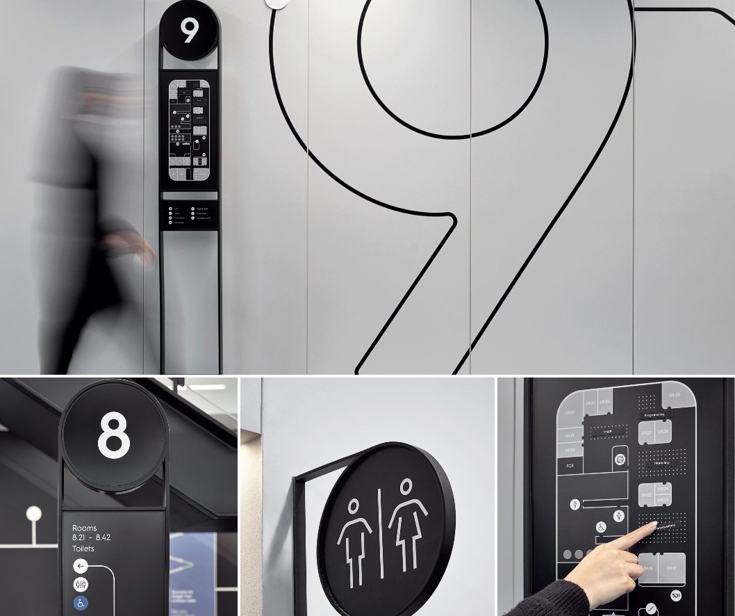
At the heart of the project was a simple yet powerful visual idea: deconstructing the iconic Nine logo.
Nine’s logo—a grid of nine dots—is one of the most recognized brand marks in Australia. Rather than layering this symbol over the workspace, Frost* took it apart. They reimagined the logo as a dynamic line and dot system, which would become the backbone of the environmental graphics and signage program.
This system offered both metaphor and utility:
- Metaphor: The lines represent journeys, transitions, and progress. The dots represent people, teams, or key moments.
- Utility: The motif could be stretched, scaled, rotated, repeated. It became everything from level identifiers to magnetic map tags to iconography.
The genius of this system lies in its modularity. It’s recognizable, flexible, and endlessly applicable—able to adapt to the demands of different zones, departments, and media formats without losing cohesion.
From Wayfinding to Brand-Building
In many workplaces, signage is a passive utility. In Nine’s new headquarters, it’s a brand experience.
Frost* used the line-and-dot device to inform, guide, and inspire. It appears at every major transition point in the building, from lifts and lobbies to hallways and breakout areas. But it never overwhelms the space. The typography is clean, the material palette considered. There’s restraint in the application, which allows the system to enhance the architecture rather than compete with it.
Some examples of this layered approach:
- Floor-to-ceiling level markers use vertical lines and dot markers, turning a simple number into a sculptural piece of information design.
- Magnetic wayfinding boards allow for real-time updates—teams change locations, and the signage moves with them.
- Pictograms based on the same geometric language help define bathrooms, meeting rooms, tech areas, and more.
It’s signage that works, but also speaks. And what it says is: This is one company, many voices, moving forward together.
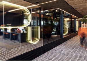
Environmental Graphics as Culture Code
Nine’s headquarters wasn’t just built to consolidate operations. It was built to redefine company culture.
Environmental graphics played a crucial role in making that shift real. Rather than rely solely on slogans or generic motivational quotes, Frost* helped Nine tell a story of legacy, innovation, and pride through space.
Heritage walls feature archived front pages, pivotal broadcasts, and groundbreaking moments. Meeting spaces named after industry milestones. Brand motifs embedded into corridors that remind staff: you’re not just in a building—you’re inside a living, evolving media institution.
According to Carlo Giannasca, Managing Director at Frost*collective:
“A set of graphic guidelines specifying sizes, materiality, and considerations for choosing imagery help the client achieve visual consistency and allow them to unroll a rich and inspiring tapestry of their accomplishments.”
In other words, design became a cultural operating system.
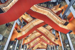
Seamless Integration with Architecture
Crucially, the graphics were never meant to sit on top of the architecture—they were designed to flow with it.
The interiors—refined, contemporary, and open—provided the ideal canvas. Frost* responded by creating a graphic language that felt invisible when you didn’t need it, and compelling when you did.
The line-and-dot language isn’t flashy. It’s quietly confident. It emerges subtly from polished concrete, etched into timber panels, or layered behind glass. It works equally well in editorial zones, executive suites, and broadcast studios.
Because of its minimalist structure, the system becomes iconic without being intrusive—a balancing act few graphics systems ever achieve.
Materiality and Tactility
Frost* didn’t stop at form and function. Materiality was just as important.
The signage and graphics use a carefully curated mix of materials:
- Brushed metal in high-traffic areas for durability and a sense of permanence.
- Acrylic and glass overlays that reflect the high-tech, transparent nature of digital media.
- Magnetized panels for updatable, living directories—flexible and future-proof.
Every material was selected not only for aesthetic value, but for its tactile resonance. Staff interact with these surfaces daily. They aren’t just looking at the brand—they’re touching it. That physical connection builds a sense of ownership and pride.
Digital and Physical Harmony
The beauty of Frost*collective’s system is that it bridges the digital and physical seamlessly.
Nine is a digital-first company, operating across online video, live streaming, podcasts, news websites, and mobile apps. The signage needed to speak that language—clean lines, grid systems, responsive behaviors.
But it also had to ground employees in a physical space. To feel real. Concrete. Tangible.
By taking inspiration from the digital realm (grids, icons, motion paths) and embedding those concepts in physical form, the design becomes a translation layer—connecting the virtual world Nine creates with the physical world its people inhabit.
The Result: A Workplace That Tells a Story
Step into Nine’s headquarters now, and you’ll notice something immediately: it feels like a place with a clear identity.
Employees navigate confidently through a large, complex building—guided by intuitive graphics and a shared design language.
They see themselves reflected in the space—not just as workers, but as contributors to a larger narrative.
That narrative is reinforced daily through the environmental design. Wayfinding becomes storytelling. Signage becomes memory-making. Floor numbers become icons.
And all of it stems from one deconstructed logo—line and dot—now rebuilt as a unifying system.
Impression
The Frost*collective collaboration with Nine Entertainment is a benchmark in modern workplace design. It demonstrates that:
- Brand and space can be seamlessly integrated when design is embedded early and strategically.
- Wayfinding isn’t just directional—it’s emotional, and it shapes how people feel about where they work.
- Minimalist design can be iconic, if the thinking behind it is rigorous and brave.
- Legacy and innovation are not opposites—they can be expressed in harmony through thoughtful visual systems.
In the end, Frost* didn’t just design a signage program. They helped design a new way for Australia’s largest media company to see itself.