Expressive by Design: Google’s Material 3 Update Unleashes Emotion, Color, and Creative Latitude
June 1, 2025
In a world increasingly shaped by sterile minimalism, Google has made a striking pivot with its latest iteration of design philosophy—Material 3 Expressive. Unveiled in May 2025, this fourth major evolution of Google’s Material Design system channels a newfound appetite for vibrant, playful interfaces. Gone are the days of rigid geometry and subdued palettes; in their place emerges an interface that breathes, emotes, and occasionally bursts with the energy of a graphic novel panel.
As Vanessa Cho, Vice President of Google Design, revealed in an interview with Dezeen, the update was shaped by the desires of users who craved not just functional clarity but “wild and way-too-playful” interactions. And this was not merely whimsy—it was substantiated by exhaustive user testing. In response, Google launched Material 3 Expressive as both a stylistic liberation and a strategic reframing of UI/UX, aligning itself with evolving design sensibilities that emphasize personality, accessibility, and human emotion.
From Order to Expression: The Material Design Journey
Material Design has always served as Google’s visual framework for digital coherence, offering developers a system of patterns, components, and motion principles. Initially introduced in 2014, the original Material Design emphasized tactile surfaces and realistic lighting, echoing physical materials like paper and ink. It evolved steadily, through Material Theming and Material You, each layering more options for customization and accessibility. But Material 3 Expressive represents more than an update—it is a philosophical shift.
Whereas Material You focused on user-driven customization, allowing device owners to tailor color schemes based on wallpapers and system-wide aesthetics, Expressive turns the dial from introspection to extroversion. It encourages developers to embrace emotion—a concept often underexplored in UI—and to consider design not just as a system of affordances but as a canvas for emotional resonance.
Designing with Feelings: The Rise of “Emotive Interfaces”
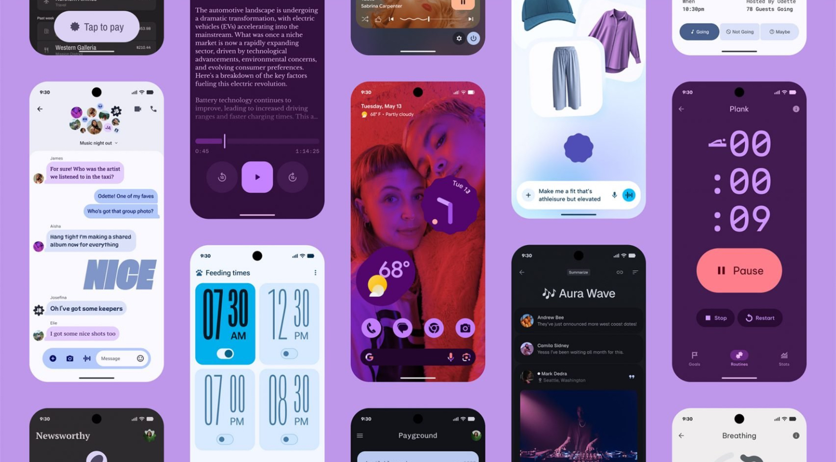
Material 3 Expressive introduces new principles for designing emotion-first interfaces. The key visual drivers? Bolder hues, exaggerated curvature, dynamic shadows, and elastic motion. It’s a rejection of the flat, grayscale interfaces that once dominated mobile and web environments. Interfaces now move more organically—cards expand with bounce, buttons glow with ambient gradients, and shapes asymmetrically flex under interaction.
Google’s update proposes that interface elements don’t need to disappear into the background to be successful. Instead, by making them pop, animate, or even amuse, they become more than tools—they become companions in the digital journey. It’s an ethos reminiscent of postmodern graphic design, where clarity doesn’t always mean uniformity.
And yet, Expressive is no free-for-all. Every design cue has been codified in a highly detailed update to the Material Design Guidelines. The new design tokens include parameters for expressive typography, responsive iconography, and fluid animation libraries. Developers aren’t left to their own devices; they are empowered with a toolkit that balances experimentation with usability.
Color as Character: A Radical Expansion of Palette
Central to Material 3 Expressive is a dramatic expansion of color use. While previous iterations allowed for personalization and dynamic theming, Expressive opens the floodgates to chromatic vibrancy. Google now encourages designers to think in terms of emotional palette mapping: what does joy look like in a UI? What hue communicates confidence, or calm, or creativity?
The update leverages the Tonal Palette System from Material You but retools it for broader range and expression. Colors now have more latitude to clash, contrast, and delight. Vibrant pinks, cobalt blues, toxic greens, and even warm beige tones can exist not in isolation, but as part of holistic moodboards for apps and services.
Google’s internal research suggested that users—especially Gen Z and Gen Alpha—found these colors to be more inviting, relatable, and reflective of their real-world experiences, from fashion to gaming to digital art. Where once the neutral gray might have symbolized professionalism, it now suggests sterility. The future is coded in high saturation.
Shape Language: From Geometric Restraint to Fluid Whimsy
Another major shift in Expressive lies in its updated shape language. Material 3 Expressive reimagines basic UI containers—not as rectangles or circles alone—but as playful, adaptive forms that shift depending on content and device context. Corners are often exaggerated, buttons stretch or shrink with purpose, and cards float with a softness that implies personality.
It’s an aesthetic choice, but also a usability one. These changes stem from a deeper understanding of how human cognition interacts with shape recognition. Research shows that softer, more organic shapes reduce perceived tension and increase user affinity. This insight led Google to adopt ‘comfort-first ergonomics’ in shape rendering, particularly on smaller screens like Wear OS watches and foldable Android devices.
The result is not merely an abstract improvement in visuals but a tangible gain in touch fidelity, reducing misclicks and improving flow. The whimsical now serves the practical.
Kinetic Delight: Reclaiming Animation as Function
One of the cornerstones of Material 3 Expressive is its embrace of motion design as both form and function. Animation was always part of the Material system, but in this version, it takes on a more emotional tone. Transitions have bounce. Feedback glimmers. Scrolls wave. The line between navigation and animation is thinner than ever.
Expressive’s animation updates are governed by a new motion framework that Google calls “Kinetic Expressivity.” This system includes:
- Elastic interpolations for transitions,
- Micro-animations on hover, press, and swipe,
- Multi-stage gesture mapping, and
- Customizable temporal pacing based on app context.
Such additions are more than mere visual enhancements; they are strategic UX decisions. Google’s user testing discovered that delightful micro-movements reduce abandonment rates and make apps feel more “alive.” These kinetic gestures act like digital body language, offering feedback, emotion, and charm without text.
The Broader Cultural Context: UI as Personality Statement
Google’s pivot toward playful expressivity doesn’t emerge in a vacuum. It mirrors a wider cultural appetite for authenticity, creativity, and personal agency in digital environments. As more of our lives are mediated by screens, users—particularly younger demographics—expect those screens to reflect their values, moods, and aesthetics.
This movement has precedent. The resurgence of skeuomorphism in niche applications, the explosion of UI trends on TikTok and Instagram, and even the rise of digital fashion all suggest that functionality alone is no longer enough. Users crave expression.
Material 3 Expressive taps into this desire, inviting developers to create with narrative in mind. Apps can now embody playfulness (Duolingo), calm (Headspace), or even rebelliousness (Reddit). Visual design becomes a storytelling device, and in turn, brands can better distinguish their identities in a saturated market.
Implications for Developers and Designers
For developers, Material 3 Expressive is both a gift and a challenge. It democratizes high-fidelity UI options through its open-source toolkit, while raising the bar for visual storytelling. Google has released extensive design documentation, Sketch and Figma component libraries, and updates to Jetpack Compose and Flutter to streamline adoption.
The real test lies in implementation with restraint. Not every app needs a circus of color or squishy buttons. Google’s guidelines offer clear caveats: use expressive design where it aligns with brand personality, user intent, and content context. It’s an invitation to emotive design, not an imperative.
Designers, on the other hand, are now faced with infinite stylistic latitude, which comes with its own perils. Balancing emotion with legibility, novelty with familiarity, and performance with creativity will become the new mark of a master UI artist.
Future Forward: What Material 3 Expressive Signals
Material 3 Expressive represents not just the future of Google’s platforms, but perhaps a redefinition of how we understand interface design altogether. It suggests that interfaces are no longer just invisible bridges between user and task—they are expressive surfaces, full of personality and intention.
Looking ahead, this update may inspire competitors—Apple, Samsung, Huawei, and others—to rethink their own design languages. More broadly, it places emotion and joy at the forefront of software aesthetics, signaling a new era of digital craft where beauty, accessibility, and individuality converge.