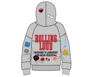
In an age where hyperrealism dominates branding and product visibility is often filtered through the sharp lens of Instagram-ready photography, the decision by Rolling Loud to render its Patched Up Heather Grey Quarter-Zip in illustrative form may seem counterintuitive. But on closer inspection, it reflects a precise and strategic design philosophy—one rooted in clarity, intent, and communicative fidelity. Rather than a placeholder for a product in production, the animated showcase becomes a definitive medium of storytelling. It’s a graphic assertion of identity, form, and collaborative energy that suits Rolling Loud’s ethos: visual, communal, and culture-forward.
This editorial dissects the function of illustration in fashion merchandising, focusing specifically on Rolling Loud’s Patched Up Quarter-Zip. From the internal technical rationale to the external brand perception, the use of animation over photography here isn’t accidental—it’s architectural. It marks a return to roots, not of simplicity, but of clarity, where line and shape carry the cultural memory of garment design.
Why Illustration? The Precision of the Line
To begin with, illustration—particularly vector-based fashion flat sketches—is a tool of accuracy. In fashion development cycles, especially for complex or collaborative garments like the Rolling Loud quarter-zip, there is a crucial phase before sample production where ideas must be communicated in exact terms. Flat drawings are not casual doodles; they are blueprints, used across design, development, and production teams to ensure every measurement, stitch, and surface treatment adheres to a shared vision.
This is particularly vital for Rolling Loud’s quarter-zip, a piece characterized by multi-patch iconography, a structured silhouette, and technical detailing like ribbed hems, snap-secured pouches, and a quarter-zip opening. Illustration allows for clean delineation of every aspect:
- The placement and scale of patches are easily identified and mirrored with precision.
- The block “LOUD” typography across the chest is centrally aligned and framed proportionally.
- The structural features, like hood seams, elastic cuffs, and reinforced drawcord eyelets, are clearly indicated for production consistency.
The visual economy of illustration offers a language unburdened by lighting angles, fabric shadows, or model poses. It communicates design truthfully and effectively—a language not of suggestion, but declaration.
Functionality Over Aesthetic: A Developmental Utility
In fashion, there exists a difference between what looks good and what is understood clearly. Illustrative renderings speak primarily to the latter. Before a jacket can appear on a billboard, runway, or festival crowd, it must be engineered—a process that requires unambiguous visualization. This is especially critical for brands like Rolling Loud, which collaborate with outside artists, license partners, and patch designers. The illustrated format functions as a developmental utility—a standardized sheet that aligns product designers, garment technicians, and manufacturers under a single visual grammar.
With the Patched Up Quarter-Zip, the sheer variety of mixed-media patches (embroidered, printed, textured) requires intentional spatial logic. An illustration not only shows where each patch goes, but implies how they relate to one another compositionally. This kind of roadmap isn’t a simplification—it’s a necessity.
Animated Identity: Signaling Culture Through Style
Yet, beyond function, Rolling Loud’s choice to present this garment in illustrated form communicates something deeper: a cultural alignment with DIY streetwear history, merch aesthetics, and zine-based visual storytelling.
Rolling Loud’s identity is built on more than festival logistics. It’s a youth ecosystem, born out of skate decks, soundcloud sleeves, and independent screen-printed T-shirts. Illustrated garments echo this lineage. Think of early Supreme line sheets, Palace sketches, or vintage Obey renderings—visuals that existed somewhere between commercial draft and underground manifesto.
To see the Patched Up Quarter-Zip not on a model, but in flat vector form, is to engage it as design, not display. It’s a nod to collectors, to those who understand fashion as process, not just product. It says: this isn’t a finished scene—it’s a diagram of our intent.
That aligns perfectly with the narrative of Rolling Loud itself. The brand’s festival stages, like its garments, are always evolving—built piece by piece, patch by patch, artist by artist. The animated representation becomes part of that modular language.
Anti-Gloss and Anti-Gatekeeping
Moreover, there’s something anti-gloss about the illustrated garment—a rejection of the overstyled, retouched, hyper-curated image language that dominates much of modern streetwear marketing. Rolling Loud, while operating at the scale of a multinational brand, still leverages a raw energy that feels closer to bootleg culture than couture.
By choosing illustration, Rolling Loud bypasses the performance of perfection. There’s no model to objectify, no environment to frame a fantasy. Just the product, as it is meant to be—interpretable by the wearer.
This decision is also anti-gatekeeping. Photographic lookbooks often impose identity onto the viewer: here is how to wear this, how you should look, how to stand. An illustrated showcase resists that imposition. It gives the garment back to the audience, inviting them to imagine themselves inside it, rather than watching someone else embody it.
A Living Archive
Rolling Loud is more than a festival—it’s an evolving archive of hip-hop history. Artists debut albums on its stages. Styles emerge in its crowds. Cities are introduced to global talent through its programming. The Patched Up Quarter-Zip is a physical reflection of that archive, and the animated rendering functions almost as a library card—a formal index of what the garment holds.
Every patch is a story, and the illustrated jacket allows us to read them clearly: the “I Heart RL” motif, the global tour badge, the smiley glitch icon, the bold varsity font—all rendered without distortion. This is crucial in a time when fashion is increasingly collectable, and consumers want to know exactly what they’re buying. The illustration provides a museum view—archival, specific, and honest.
Illustration as Cultural Blueprint
In sum, the animated rendering of Rolling Loud’s Patched Up Heather Grey Quarter-Zip isn’t a stand-in for the real thing—it is the real thing, in one of its most honest forms. It presents the jacket not as an accessory, but as a piece of cultural infrastructure. A garment illustrated not to hide, but to clarify; not to tease, but to anchor.
For a brand that prides itself on expression, accessibility, and realness, this method of presentation aligns perfectly with its mission. Rolling Loud isn’t selling fantasy—it’s documenting presence. Through line, patch, and proportion, this illustration tells a complete story. And in doing so, it offers a new kind of fashion imagery: not one filtered through glamour, but one drawn from ground truth.


