From Banda to Pulse: Kappa’s SS26 Recalibrates Sport as Form
March 30, 2026
1 hour ago


There is a narrowly fetched discipline in how Kappa approaches Spring/Summer 2026. The collection does not indulge in revival for its own sake; instead, it treats the archive as a system of lines, symbols, and tensions to be recalibrated. Within Kappa Authentic, the past becomes less a reference point and more a structural language—one that can be bent, tightened, or extended depending on the garment.
This distinction matters. The “Authentic” designation signals a parallel identity within the brand—one that operates outside pure performance wear while still anchored in the codes of sport. For SS26, that language unfolds across football silhouettes, motorsport gestures, and leisure garments that resist being categorized too quickly.
At its core, the collection asks a simple question: what remains when a sports brand stops performing sport and begins performing culture?
flow
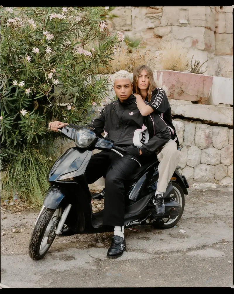
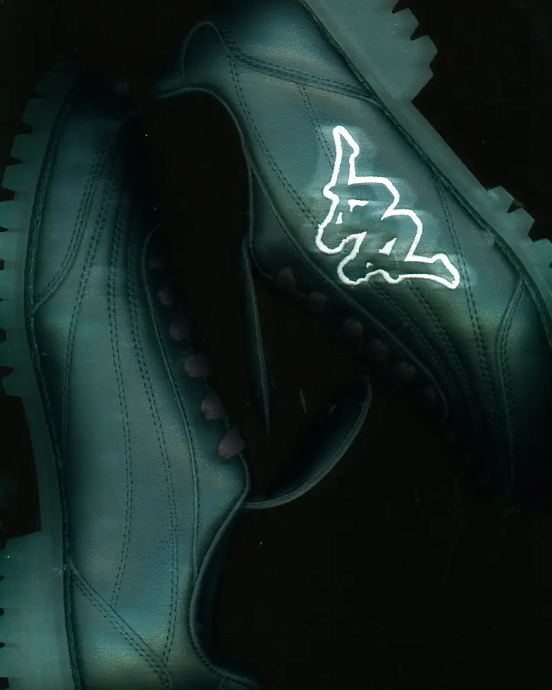
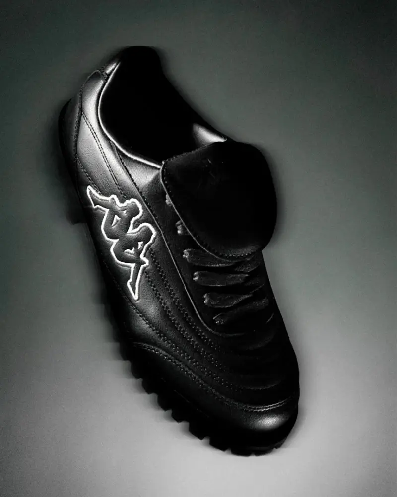
The answer begins with the Banda line, arguably the most recognizable visual code in Kappa’s history. The repeating Omini logo—two seated figures back-to-back—has long functioned as both ornament and identifier. In SS26, it returns not as a static emblem but as a rhythm.
Originally embedded in 1990s tracksuits, the Banda motif carried a duality: it was both uniform and rebellion. It marked athletes, but it also became shorthand for terrace culture, nightlife, and the emergence of sportswear as everyday attire.
For SS26, the motif is rebalanced. The repetition is tighter, cleaner, and more intentional. Instead of dominating the garment, it integrates with the cut. Tracksuit trousers taper slightly more than their archival counterparts. Jackets lose excess volume in favor of sharper proportions. The effect is subtle but decisive—Banda becomes less about statement and more about continuity.
There is also a shift in materiality. Where earlier iterations leaned heavily into synthetic sheen, the new collection introduces matte finishes and blended fabrics. This recalibration softens the visual noise while preserving the graphic identity.
The result is not nostalgia. It is control.
View this post on Instagram
imagine
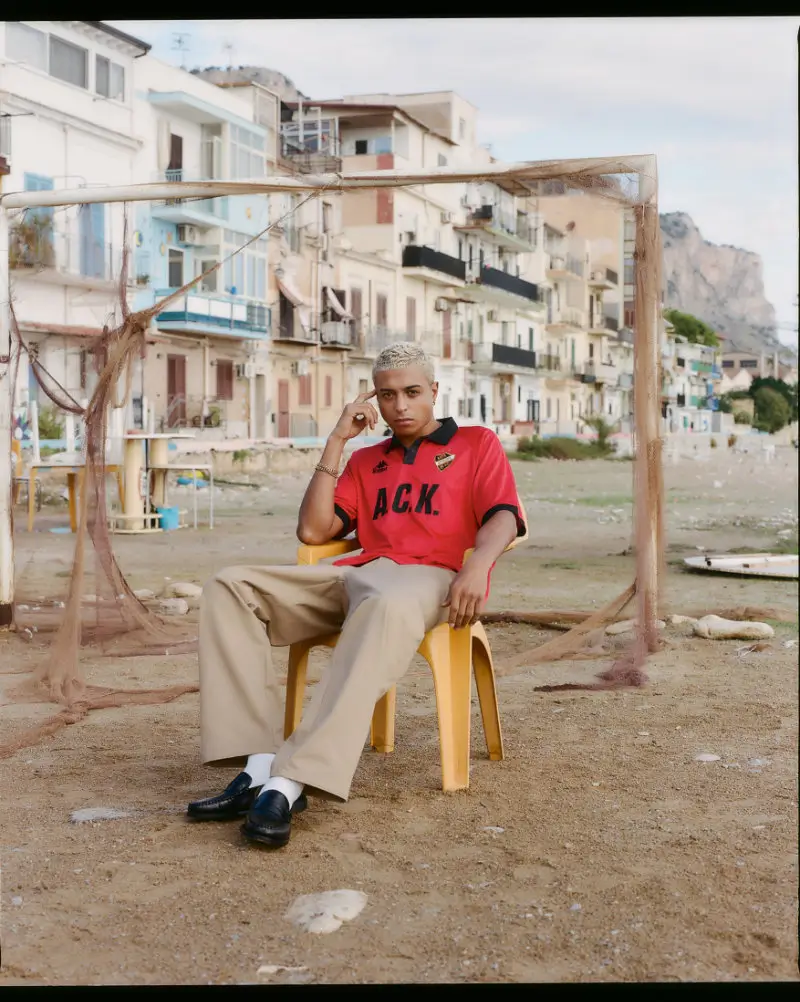
Football remains the gravitational center of Kappa’s design language, but SS26 resists the urge to replicate kits as they once were. Instead, the jersey becomes an interface—something that mediates between performance and presence.
Cuts are relaxed without drifting into oversizing. Sleeves sit slightly longer, allowing for layering, while collars oscillate between classic ribbed constructions and open placket designs. Color palettes lean toward controlled contrasts: deep navy against off-white, muted reds against tonal blacks.
What distinguishes these jerseys is not just their aesthetic but their repositioning. They are no longer tied to teams, sponsors, or seasonal leagues. Detached from those frameworks, they become objects of styling—capable of moving between contexts without losing coherence.
In this sense, the football jersey becomes less about allegiance and more about alignment: alignment with a visual system, with a rhythm of stripes, with a memory of sport that no longer requires a pitch.
consider
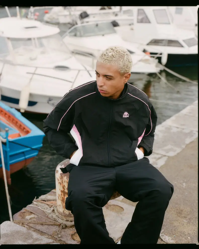
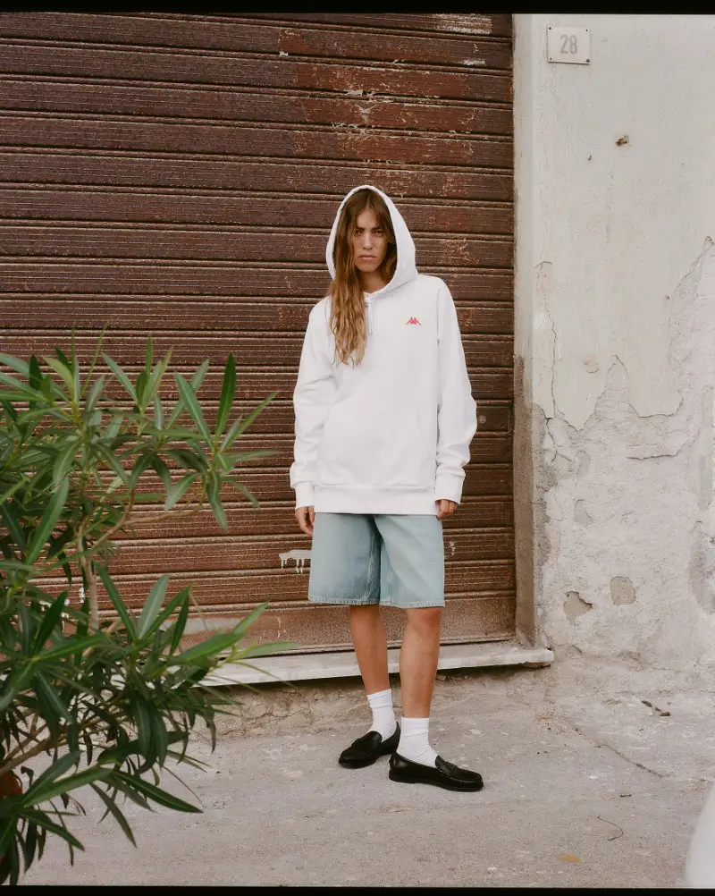
The tracksuit, long a cornerstone of Kappa’s identity, undergoes a quiet transformation in SS26. It retains its structural DNA—zip jackets, elasticated waists, coordinated sets—but sheds the urgency of performance.
Where earlier tracksuits suggested motion, speed, and preparation, these feel more measured. Fabrics drape rather than cling. Zippers are concealed or minimized. Pocket placements become more architectural, integrated into seams rather than added as afterthoughts.
This recalibration reflects a broader shift in how sportswear functions within contemporary wardrobes. Movement is still implied, but it is no longer the primary narrative. Instead, the tracksuit becomes a framework for ease—something that accommodates motion rather than demanding it.
The Banda stripe, when present, operates as a guide rather than a declaration. It traces the body’s movement without overwhelming it.
idea
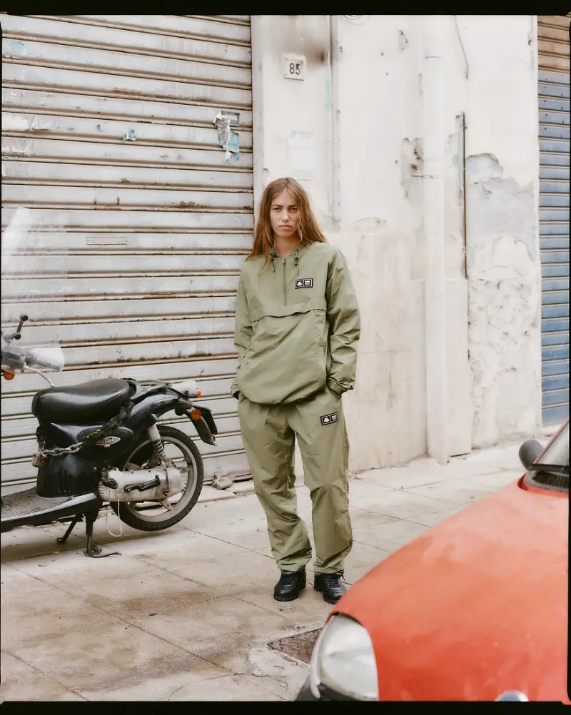
One of the more unexpected dimensions of the SS26 collection arrives through its motorsport-influenced line. This is where Kappa’s geographic origin—Turin—begins to surface more explicitly.
Turin’s industrial history, deeply tied to automotive production, provides a different kind of archive. It is not about athletes or stadiums, but about factories, speed, and mechanical precision.
The racing jackets in SS26 channel this lineage without becoming literal reproductions. They avoid excessive branding or sponsor-style graphics. Instead, they rely on paneling, stitching, and color blocking to evoke motion and machinery.
Leather appears more prominently here, often paired with technical fabrics. The silhouettes are structured but not rigid, allowing the garments to retain a degree of flexibility. Stripes—echoing both racing lanes and the Banda motif—run across sleeves and torsos, creating a visual continuity between sport and industry.
This is where Kappa’s design language expands. The brand is no longer referencing sport alone; it is mapping the broader ecosystem in which sport exists.
stir
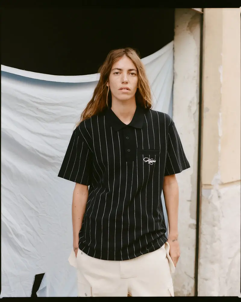
If football and motorsport establish the collection’s structural poles, the leisure pieces provide its connective tissue. Striped polo shirts and beachwear introduce a lighter register, but they remain tethered to the same visual logic.
Stripes, once again, play a central role. On polos, they are broader, more spaced, and often tonal. The Omini logo appears sparingly, sometimes embroidered rather than printed, reinforcing a sense of restraint.
Beachwear follows a similar approach. Shorts and lightweight shirts adopt relaxed cuts, but the detailing remains precise. Drawstrings are minimal. Seams are clean. Patterns avoid excess complexity.
What emerges is a continuity of language. Even in its most relaxed pieces, the collection maintains a coherence that ties back to its core themes.
Leisure, here, is not an escape from the system. It is an extension of it.
View this post on Instagram