KAWS’ TIDE (2023): A Reflection on Form, Fragmentation, and Cultural Continuity
April 14, 2025
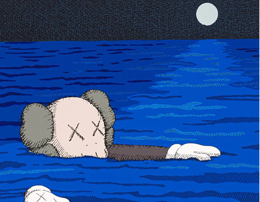
When viewing KAWS’ 2023 print TIDE for the first time, one might be overwhelmed by its vibrant dynamism. Executed as a 10-color silkscreen on Coventry Rag paper, utilizing both water-based and ultraviolet inks, TIDE is not simply another collectible in the long line of editions from the Brooklyn-based artist. It is a sophisticated, emotionally resonant work that merges KAWS’ iconic cartoon abstraction with a formal rigor that speaks to printmaking’s legacy and evolution. TIDE is not a wave in passing. It is a profound pull—toward memory, saturation, and cultural sediment.
This essay provides an extended consideration of TIDE—its aesthetic logic, technical mastery, thematic implications, and its place within both the KAWS canon and the broader narrative of post-2000s contemporary art.
Medium as Message: The Enduring Power of Silkscreen
To begin with the material is to begin with intention. Silkscreen printing—especially in 10 dense, layered colors—is never passive. Every hue in TIDE has been precisely layered, with water-based inks bringing matte subtlety and ultraviolet inks delivering luminous saturation. The combination of these two ink types serves as a metaphor in itself: one natural, absorbed into the fiber of the Coventry Rag paper like memory into skin; the other synthetic, reactive, ghostly like the ever-glowing stimuli of a screen culture.
The Coventry Rag, a 100% cotton archival substrate prized for its tooth and durability, provides a tactile surface that holds both the rich inks and the cultural gravity they carry. KAWS’ choice of this medium reflects an evolving commitment to printmaking as more than reproduction—this is printmaking as painting, as material study, and as structural metaphor.
Anatomy of TIDE: Iconography, Color, and Compression
Visually, TIDE is classic KAWS—interlocking abstract forms, vibrant colors, and fractured cartoon anatomy. A closer examination reveals that these forms are not free-floating or improvisational, but strategically placed, emphasizing compression and closeness. Limbs, heads, hands—identifiable yet abstracted—are stacked, folded, and fused, reminiscent of both Cubism’s spatial collapse and the layering logic of street art paste-ups.
The forms themselves recall KAWS’ most recognizable characters—COMPANION, BFF, and CHUM—without directly naming them. Instead, their fragmented features (gloved fingers, bulbous noses, “X”-ed eyes) suggest iconic presence via dismembered suggestion. In TIDE, these familiar forms are not isolated in narrative but immersed in a formal tide—swept together, pulled apart, and reassembled in a gridless geometry of gesture and color.
The color palette is rich, intense, and deeply synthetic: cyan blues, electric reds, neon violets, pale yellows, minty greens, and the saturated blacks that serve as anchors throughout the composition. These are the colors of children’s cartoons, mass consumer packaging, and 2000s LCD backlights. They are as much pop as they are postmodern—layered with irony, nostalgia, and critique.
But they are not chaotic. The composition’s careful balance speaks to KAWS’ deep understanding of visual rhythm. Negative space is used sparingly; every inch of TIDE is packed. There’s tension in the closeness. Bodies overlap. Limbs intertwine. Faces blur into fists. It’s a physical arrangement of overload, perhaps reflecting our own moment’s saturation of stimuli, screen content, and consumer desire.
KAWS and the Tidal Metaphor: Flux, Repetition, and Cultural Recurrence
The title TIDE immediately opens conceptual interpretations. A tide suggests cycles, ebb and flow, inevitability. It can be both nourishing and destructive, shaping coastlines and dragging debris. Within the context of KAWS’ work, this tide may represent the ongoing cycle of pop cultural imagery—how characters rise, fall, and are recycled through memes, reboots, and merchandise.
KAWS’ art has always been about sampling and remixing visual culture. With TIDE, he places this visual inheritance in motion. The recognizable elements are still there—the Mickey-glove fingers, the Simpsons-colored palettes, the vinyl-toy sheen—but now they’re caught in a compositional undertow, suggesting both loss of control and inescapable recurrence.
Is TIDE a wave of memory crashing? A reflection on the artist’s own repetition of motifs? A commentary on consumer culture’s tidal pull—drawing us into cycles of desire, purchase, and discard? Perhaps all of the above. It’s important to remember that KAWS does not moralize. He does not elevate or condemn pop culture—he immerses in it, allowing us to experience its gravity for ourselves.
Printmaking and the Ritual of Multiplicity
KAWS’ choice of print as medium—specifically, editioned silkscreens—is conceptually vital. Unlike a painting or sculpture, a print speaks to access and multiplicity, yet in KAWS’ case, this accessibility is complicated. His silkscreens are editioned (often tightly), expensive, and hotly traded on secondary markets. They sit at the intersection of democratization and elite collection.
What TIDE offers, however, is a powerful meditation on image repetition—not just in the printing process, but in cultural life. How often have we seen the COMPANION face? How many variations exist across toys, T-shirts, murals, and museum shows? Like Warhol before him, KAWS understands the power of the repeat. But where Warhol emphasized surface, KAWS emphasizes emotional distortion—his characters do not smile. They sag, slump, hunch, or fall apart.
In TIDE, the repetition becomes claustrophobic, collapsing the figure into overlapping volumes that are hard to parse but impossible to ignore. The print refuses to give the viewer an easy reading—it demands one sit with the visual overload, just as we sit with algorithmic repetition on TikTok, YouTube thumbnails, or advertising loops.
Ultraviolet Ink and the Metaphor of Glow
The use of ultraviolet ink in TIDE introduces a latent dimension—glow. Not visible in all lighting, UV inks activate under specific conditions. They represent hidden labor, delayed meaning, and the idea that full understanding requires re-contextualization. This is not just a technical flex. It is a metaphor.
KAWS may be commenting on how true meaning in culture often sits just beneath visibility—only revealed in the right light, with the right context, at the right time. The UV glow in TIDE evokes the screen light of a phone in the dark. It mirrors the nocturnal consumerism of the 21st century, where buying, scrolling, and liking happen in solitude, often invisibly. In a gallery under fluorescent light, TIDE is loud. Under UV, it whispers back.
Art Market Dynamics: From Street to Sotheby’s
From a market perspective, TIDE is emblematic of KAWS’ transition from subcultural insider to art-world juggernaut. What began as street-level subversion—altering bus shelter ads and recontextualizing cartoons—has evolved into partnerships with Dior, Uniqlo, and major museum retrospectives. His prints now fetch tens of thousands on the secondary market, often minutes after release.
TIDE fits squarely in this trajectory. Its technical rigor, aesthetic confidence, and limited edition make it covetable, but also raise questions: What happens when art built on accessibility becomes rarefied? Is TIDE a critique of its own exclusivity? Or does it embody the postmodern condition of critiquing capitalism from within?
The tension is unresolved. But perhaps that’s KAWS’ point. TIDE washes over you—not to cleanse, but to complicate.
Place Within the KAWS Canon
For those familiar with KAWS’ oeuvre, TIDE reads as a culmination and continuation. It draws from earlier works like “URGE” (2020) and “THE THINGS THAT COMFORT” (2022), which similarly collapsed anatomy into abstraction. But TIDE feels more precise, more weighty. It is less fun and more contemplative.
Compared to his large-scale sculptures, TIDE is intimate but no less aggressive. It offers no clear face, no clean edge, no safe entry point. It is a crowd of symbols jostling for attention, a visual algorithm rendered in ink. It is, in short, KAWS at his most formally confident and culturally reflective.
A Print That Holds the Present
KAWS’ TIDE (2023) is not a mere decorative edition. It is a distilled reflection of contemporary life—its over-saturation, emotional fragmentation, and cyclical desires. Through expert printmaking, chromatic density, and cultural resonance, KAWS constructs a piece that is both visually irresistible and critically loaded.
At a time when art is increasingly flattened into content, TIDE demands slow looking. It challenges the viewer to read between lines, between limbs, between layers. It is both beautiful and overwhelming. It is KAWS at his best—synthesizing the visual language of the global image economy into a single, graduated surface, pulsing.