Lanvin Unveils Its New Signature Shade: The Story of Lanvin Blue
September 27, 2025

New Color For Fashion Decor
Fashion houses often define themselves not only through silhouettes, fabrics, or iconic motifs, but also through color. From Valentino’s fiery red to Hermès’s orange, color becomes a symbolic language that extends beyond garments into heritage and identity. In 2025, Lanvin has chosen to affirm its presence in the fashion landscape with the introduction of a new chromatic signature: Lanvin Blue.
This shade is more than a marketing flourish. It represents continuity, reverence for history, and an artistic dialogue that stretches across centuries—from Renaissance frescoes in Florence to Parisian ateliers today. With the creative collaboration of M/M Paris and the leadership of Artistic Director Peter Copping, Lanvin Blue is being elevated into a living emblem of the maison.
Jeanne Lanvin and the Origins of Blue
To understand the gravity of this new signature, one must return to the maison’s founder. Jeanne Lanvin, who began her career as a milliner before evolving into one of Paris’s most celebrated couturières, had an enduring fascination with the color blue.
Her encounter in Florence with the frescoes of Fra Angelico, whose ethereal depictions of the heavens bathed in celestial blue captivated her imagination, became a turning point. Jeanne did not merely admire the shade—she sought to make it her own.
She established her own dye workshop, producing 23 variations of blue that would infiltrate her fashion collections, interiors, and even theatrical commissions. From the drapery in her bedroom to the sets of the Théâtre Daunou, blue became a marker of Jeanne Lanvin’s aesthetic vision.
For her, blue was not just a color but an atmosphere—serene, infinite, and sacred. In many ways, her vision prefigured the modern understanding of brand chromatics, where a single shade could represent an entire identity.
The Role of M/M Paris: Recasting Identity
The renewal of Lanvin’s visual identity, begun in 2022, sought to balance heritage with modernity. Enter M/M Paris, the creative duo known for their bold graphic design and collaborations with cultural institutions from fashion to fine art.
Their task was not to invent something new for novelty’s sake, but to excavate history and recast it with precision. The new Lanvin Blue is therefore both an homage and a redefinition: it builds on Jeanne Lanvin’s devotion to Fra Angelico’s celestial palette while adapting to contemporary visual needs across print, packaging, digital, and fashion applications.
By consolidating Lanvin’s legacy into a single, luminous chromatic code, M/M Paris has offered the maison what every heritage house seeks—a signature that transcends seasons.
The Chromatic Language of Luxury
Color in luxury fashion is never incidental. It communicates identity in subtle yet powerful ways:
-
Valentino Red became a cultural shorthand for sensual femininity.
-
Cartier Red evokes opulence and timeless craftsmanship.
-
Hermès Orange reflects modernity, optimism, and craftsmanship.
Lanvin Blue enters this lineage not as a competitor, but as a distinct voice. Where red and orange convey fire and intensity, Lanvin Blue communicates luminosity, serenity, and transcendence. It is at once regal and intimate, contemporary yet eternal.
Its placement across packaging ensures that consumers who leave a Lanvin boutique carry more than a product—they carry a fragment of the maison’s chromatic soul.
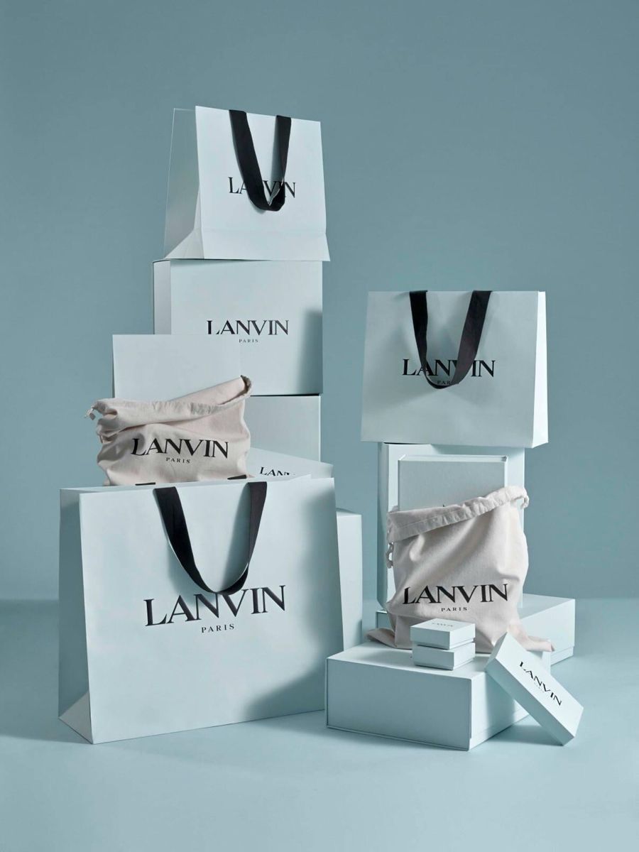
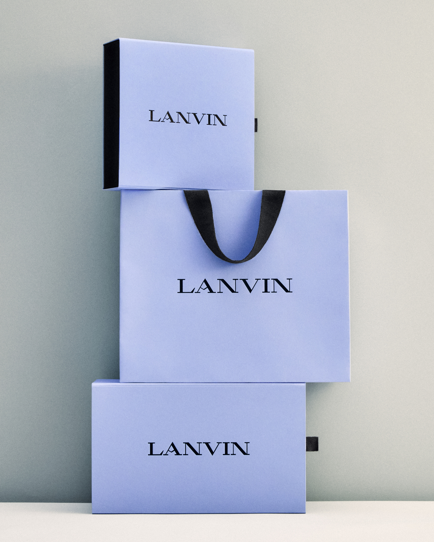
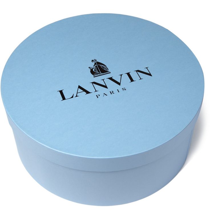
The Packaging Rollout: Symbol and Substance
Already in boutiques worldwide, Lanvin Blue dominates the new packaging. Boxes, ribbons, shopping bags, and tissue papers now bear this luminous hue. The effect is immediate: Lanvin products no longer blend into the multicolored landscape of luxury retail. Instead, they are codified and recognizable.
In marketing terms, this visual consolidation strengthens brand recall—the consumer associates the entire Lanvin experience with a single, striking chromatic identity. But beyond branding, there is a poetic quality. To open a Lanvin box is not just to reveal a garment or accessory; it is to encounter a piece of Jeanne Lanvin’s legacy reframed for the present.
Peter Copping’s Role: Carrying the Hue into Design
The appointment of Peter Copping as Artistic Director in 2024 marked a new chapter for Lanvin. Known for his meticulous approach at Oscar de la Renta and Nina Ricci, Copping was tasked with balancing Lanvin’s heritage with modern relevance.
Lanvin Blue is his first major symbolic gesture. It appears in the maison’s debut accessories under his direction, signaling how the hue will integrate into the product range. Copping is expected to weave Lanvin Blue into ready-to-wear, eveningwear, and perhaps even menswear, ensuring that it is not relegated to packaging alone.
His Spring-Summer 2026 presentation at Paris Fashion Week is slated to highlight Lanvin Blue not merely as an accent but as a centerpiece of collection design. This step will affirm its permanence as an aesthetic pillar of the maison.
Blue as Cultural Archetype
The significance of blue extends beyond Lanvin. In art history, blue has always carried profound meaning:
-
In the Middle Ages, ultramarine was more precious than gold, reserved for depictions of the Virgin Mary.
-
In the Renaissance, Fra Angelico used celestial blues to transport viewers into spiritual contemplation.
-
In the 20th century, Yves Klein developed his patented International Klein Blue, cementing blue as a vehicle for avant-garde innovation.
Lanvin Blue enters this continuum, borrowing from spiritual history while embedding itself in fashion’s symbolic economy. Unlike Klein’s radical minimalism, however, Lanvin Blue is about synthesis: merging art, heritage, and commerce into a single chromatic gesture.
The Psychology of Lanvin Blue
Blue is universally associated with calmness, stability, and trust. In fashion psychology, it also conveys elegance and introspection. Lanvin Blue’s distinct luminosity, however, adds a note of sophistication and elevation—bridging intimacy with grandeur.
For consumers, the shade offers reassurance while affirming luxury. For the maison, it becomes a communicative tool that speaks across cultures and markets. In an era where color itself can become a marketing asset, Lanvin Blue possesses both psychological depth and aesthetic clarity.
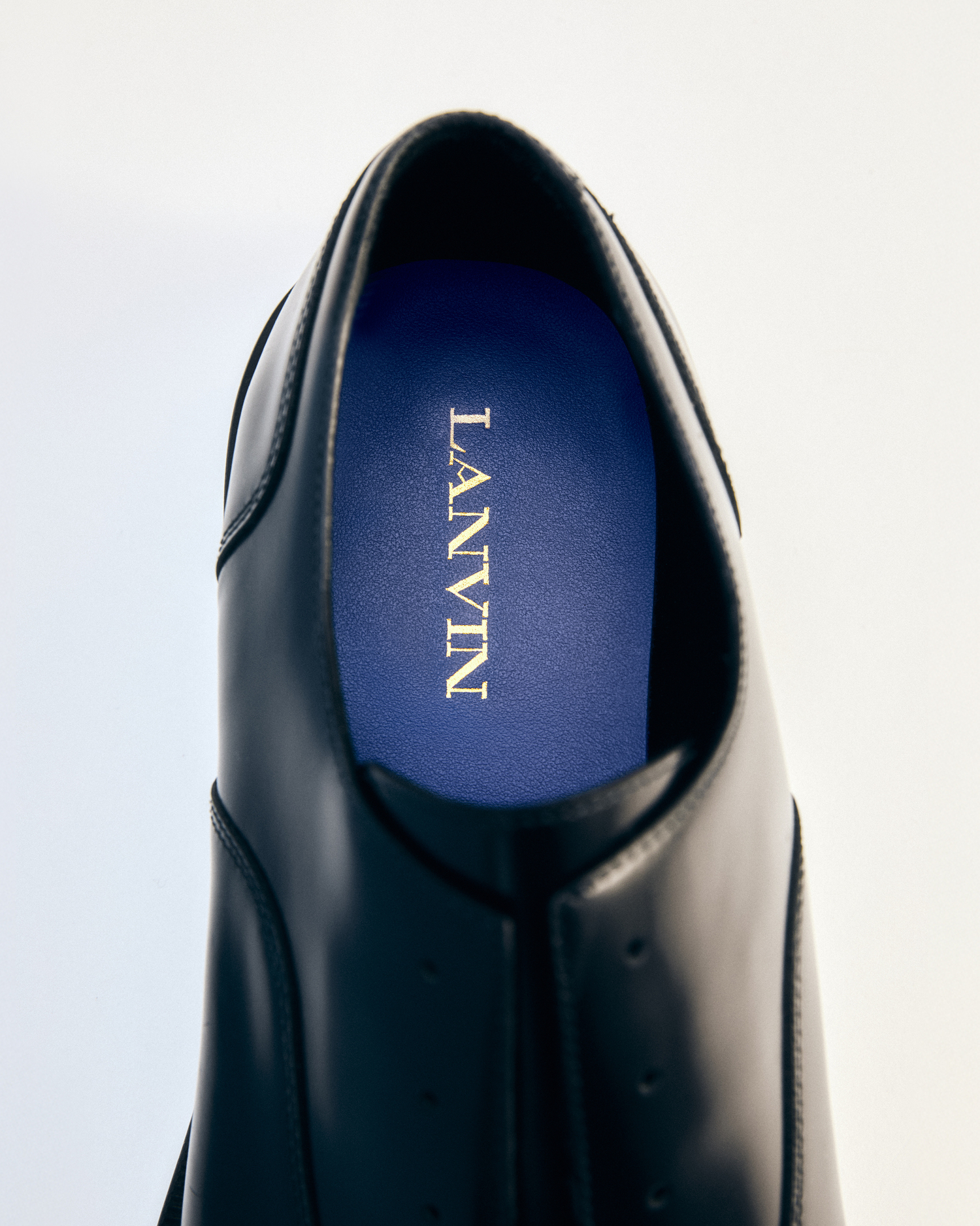
Lanvin Blue in Accessories and Collections
The rollout of Lanvin Blue is not merely symbolic. Accessories already feature the shade, from handbags with blue linings to jewelry packaging framed in the new chromatic identity. Over time, this hue is expected to permeate seasonal collections:
-
Ready-to-Wear: Evening dresses, silk blouses, and outerwear may bear Lanvin Blue as a dominant tone or accent.
-
Footwear: Expect pumps, sneakers, and sandals crafted in the shade, carrying the identity literally onto the street.
-
Menswear: Ties, pocket squares, and suiting details may serve as subtle injections of Lanvin Blue into the male wardrobe.
-
Homeware and Interiors: Given Jeanne Lanvin’s history of infusing blue into her own living spaces, it is not far-fetched to imagine home objects under Copping’s leadership.
This expansion ensures that Lanvin Blue will not stagnate as a packaging gimmick but will live as a functional and fashionable spectrum.
Paris Fashion Week 2026: The Stage of Affirmation
The Spring-Summer 2026 collection will serve as Lanvin Blue’s coronation. At Paris Fashion Week, where visual codes are scrutinized by critics, editors, and consumers alike, Lanvin will project its new signature shade onto a global stage.
If executed successfully, Lanvin Blue will join the canon of fashion colors that are instantly recognizable, becoming inseparable from the maison’s narrative. Its presence in show invitations, stage design, and garments will consolidate the chromatic identity across every touchpoint.
Blue as Continuity in Times of Change
Fashion is often about flux—seasonal reinvention, new designers, and shifting trends. Lanvin Blue, however, offers a constant amidst change. It ties Jeanne Lanvin’s historic devotion to color with Peter Copping’s contemporary vision, bridging a century of fashion evolution.
This continuity reassures loyal clients while engaging new generations. In a marketplace oversaturated with novelty, the choice to reaffirm history through a single, luminous hue is a powerful statement of stability and confidence.
Identity
Lanvin Blue is more than a shade; it is an emblem of heritage, artistry, and future ambition. By drawing from Jeanne Lanvin’s devotion to Fra Angelico’s frescoes, by reinterpreting it through the lens of M/M Paris, and by launching it into global visibility under Peter Copping’s leadership, Lanvin positions itself within the chromatic pantheon of luxury fashion.
As consumers encounter Lanvin packaging, accessories, and eventually full collections infused with this luminous shade, they are not merely purchasing a product—they are participating in a narrative that spans art, history, and design.
Lanvin Blue is not just color. It is identity. It is the soul of a maison translated into light. And in the chromatic history of fashion, it will endure as one of the most profound symbols of continuity and elegance.