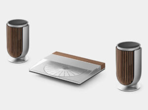
Marc Newson × Ressence: TYPE 3 MN
January 8, 2026


when
Some watches refine tradition. Others quietly dismantle it. The Ressence TYPE 3 MN belongs firmly in the latter category—a watch that does not merely reinterpret how time is displayed, but questions why we ever accepted the old rules in the first place. The collaboration between Ressence and Marc Newson feels less like a guest designer stepping into watchmaking and more like a convergence of parallel philosophies that have been orbiting each other for decades.
Marc Newson has spent his career smoothing the future. From furniture and aircraft interiors to consumer electronics and watches, his work consistently strips objects down to their most essential gestures, then rebuilds them with organic logic and industrial precision. Ressence, founded by Benoît Mintiens, has done the same within horology—challenging hands, crowns, and even the idea of a “dial” itself. The TYPE 3 MN is the moment where those instincts align completely.
This is not a watch that wants to look complicated. It wants to feel inevitable.
flow
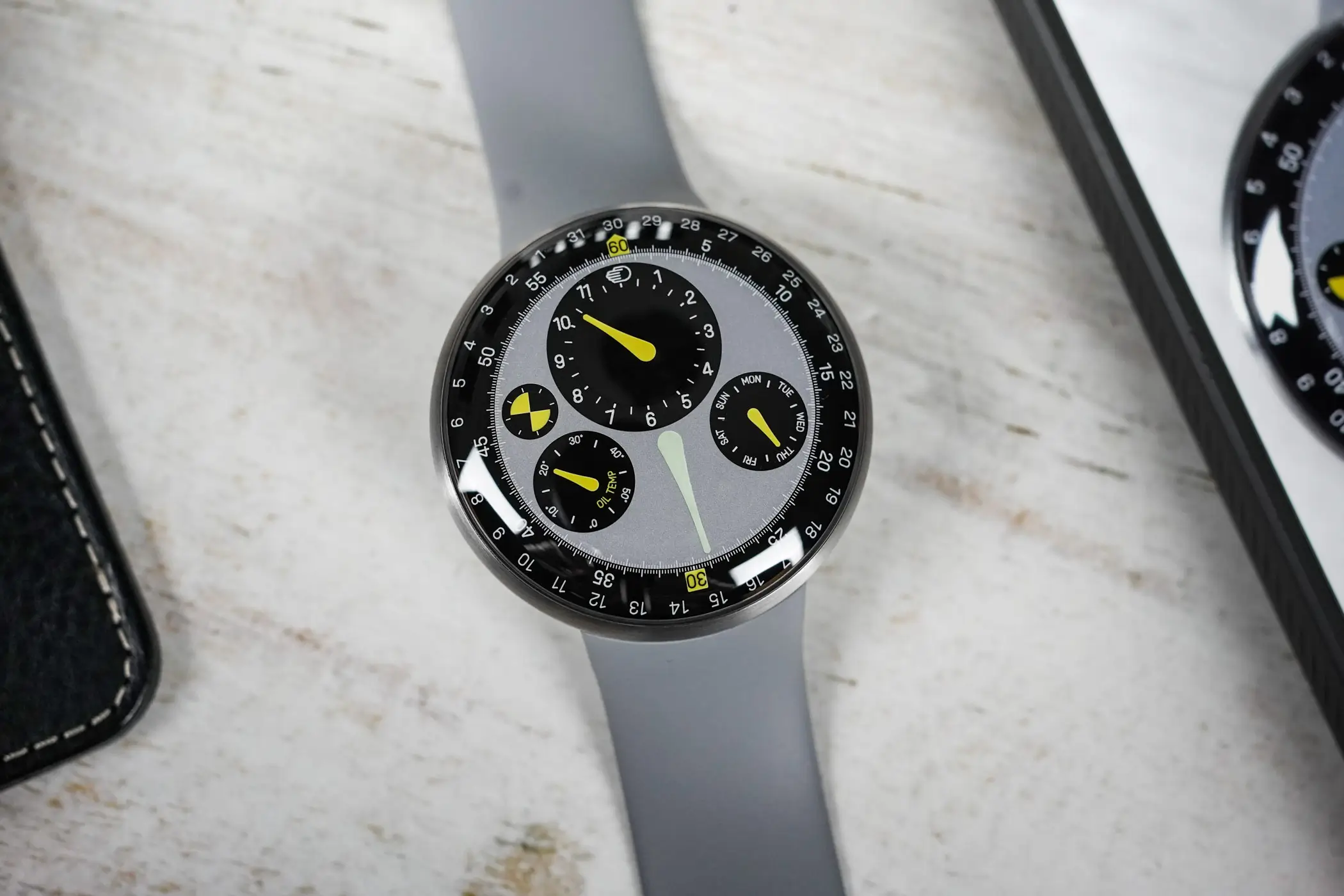
To understand the TYPE 3 MN, you first have to understand what the TYPE 3 represents within Ressence’s catalogue. Introduced as the brand’s most technically daring expression, the TYPE 3 eliminated conventional hands and replaced them with rotating discs driven by Ressence’s Orbital Convex System, or ROCS. The display appears flat against the crystal, with no visible separation between viewer and information.
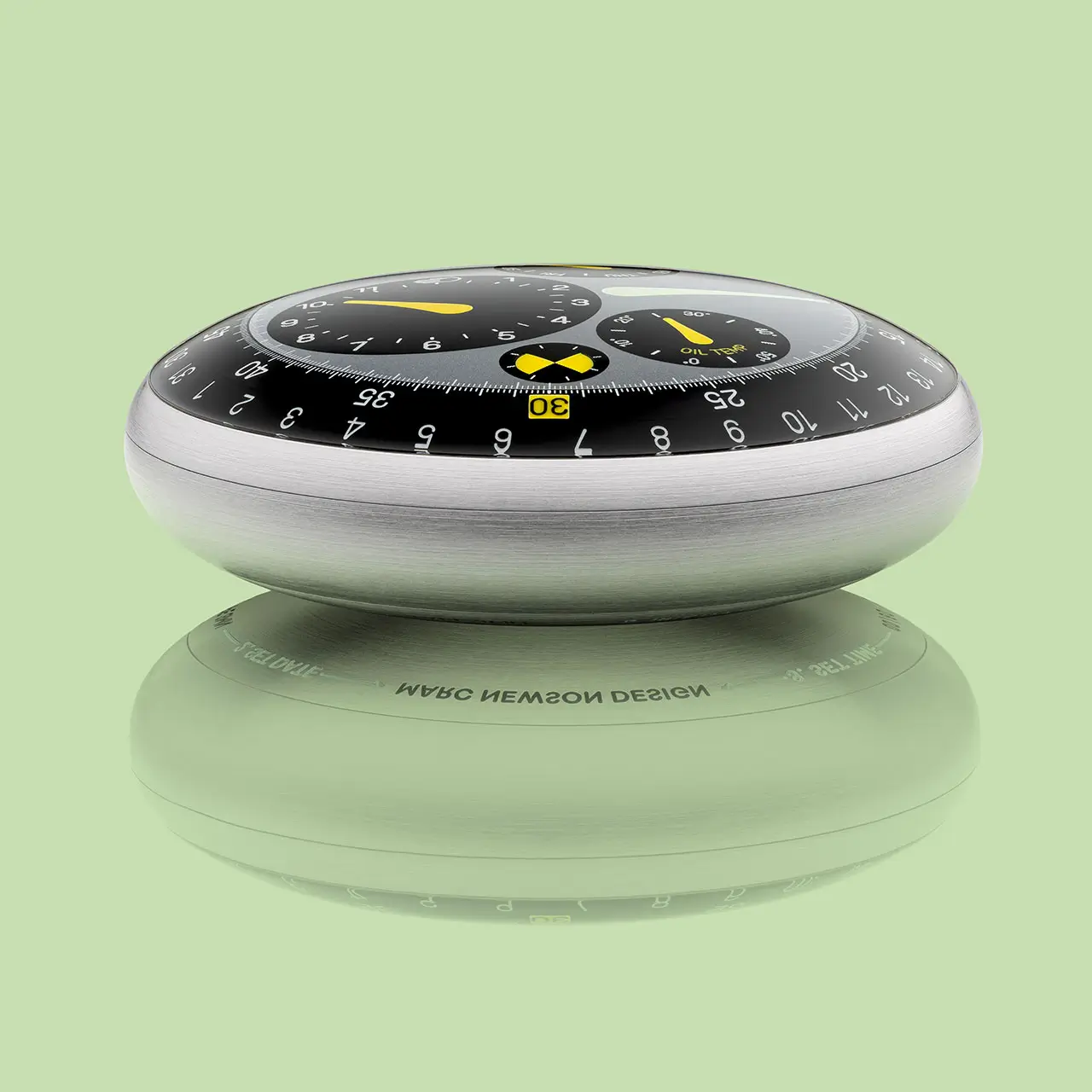
The secret is oil. The upper chamber of the TYPE 3 is completely filled with oil, cancelling out light refraction and giving the illusion that the indications are printed directly onto the sapphire crystal. Tilt the watch, and the display remains perfectly legible, floating unnaturally close to the surface. It is one of the most disorienting—and compelling—visual tricks in modern watchmaking.
Mechanically, the oil-filled display is isolated from the movement below, connected through a magnetic transmission. This separation allows Ressence to rethink the watch as a system rather than a collection of parts. Time becomes a graphic experience, not a mechanical one.
In many ways, the TYPE 3 already behaves like an interface. Marc Newson’s contribution is to refine that interface until it feels more intuitive, more fluid, and more distinctly contemporary.
lang
Marc Newson’s influence on the TYPE 3 MN is immediately apparent, yet remarkably restrained. There are no flamboyant shapes, no forced signatures, no unnecessary flourishes. Instead, his presence is felt through proportion, color discipline, and ergonomic clarity.
Newson has always been drawn to objects that feel evolved rather than invented. The TYPE 3 MN reflects this instinct. Its visual language is softened but precise, with smooth transitions and carefully calibrated contrasts. The watch does not shout “designer collaboration.” It whispers coherence.
Color plays a critical role. The dial palette leans into cool greys and deep blacks, punctuated by crisp white markings and a signature green accent—an unmistakable nod to Newson’s earlier watch designs and his long-standing fascination with functional color coding. Here, color is not decorative. It guides the eye, helping the wearer intuitively read the display without conscious effort.
The result is a dial that feels more like instrumentation than ornamentation.
style
The TYPE 3 MN dial is not static. It is in constant motion, yet never feels busy. Hours, minutes, seconds, and running indicators are displayed on a set of convex, rotating discs that orbit each other with measured calm. The entire display turns as time passes, creating a sense of continuity rather than segmentation.
This approach fundamentally changes how time is perceived. There is no central authority—no dominant hand dictating the rhythm. Instead, time unfolds as a system of relationships, each disc moving in concert with the others. It is closer to watching celestial bodies than reading a clock.
The oil-filled chamber amplifies this effect. The markings appear suspended, with an almost liquid sharpness that blurs the boundary between mechanical and digital aesthetics. It looks futuristic without relying on screens, pixels, or electricity. The illusion is so convincing that first-time viewers often mistake it for a display rather than a purely mechanical construction.
In the TYPE 3 MN, this visual phenomenon is sharpened further. Darker components appear deeper and more saturated, while lighter elements pop against the background, creating a layered, three-dimensional reading experience that feels almost tactile.
mat
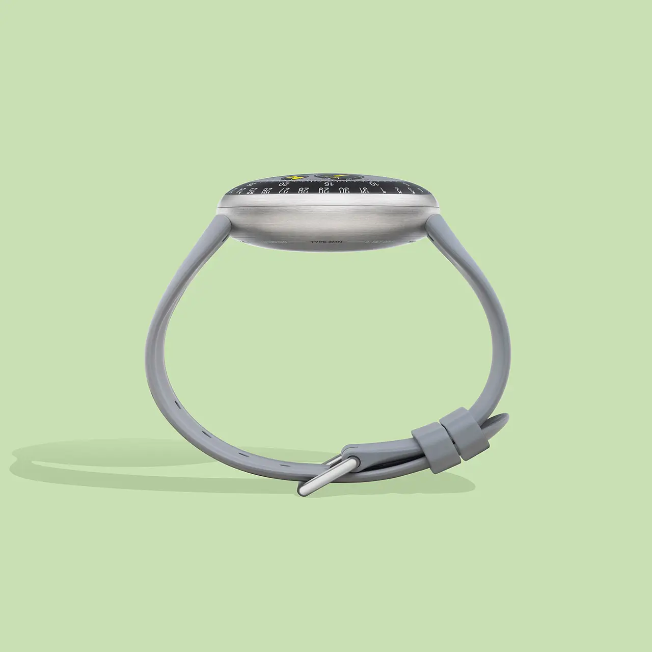
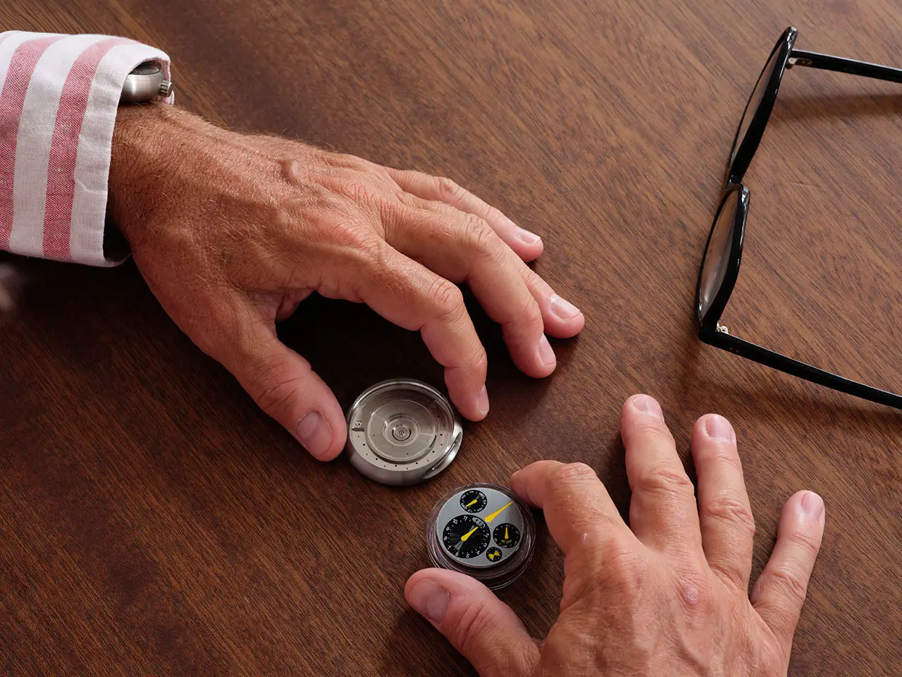
The TYPE 3 MN case is crafted from Grade 5 titanium, a material chosen as much for its lightness as for its technical honesty. Titanium aligns perfectly with both Ressence’s and Newson’s philosophies: strong, modern, and unpretentious. At 44mm in diameter, the watch sounds large on paper, but wears with surprising ease thanks to its ergonomic curvature and relatively thin profile.
The case houses two domed sapphire crystals—one on top, one on the back—both treated with anti-reflective coatings. These domes are not decorative. They are functional components that support the oil-filled architecture while reinforcing the illusion of depthlessness on the dial side.
Notably absent is a traditional crown. Instead, time-setting is handled via a rotating caseback, preserving the watch’s seamless silhouette. This detail alone speaks volumes about Ressence’s commitment to removing friction—both visual and physical—from the act of wearing and interacting with a watch.
Everything here serves a purpose. Nothing exists merely to reassure tradition.
haute
In luxury watchmaking, legibility is often sacrificed at the altar of complexity. Skeletonization, ornate hands, layered dials—these choices can be beautiful, but they often make time harder to read. Ressence has always argued the opposite: true luxury is effortlessness.
The TYPE 3 MN embodies this belief. The oil-filled display ensures clarity at virtually any angle. The rotating discs eliminate hand overlap. The typography is clean, modern, and proportionally balanced. Even in low light, the Super-LumiNova-filled engravings glow evenly, maintaining readability without overpowering the design.
This approach aligns perfectly with Marc Newson’s long-standing belief that good design should disappear into use. When something works intuitively, you stop noticing it—and that is the highest compliment.
The TYPE 3 MN does not demand attention. It earns it through calm confidence.
fwd
Despite its futuristic appearance, the TYPE 3 MN is not disconnected from watchmaking history. Its mechanical heart remains resolutely traditional, relying on proven movements and classical engineering principles. What changes is the way those mechanics are translated to the wearer.
In this sense, the watch becomes a bridge between eras. It respects mechanical heritage while rejecting visual nostalgia. It suggests a future where watches are not relics or status symbols, but refined tools—objects that quietly enhance daily life.
Marc Newson’s involvement reinforces this balance. His career has consistently navigated the tension between craft and industry, between human touch and machine precision. The TYPE 3 MN sits comfortably within that lineage, feeling both experimental and deeply resolved.
collect
The TYPE 3 MN is produced in a tightly limited edition, reinforcing its role as a design statement rather than a mass-market experiment. Yet its influence extends far beyond its production numbers. Like many of Ressence’s creations, its ideas ripple outward—challenging other brands to rethink how information is presented, how watches are interacted with, and what contemporary horology can look like.
This is not a watch chasing trends. It exists outside seasonal cycles and stylistic fads. Its appeal lies in its logic, not its novelty.
For collectors, the TYPE 3 MN represents something rare: a collaboration where both parties remain fully themselves, yet produce something neither could have made alone.
fin
Ultimately, the TYPE 3 MN does not try to redefine luxury through excess. It does so through reduction, clarity, and intelligence. It invites the wearer to experience time differently—not as something chopped into segments, but as a continuous, flowing phenomenon.
Marc Newson and Ressence have not reinvented time itself. They have simply removed the clutter we’ve built around it.
And in doing so, they have created one of the most thoughtful, forward-looking mechanical watches of the modern era.