Material 3 Expressive: A New Chapter in Google’s Design Language
May 7, 2025
It’s been more than a decade since Google unveiled Material Design, a visual language that redefined digital interfaces across platforms. Initially introduced in 2014 as a design philosophy for Android, Material Design became a unifying thread that shaped the visual and interactive identity of Google’s expansive ecosystem—from Gmail to Maps, Android to Chrome OS. With its emphasis on bold colors, responsive animations, and tactile surfaces, it aimed to bring coherence, clarity, and a touch of humanity to the fragmented Android landscape.
Now, in 2025, Google appears poised to push that philosophy further with Material 3 Expressive—an evolved vision of design language born not of arbitrary gradients or flat pragmatism, but of emotional resonance and research-led intuition. Leaked via a blog post ahead of this month’s Google I/O conference, Material 3 Expressive signals a transformative moment. It’s not just another refresh. It is a re-articulation of the relationship between digital form and user feeling.
The Legacy of Material
To understand the significance of this evolution, it helps to revisit the origins. Material Design, as initially conceptualized, was grounded in the metaphor of paper and ink. It offered designers a rules-based system of elevation, motion, and layout that made digital elements feel more natural and comprehensible. Animations weren’t cosmetic—they were instructive. Depth and shadow weren’t ornamental—they guided navigation.
But over time, criticism crept in. Some argued that Material Design’s rules were too prescriptive, leading to sameness. Others felt the focus on rational grid structures and color systems stifled brand individuality. And while Material Design 2 (launched around 2018) brought in more flexibility, allowing developers and companies to better tailor their visual identity, it was still constrained by a core set of behaviors and typographic hierarchies.
With Material You—the 2021 iteration—Google made personalization the centerpiece. The system dynamically adapted to a user’s wallpaper or preferences, allowing color palettes and layouts to shift accordingly. It was a move toward user-centric expression, but it still leaned heavily on consistency and harmony. Material You was soft, rounded, organic—but still bound by compositional logic.
Now, Material 3 Expressive builds upon this trajectory with greater ambition: not just expressing the user, but evoking emotion.
Design That Feels
According to the prematurely published blog post, Google’s guiding question for Material 3 Expressive wasn’t What should a button look like? but How should it feel? It’s a subtle but profound shift. The goal is not merely functional elegance or visual unity—it’s to engage the senses and reflect the complexity of human emotion in digital space.
This move away from “41 shades of blue”—a reference to the infamous A/B testing that once led to Google refining link color by statistical analysis—marks a return to a more human design process. It privileges intuition, artistic intent, and interdisciplinary collaboration over mechanical optimization.
What does this mean in practice?
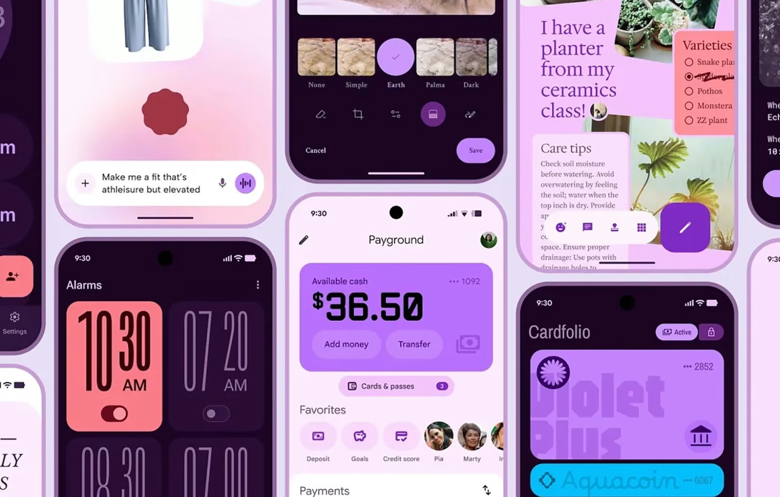
Material 3 Expressive favors unexpected color combinations, textural contrast, ambient motion, and layered depth. It incorporates gestural cues that feel responsive in a bodily way—not just functional but sensorial. It’s a design system that acknowledges that how something feels is just as important as what it does.
Color as Emotion
At the heart of this philosophy is color. Material You introduced dynamic color theming based on user preferences and device background images. But Material 3 Expressive takes this further. Instead of merely harmonizing tones, it allows for emotional dissonance—jolts of contrast, moody saturation, and thematic boldness.
This is not chaos—it’s character. Google has developed new color algorithms not just to “look nice” but to evoke mood. For instance, a meditation app might default to desaturated lilacs and soft teals, while a news app might harness bold reds and grounded neutrals. Rather than relying on fixed brand colors, Expressive palettes flex contextually—reflecting user state, time of day, even calendar events or local weather.
It’s a system of ambient personality—where color becomes less a static identity and more a living layer of emotional context.
Typography Reimagined
Google Fonts remains one of the most important typographic resources in the world, and Material 3 Expressive continues to lean on its depth. However, there’s a marked shift away from utilitarianism. Typography in this iteration becomes more performative. Display typefaces with high contrast, idiosyncratic proportions, or culturally-specific cues are increasingly welcome.
This re-valorizes typographic voice. Designers are encouraged to treat type not just as an information carrier but as a primary expressive element—able to speak tone, cadence, and attitude visually.
Motion, too, plays a role. Headlines and text fields might gently pulse or shift their baseline as a subtle response to input, imbuing forms with presence and affect.
Movement, Mood, and Microinteractions
One of the most transformative aspects of Material 3 Expressive is its approach to motion. While Material Design has always used animation as a signposting tool, Expressive treats it as emotional architecture.
Transitions now reflect narrative logic. A card might expand like a blooming petal when opened or shrink with recoil when dismissed—drawing from metaphors found in nature, theater, and choreography. These gestures are not just functional cues but embodied rhythms that make interacting with digital environments feel immersive and intuitive.
Microinteractions—the small moments of feedback when clicking a button, typing in a field, or dragging a slider—are richer, more resonant. They might glow, shift texture, or “breathe,” depending on input velocity, rhythm, or even ambient device sensors. These interactions allow for nuance—digital responses that aren’t just binary but atmospheric.
Bridging Culture and Platform
One of the long-standing critiques of Material Design was its Western design bias. Expressive seeks to address that by expanding visual and cultural references. Google is working with global design communities to incorporate aesthetics, gestures, and materials from diverse regions. That means more room for ornamental patterns, textural overlays, iconographies beyond minimalist norms.
This democratization doesn’t dilute the system—it deepens it. Expressive supports a modular structure, meaning regional styles, cultural idioms, and even ritual gestures can be translated into responsive UI systems without breaking functional cohesion. A banking app in Lagos, a social platform in Seoul, and a mental health tool in São Paulo might all look wildly different—but still feel grounded in Material Expressive’s design logic.
Tools for Designers and Developers
From a tooling perspective, Material 3 Expressive will arrive with updates to Google’s Material Theme Builder, Jetpack Compose, and Flutter integrations. This ensures that developers won’t be left wrestling with implementation. Google is investing in plug-and-play components that allow for granular customization while maintaining performance efficiency.
There’s also a new library of Expressive Tokens—a semantic design language that decouples visual properties from hardcoded variables. So instead of defining “ButtonColor = #4285F4,” a designer can declare “ButtonMood = Alert” and let the system derive context-aware visual properties. This opens up a vast creative field without sacrificing design fidelity.
Accessibility and Ethics in Expressiveness
More expressiveness means more potential for misalignment—overstimulating visuals, cultural missteps, or sensory overload. Google acknowledges this and is developing opt-in controls for visual intensity, motion sensitivity, and color contrast. Expressive isn’t about maximalism for its own sake—it’s about attunement.
Accessibility remains central. All expressive elements are being tested against WCAG standards and further tuned through user testing with neurodivergent and visually impaired communities. Expressive design shouldn’t just be beautiful; it should be inclusive by default.
From Interface to Atmosphere
The biggest philosophical leap in Material 3 Expressive is its ambition: to turn the interface into an atmosphere. Where earlier design systems treated screens as surfaces to organize and display information, Expressive sees them as spaces to inhabit—textured, responsive, emotionally calibrated.
This shift could define not just the look of Android in coming years, but how all digital environments evolve. As we move toward spatial computing, mixed reality, and emotionally intelligent systems, Expressive provides a bridge—a design language that feels poised to speak not just to the eye, but to the whole self.
Flow
Material 3 Expressive marks a pivotal turn in Google’s design legacy. It’s a move from rules to resonance, from uniformity to nuance. It doesn’t discard the foundations of Material Design—it extends them into a fuller, more human dimension. At a time when technology risks becoming either too generic or too chaotic, Expressive offers a third way: design that listens, reflects, and adapts—not just to what users do, but to what they feel.
Whether on Android, Chrome, Wear OS, or future spatial interfaces, Material 3 Expressive may well shape the emotional register of the digital world. In doing so, it reminds us that design, at its best, is not just about systems—it’s about stories.