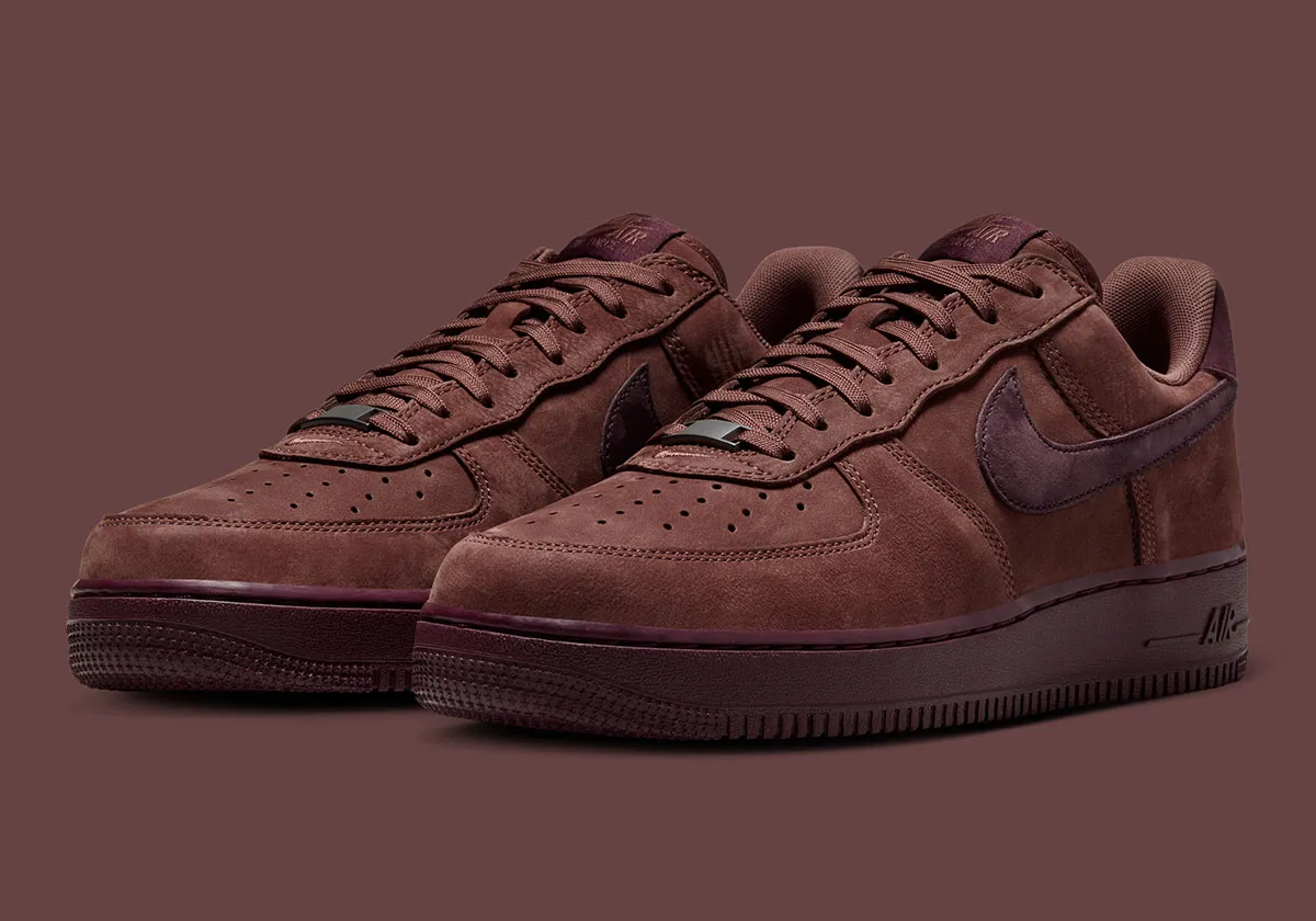
Nike Air Force 1 Low Premium “Red Sepia”
April 2, 2026
13 minutes ago
consider
Few silhouettes operate with the quiet authority of the Nike Air Force 1. Since its 1982 debut, the model has moved beyond hardwood origins into something closer to cultural infrastructure—an object that absorbs trend, rather than follows it. The “Red Sepia” iteration arrives within that lineage, not attempting reinvention but instead refining tone, texture, and timing.
Positioned for Spring/Summer 2026, this Premium build reads with an entirely different seasonal accent. Where most warm-weather releases lean toward breathability and brightness, this pair moves in the opposite direction—deep, grounded, and calibrated with restraint. It suggests a shift in how Nike is approaching its most enduring product: less reactive, more editorial.
stir
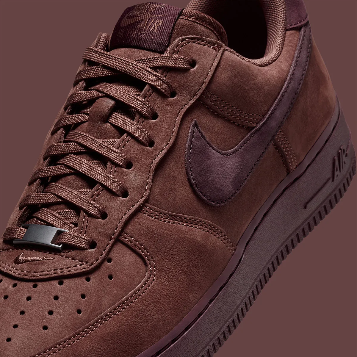
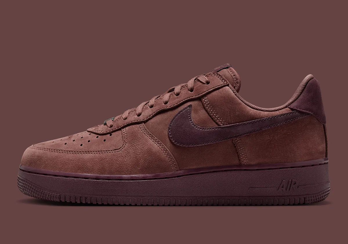
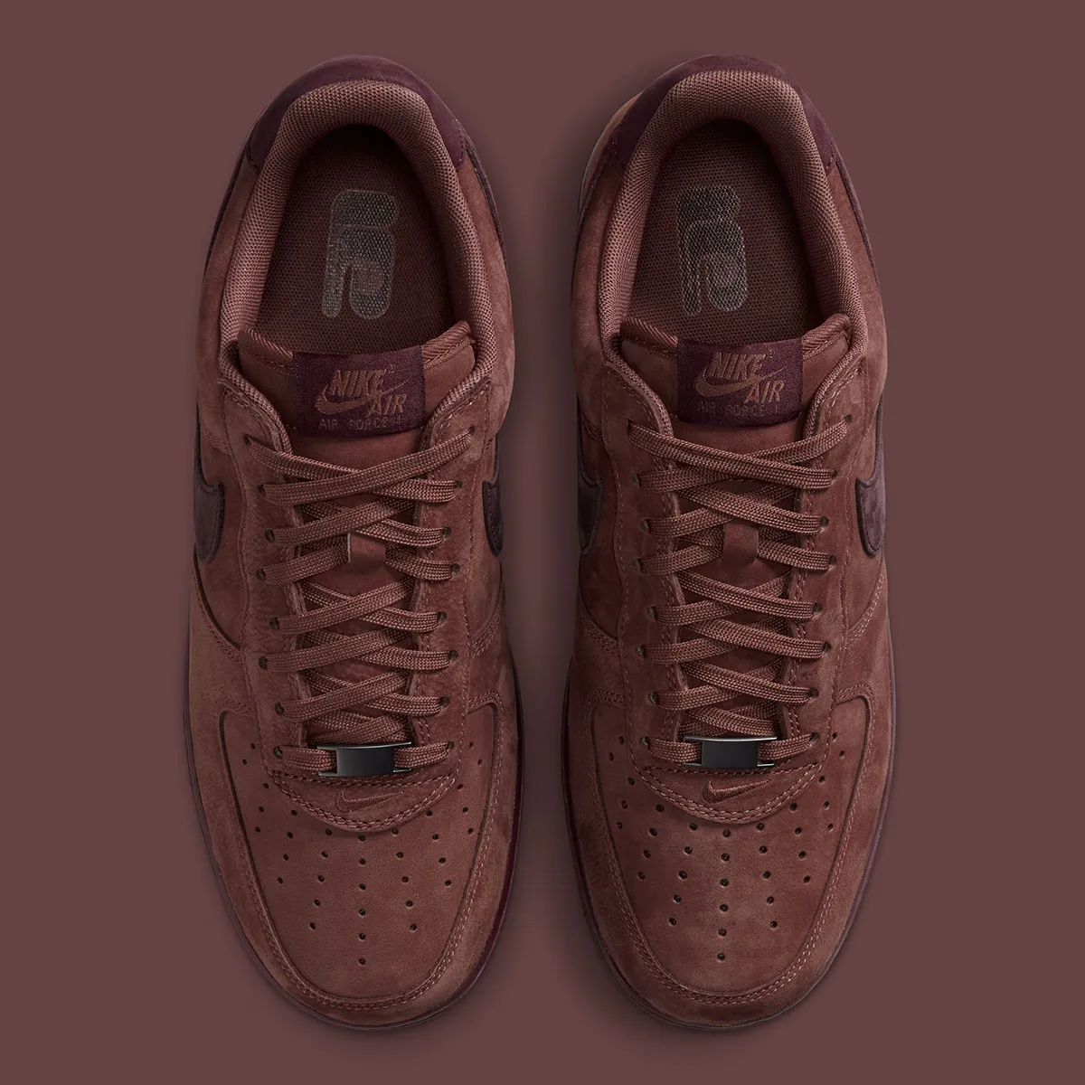
The core of the “Red Sepia” lies in its palette. A muted, earthy red dominates the upper—less saturated than varsity tones, closer to oxidized leather or aged pigment. It carries the visual weight of fall, yet is introduced months ahead of that season, creating a subtle dissonance that feels intentional.
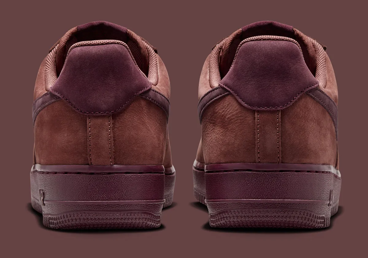
The Mahogany accents—applied across the Swoosh, heel tab, and midsole—anchor the composition. This darker register gives the shoe structure, preventing the Red Sepia from reading too soft or diffuse. Together, the tones form a near-monochromatic spectrum, one that leans into depth rather than contrast.
This isn’t color blocking in the traditional sense. It’s tonal layering—an approach more commonly associated with luxury footwear than mass-market sneakers. The effect is understated but deliberate, aligning with a broader shift toward quieter, more considered design language across Nike’s Premium tier.
flow
Nike’s recent Premium Air Force 1 builds have consistently emphasized material integrity over overt embellishment, and the “Red Sepia” continues that trajectory. The leather upper appears smooth yet substantial, with a finish that avoids excessive gloss while still catching light in subtle gradients.
There’s a notable absence of distraction. No patent overlays, no contrast stitching, no aggressive textural shifts. Instead, the shoe relies on the inherent quality of its materials to communicate value. It’s a move that aligns with contemporary consumer sensibilities—where discernment often replaces display.
The construction remains faithful to the Air Force 1 blueprint: perforated toe box, padded collar, and the familiar cupsole unit. Yet within that framework, the material upgrade recalibrates the silhouette’s presence. It feels less like a staple, more like a considered piece within a rotation.
idea
Perhaps the most telling detail is what’s missing. Nike has stripped the traditional branding from the heel, a move that has become increasingly common across its higher-tier releases. In its place: negative space.
This absence functions as a form of restraint. It shifts attention away from logo recognition and toward form, color, and proportion. For a model as instantly recognizable as the Air Force 1, the removal doesn’t diminish identity—it refines it.
In a landscape saturated with overt branding, this kind of quiet confidence resonates. It suggests that the silhouette no longer needs reinforcement; its legacy is already embedded.
intent
Releasing a fall-coded shoe in Spring/Summer is not an oversight—it’s a recalibration of the retail calendar. Nike appears to be challenging the expectation that colorways must strictly adhere to seasonal palettes.
This approach opens new possibilities for styling. The “Red Sepia” can function as a grounding element within lighter, summer-oriented wardrobes—introducing contrast without relying on brightness. It also extends the lifecycle of the shoe, allowing it to transition seamlessly into autumn without feeling outdated.
In this sense, timing becomes part of the design language. The shoe isn’t just an object; it’s a proposition about how and when it should be worn.
view
The “Red Sepia” arrives alongside a broader push to reinvigorate the Air Force 1, including the recent patent leather three-pack that leaned into nostalgia and visual impact. Where those pairs aimed to “restore the feeling” through familiarity and shine, this release takes a more introspective route.
It reflects a dual strategy: one that balances overt, attention-grabbing drops with quieter, more refined iterations. Together, they broaden the silhouette’s appeal, ensuring relevance across different segments of the market.
For long-time wearers, the “Red Sepia” offers something distinct without abandoning the core DNA. For newer audiences, it presents the Air Force 1 in a more elevated, contemporary context.
base
The strength of the “Red Sepia” lies in its adaptability. Its tonal depth allows it to anchor a range of looks without overwhelming them.
Paired with light-wash denim or neutral tailoring, the shoe introduces a controlled contrast—adding weight to otherwise airy compositions. Within darker palettes, it blends seamlessly, contributing to a cohesive, layered aesthetic.
It’s a sneaker that doesn’t demand attention, but rewards it. The nuances of its color and material reveal themselves over time, rather than at first glance.
fwd
The Nike Air Force 1 Low Premium “Red Sepia” doesn’t attempt to redefine the silhouette. Instead, it refines its language—through tone, material, and restraint.
It suggests a broader evolution within Nike’s approach: one that values subtlety over spectacle, and longevity over immediacy. In doing so, it repositions the Air Force 1 not just as a cultural constant, but as a platform for ongoing, nuanced design exploration.
rel
Name: Nike Air Force 1 Low Premium “Red Sepia”
Colorway: Red Sepia / Mahogany
Release Window: Spring/Summer 2026
Category: Lifestyle / Premium
In a landscape where sneakers often compete for attention through excess, the “Red Sepia” takes a different route. It leans into quiet confidence—allowing color, material, and proportion to carry the narrative.
For a silhouette that has already said so much, this restraint feels not only refreshing, but necessary.