Nothing Phone (3) and the Evolution of the Glyph Interface
June 4, 2025
10 months ago
When Nothing launched its first smartphone in 2022, it wasn’t trying to compete with the hyper-spec arms race of flagship Android devices. Instead, it positioned itself as a design-first disruptor—one that would upend what a smartphone could feel like, not just function like. The center of that promise was the Glyph Interface: a constellation of LED light bars on the back of the phone that blinked, pulsed, and danced in response to various notifications, sounds, and user prompts. It was a bold experiment in non-verbal interaction—a fusion of UX, minimalism, and sci-fi nostalgia that turned everyday communication into choreography.
But five days ago, that experiment appeared to end—or at least shift dramatically—when Nothing tweeted three cryptic words: “Glyph is dead.”
The internet, of course, didn’t believe it. No one really did. Instead, the tweet was interpreted as the end of a chapter—not a book. Now, with the recently released visual teaser for the Nothing Phone (3), the new chapter has a name: Glyph Matrix.
From Bars to Brains: The Genesis of the Glyph Interface
To understand where the Glyph Matrix is headed, we have to understand where it began.
The original Glyph Interface, first seen on the Phone (1) and refined in the Phone (2), consisted of carefully arranged white LED light bars embedded beneath a transparent rear case. The design felt instantly iconic—like a neon exoskeleton or a sci-fi artifact from a lost future. These light bars weren’t just aesthetic. They served real-world functions:
- Custom notifications: Different light patterns for different contacts or apps.
- Charging indicators: Lights would gradually fill as the battery charged.
- Flashlight prompts and camera countdowns.
- A quirky, stylish alternative to the traditional notification sound.
But most importantly, the Glyph Interface reintroduced intimacy and anticipation into a space that had become sterile. Where most phones were passive slabs of glass, the Glyph was performative—even theatrical.
Still, innovation has its limits. By the time the Phone (2) dropped, the novelty had plateaued. The light bars, while charming, were also inherently linear. There’s only so much you can convey with slashes and arcs. The interface, for all its charm, lacked the resolution to evolve—until now.
Glyph Matrix: A New Canvas Emerges
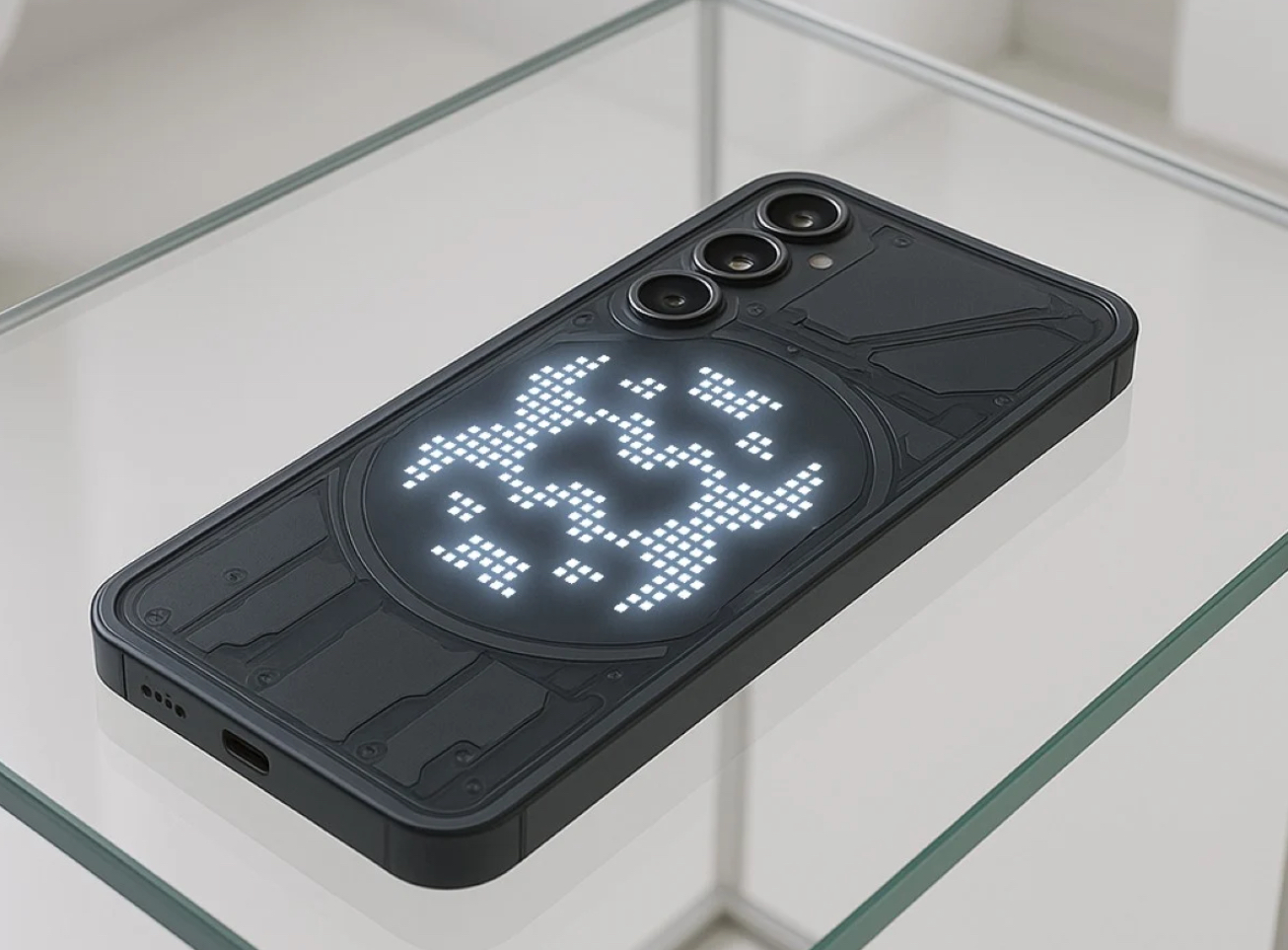
The teaser for the Nothing Phone (3) reimagines what glyphs could be. Rather than light bars embedded in geometric tracks, the Glyph Matrix introduces a circular grid of LED dots—not unlike a primitive pixel display. Think of it as a minimalist E Ink screen made of light.
So, what does the Glyph Matrix do differently?
- Increased Visual Complexity:
Unlike static bars, a matrix of dots offers far greater flexibility. It can form animated patterns, basic pictograms, and potentially even text or emojis. - Dynamic Notifications:
Instead of predefined animations, the matrix could be programmed for contextual visualizations—like a spiraling pattern for a voice memo, or a pulsing heart for a message from a loved one. - Brand Identity:
The circular layout—like a portal, spotlight, or eye—leans further into the retro-futurism Nothing thrives on. If the glyph bars were cybernetic ribs, the Glyph Matrix is the brain. - User Personalization at Scale:
With a simple app interface, users may be able to upload or design their own glyph animations, bringing the democratization of design to the back of their phones. - Functional Display Potential:
Could this be used to show charging percentages, step counts, or even a voice assistant pulse? Possibly. It’s the first time the Glyph Interface feels like it might step closer to becoming a secondary display—a leap toward post-screen interactions.
The Cultural Language of Light
From Blade Runner’s neon dystopia to the glowing glyphs of Arrival, light has always been language in futuristic storytelling. And Nothing understands that cultural code deeply. Carl Pei, the brand’s founder and a co-founder of OnePlus, has consistently spoken of Nothing’s mission to make tech feel human again—but not through skeuomorphic nostalgia. Instead, the company seeks a sensation-driven aesthetic: transparent casings, analog sounds, kinetic visuals.
The original Glyph Interface was a statement of values: that phones could be communicative objects, not just conduits. Now, with the Glyph Matrix, that language gets more semantic. Instead of blinking patterns, we might receive symbols. Light as metaphor. Light as mood. Light as notification, yes—but also light as message.
In this, Nothing separates itself from other Android manufacturers. It’s not just adding specs; it’s adding stories. And those stories live in the peripheral—the side glance, the moment you flip your phone on a table and catch the glow.
Limitations and Doubts: The Bright Risk of Reinvention
Of course, all innovation courts skepticism—and the Glyph Matrix is no exception.
Power Consumption
Will a more complex matrix of lights drain battery faster? If the matrix becomes more dynamic or data-driven, power efficiency will be a concern. LED arrays—even small ones—can add up.
Practical Usefulness
Do users really need a miniature pixel grid of light on the back of their phone? The glyph bars already flirted with redundancy. The Glyph Matrix will need to justify its complexity with genuine utility.
Gimmick vs. Interface
As always with radical UI/UX shifts, there’s a thin line between gimmick and revolution. The matrix must feel integrated, not accessory. If it simply animates like a Tamagotchi without deeper connectivity, it risks becoming visual noise.
App Integration and API Expansion
Will developers be able to build glyph-based features? Will third-party apps integrate with the Matrix? The Glyph’s success hinges on it being more than a pre-baked visualizer—it must become a platform.
Design Beyond Screens: The Future of Peripheral Interfaces
Nothing’s move from bars to matrix signals something deeper: a paradigm shift in how we interact with devices.
In traditional mobile design, screens dominate. Front-facing. Central. Total. But the Glyph Matrix suggests a future where the back of your phone is just as communicative—where we develop peripheral interactions that don’t require unlocking, swiping, or tapping.
This reflects a broader trend in tech
- Apple’s Dynamic Island turns the notch into an interface.
- Humane’s AI Pin uses projection instead of screens.
- Ray-Ban Meta smart glasses use LED cues for notifications.
In all of these cases, the goal is ambient computing—technology that fades into the periphery of consciousness until it’s needed.
The Glyph Matrix could be a step toward this future. A passive alert system, a visual mood ring, a low-res assistant. Its value lies not in replacing the screen, but in augmenting attention.
Nothing’s Brand Philosophy: Lightness as Depth
There is a certain irony to the name “Nothing.” On the surface, it suggests emptiness. But in practice, it’s about clearing the clutter—offering a device that feels weightless, both physically and metaphorically.
Nothing’s products, from the Ear (1) to the Phone (2), have consistently embraced
- Transparency (literally, in hardware)
- Reduction (in bloatware and marketing speak)
- Surprise (in Easter eggs and launch events)
The Glyph Matrix, then, is a natural evolution of this ethos. Instead of adding a second screen or unnecessary lens, it refines what’s already there—turning light into an operating system.
The Road Ahead: Speculation, Spec, and Specimens
The teaser image leaves much to the imagination—but some plausible features and possibilities for the Phone (3) include:
- A higher refresh rate screen (likely 120Hz LTPO OLED).
- A redesigned Nothing OS interface optimized for matrix cues.
- A collaboration with visual artists or musicians to generate glyph packs.
- A haptic engine synced to glyph pulses.
- AI-enhanced glyph routines (e.g., mood detection, smart summaries).
- A “Glyph Store” or custom marketplace for animations, similar to ringtones in the 2000s.
If Nothing executes this right, we may witness a new micro-medium of expression: just as GIFs transformed emoji culture, glyphs may become a silent, visual shorthand for personality, emotion, and communication.
Impression: Glyph Isn’t Dead—It’s Just Getting Smarter
When Nothing announced the death of the Glyph Interface, it wasn’t the end—it was a provocation. A design death, in this case, was metamorphosis. The Glyph Matrix isn’t just a sequel—it’s a rebirth. From linear to radial. From ambient to semantic. From expressive to possibly intelligent.