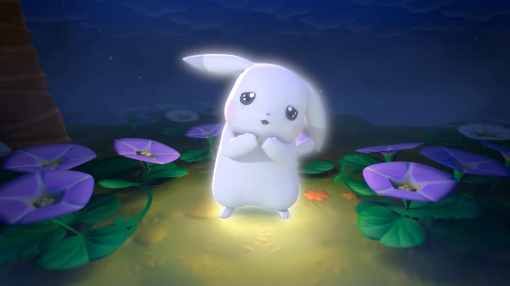
For twenty-five years, Pikachu has been one of the few constants in a pop-culture landscape defined by reinvention. Characters have been redesigned, franchises rebooted, and entire fictional universes reassembled to meet the demands of new generations. Through all of that turbulence, the Pokémon franchise maintained a single, unwavering promise: Pikachu would remain Pikachu. Yellow. Energetic. Electric. Recognizable in silhouette alone. But in a world where nostalgia evolution has become its own kind of currency, even icons can shift. And now, after a quarter-century of steadfast visual identity, Pikachu has appeared in a softened, muted, almost pastel reinterpretation—what fans are calling “Pale Pikachu.”
It is not a shock redesign. It is not an edgy rebrand. It is something subtler: a gentle shifting of a cultural monolith toward an aesthetic of quietness, calm, and softness. And the implications of that shift say as much about the moment we occupy culturally as they do about Pokémon itself.
This is Pikachu, but with the saturation dialed down, the expressiveness lowered to a softer hum, the overall design gliding closer to plush minimalism. The creature is still unmistakably itself, but it looks as though a familiar melody has been conjured on a different instrument. It is the same song—new tone.
And for a character whose face sells billions of dollars in merchandise, licensing, animation, gaming, and global identity, this tonal shift is not trivial. It is strategic, it is symbolic, and it is part of a larger recalibration of what “cute” means in the 2020s and beyond.
transition
To understand why a paler, quieter Pikachu exists at all, one has to consider the evolution of its visual archetype. Pikachu originally emerged from an era of loud primary colors and sharp silhouettes—design principles that dominated Japanese character culture through the late twentieth century. Characters like Hello Kitty, Doraemon, and Keroppi occupied a playful but high-contrast visual space. Pikachu joined them as the newest face of 1990s kid culture, arriving with a yellow so bright it bordered on neon under certain lighting conditions. That color communicated energy, joy, electricity, and instant recognizability on packed toy shelves and Game Boy screens.
But the global design ethos has shifted dramatically in recent years. A gentler, more contemplative palette now dominates lifestyle branding, animation, and character IP. Soft neutrals. Pastels. Muted tones that evoke comfort rather than stimulation. The “quiet aesthetic” movement—visible in fashion, interiors, and media—has reshaped the visual grammar that defines what feels modern.
In that context, Pale Pikachu feels less like a redesign and more like a familiar character translated into the dialect of contemporary design culture.
Crucially, this isn’t about making Pikachu “better.” It’s about making Pikachu relevant to a generation that prizes tenderness over spectacle. Where the original mascot shouted its cuteness, the new variant whispers it. The eyes are rounder, the textures softer, the energy divine rather than electric. It’s Pikachu imagined through a lens of emotional gentleness.
This shift shouldn’t be read as a replacement for classic Pikachu but as an expansion—an alternate reading of a character whose design has proven flexible enough to withstand recontextualization without losing its core identity.
View this post on Instagram
idea
Why does a softer Pikachu resonate? Because the modern consumer—especially younger audiences—craves emotional safety in their media environments. Harshness is out. Soothing is in. A generation raised amidst global instability turns toward characters that provide comfort and softness.
Mascots serve psychological functions beyond entertainment. They become emotional proxies. They absorb and reflect the feelings of the communities that embrace them.
A paler Pikachu offers something distinct from the original: a sense of calm. The vibrant Pikachu of the 1990s radiated kinetic energy—an avatar of childhood chaos and excitement. Pale Pikachu moves in the opposite direction, representing relaxation, coziness, introspection. It’s still cute, still charming, but its presence lands with a gentler emotional weight.
This shift is mirrored across other cultural domains. Studio Ghibli’s Totoro merchandise, once a niche fandom item, has exploded in popularity as a comfort symbol. Sanrio has leaned heavily into “relatable” or “emotionally vulnerable” characters—characters that look tired, anxious, or shy. Even global kids’ brands like LEGO and Disney are leaning into calm color palettes.
Pikachu’s pale transformation taps into that cultural wavelength.
fwd
What makes this design iteration effective is its restraint. The core blueprint remains intact. The cheek marks, the tail, the proportions, the overall silhouette—everything that makes Pikachu instantly identifiable remains untouched. The designers have made a statement not through alteration, but through modulation.
They have proven that Pikachu does not need to be “redesigned” to feel new. Pikachu only needs to be re-toned.
This is important because Pikachu is not just a character but a symbol. It represents Pokémon itself—the world’s most valuable entertainment franchise by some measures. Pikachu appears on passports, aircraft, parade balloons, Olympic ceremonies, NFTs, murals, fashion collaborations, and promotional campaigns across every continent with a retail presence. Changing this mascot is not merely a creative decision. It is a business one.
Maintaining the blueprint ensures Pikachu’s brand stability, while the softer palette introduces freshness without risk. It’s evolution with a safety net.
err
Pokémon has entered an interesting phase of maturity. It is no longer the chaotic, rapid-expansion brand of the late 1990s or 2000s. Instead, it is settling into its role as an intergenerational ecosystem—a franchise that belongs as much to adults as it does to children.
A softer Pikachu is a bridge between those demographics.
For kids, Pale Pikachu is approachable and cute. For adults, it aligns with contemporary minimal aesthetics. For collectors, it introduces novelty. For design enthusiasts, it signals cultural shift.
This design also opens the door for new merchandise categories—particularly home goods, lifestyle products, higher-end collaborations, and minimalist fashion. The classic bright yellow mascot may not seamlessly integrate into modern interiors, but the softer Pikachu absolutely does. It brings Pokémon into spaces where it previously felt too loud.
It isn’t difficult to imagine Pale Pikachu appearing in a Muji-adjacent merchandise drop, a Uniqlo minimalist capsule, or a global collaboration with design-forward partners like Gentle Monster, HAY, or even IKEA. This version of Pikachu is aesthetically flexible. It blends rather than dominates.
In many ways, that is the point.
without
Most character redesigns happen either in response to criticism or to generate a marketing spike. Pale Pikachu represents neither. This redesign is not the result of fan backlash, declining popularity, or rebranding necessity. Pikachu has remained globally beloved, merchandised, and instantly recognizable for decades.
This makes the choice even more interesting. It represents growth for the sake of evolution, not repair. It signals confidence from The Pokémon Company: a willingness to play with its sacred mascots without fear of destabilizing the brand.
And importantly, this is not intended to replace classic Pikachu. Instead, Pale Pikachu is additive—another face of a multifaceted character.
Like Mario’s countless suits, Kirby’s endless transformations, or Mickey Mouse’s countless stylistic iterations, Pikachu now has an alternate form that expands its expressive capacity.
gen
There is an emotional resonance to this change that transcends aesthetic preference.
For those who grew up with Pikachu, the pale version feels like a metaphor for aging with the franchise. The character that once symbolized high-energy childhood now reflects a sense of gentler adulthood. The shift mirrors how fans themselves have matured. Pikachu has softened in the same way many of its original viewers have softened—just enough to feel familiar, but different enough to mark time.
It is a rare moment in pop culture when a mascot ages not literally, but tonally.
evolve
Pale Pikachu is more than a color variation. It is the embodiment of a cultural moment—a symbol of how softness has become a preferred aesthetic and emotional mode for a global audience searching for comfort.
It preserves the essence of what Pikachu has always been while acknowledging the emotional climate of the era. It is evolution without erasure, innovation without risk, novelty without rebellion.
Most importantly, it is proof that even the most iconic characters can evolve gently, subtly, and beautifully.
Pikachu has not changed. Pikachu has shifted. Pikachu has softened. And in doing so, the character reminds us that sometimes the most powerful redesigns are the quietest ones.


