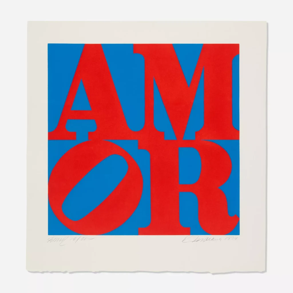
Robert Indiana’s AMOR (1994) stands as both a continuation and transformation of one of the most iconic motifs in modern art. The Spanish word for “love,” rendered in the same bold typographic style that made his LOVE series famous, demonstrates Indiana’s enduring fascination with language, geometry, and emotional universality. By translating his quintessential American Pop Art symbol into another language, Indiana expands the reach of his message beyond borders and into the realm of global communication. AMOR is not merely a translation—it is an evolution, a bridge between cultures, and a reaffirmation of Indiana’s faith in the visual and spiritual power of the word.
the evolution of love
When Indiana first conceived LOVE in the 1960s, he could not have foreseen how it would transcend time and geography to become a visual shorthand for affection, faith, and connection. Yet by 1994, when he created AMOR, the artist had lived through decades of both celebration and struggle. The ubiquity of LOVE—appearing on stamps, sculptures, and countless reproductions—had simultaneously immortalized and haunted him. For Indiana, returning to the motif in another language was not repetition but renewal.
AMOR continues the typographic arrangement that defines Indiana’s most recognized works: the first two letters “A” and “M” rest on top, while “O” and “R” form the base. The “O,” as in LOVE, leans diagonally—a subtle but deliberate distortion that injects a sense of movement and imperfection into the otherwise rigid structure. This tilt captures Indiana’s nuanced understanding of love as both beautiful and unstable, rational and chaotic. It is a visual metaphor for the fragility of human emotion and the tension between balance and imbalance that characterizes life itself.
language as a universal medium
Indiana’s decision to render the word “love” in Spanish was deeply symbolic. The early 1990s marked a period of reflection and reinvention for the artist, who had withdrawn to Vinalhaven, Maine, in partial self-exile from the New York art scene. From that geographic isolation came a renewed desire for connection—an acknowledgment that love, and art, transcend linguistic boundaries.
Spanish, with its lyrical cadence and Latin origin, adds warmth and universality to the composition. AMOR becomes not just an English concept of affection but a global proclamation. It’s an affirmation of Indiana’s lifelong dialogue with the world through words. This multilingual approach extended to other versions—AHAVA (Hebrew), EAT, HUG, HOPE—each word reimagined as both a visual object and a spiritual statement.
In this sense, AMOR is a linguistic ambassador of love. It speaks to Indiana’s belief that visual art can operate as a universal language—one capable of conveying moral and emotional truths without translation.
color and composition
In AMOR, Indiana deploys the same bold red and blue palette that characterized much of his LOVE work. Red, the color of passion, vitality, and emotion, dominates the letters. Blue fills the negative space—a cool, infinite field suggesting depth and tranquility. The pairing evokes the dualities inherent in love itself: warmth and distance, desire and serenity, the corporeal and the spiritual.
The clean, geometric forms of the letters reflect Indiana’s fascination with symmetry and industrial design, rooted in his early exposure to American signage and stenciled lettering. By adopting the visual language of commerce—billboards, advertisements, road signs—he subverted it, transforming the tools of consumerism into symbols of introspection. The flat, high-contrast fields of color draw from the techniques of printmaking and mass reproduction, but the emotional charge of the word defies mechanical detachment.
pop art meets devotion
Although Robert Indiana was closely associated with the Pop Art movement, his artistic philosophy diverged from the ironic detachment often associated with it. Where Andy Warhol and Roy Lichtenstein examined surface and repetition, Indiana infused text with metaphysical significance. His art was spiritual in the guise of Pop.
In AMOR, this spiritual undercurrent remains palpable. The cruciform alignment of the letters—a vertical “A-M” over a horizontal “O-R”—mirrors the structure of a cross. The intersection of language and faith becomes a recurring motif in Indiana’s oeuvre, reflecting his Christian Science upbringing and his ongoing meditation on the sacred in the secular. The result is a work that reads as both visual poetry and modern scripture: a prayer painted in typographic form.
1994: a moment of reflection
By 1994, Indiana was approaching his mid-sixties. His career had experienced both meteoric success and prolonged obscurity. The art world’s commodification of LOVE had left him disillusioned, yet his belief in the purity of its message endured. AMOR can thus be read as a reclamation—a reminder that beneath the iconography lies sincerity.
It was also a period of cultural globalization, when artists were re-engaging with questions of translation and multiculturalism. Indiana’s choice to express “love” in Spanish—one of the world’s most spoken languages—placed his work within a broader dialogue about inclusivity and connection. The simplicity of AMOR’s design belies its philosophical weight: that love, in any tongue, remains the most radical and universal idea.
the tilted “O”: movement and meaning
The tilted “O” has become Indiana’s most distinctive signature, and in AMOR, it assumes renewed importance. Unlike the upright stability of the other letters, the slanted “O” introduces kinetic tension—a sense that the word is alive, caught in perpetual motion. This slight deviation from perfection suggests that love, while central, is never static.
The shift also transforms the grid into something more human. It breaks the mechanical symmetry, implying vulnerability within structure. In design terms, the tilt generates visual rhythm; in symbolic terms, it reflects emotional truth. This is the genius of Indiana’s formal economy—how a single typographic adjustment can evoke the pulse of feeling.
culture
In the years following its creation, AMOR achieved public and institutional acclaim comparable to LOVE. Sculptural versions of AMOR have been installed in cities across the world, from Bogotá to Madrid to Philadelphia, where a red AMOR sculpture stands alongside its English counterpart in the city’s famed LOVE Park. These installations form a cross-lingual dialogue between cultures, embodying Indiana’s conviction that art should be democratic and accessible.
The image’s resonance lies in its universality. AMOR functions as both a word and an image, a message and a mirror. It invites the viewer to contemplate not only love’s linguistic form but also its emotional reality. The absence of ornamentation allows the concept itself to dominate—pure, bold, and inescapable.
impression
Robert Indiana’s AMOR (1994) distills decades of artistic pursuit into a single, timeless statement. It reaffirms the artist’s commitment to simplicity as a path to profundity, to the belief that love—rendered through color, line, and form—can be endlessly renewed. By reimagining LOVE in another language, Indiana affirms that love is not a static concept bound by culture or geography; it is a living force, ever evolving, ever necessary.
In AMOR, red and blue collide to form a visual heartbeat. Letters become architecture. Language becomes emotion. And Indiana, through the eloquence of design, reminds us that art’s greatest power lies not in novelty but in its capacity to make the familiar eternal.


