SAINT Mxxxxxx 26SS Drop 7 — The Stone Roses, Fragmented
April 8, 2026
2 hours ago

SAINT Mxxxxxx doesn’t recreate the past—it edits it until it feels unstable.
Drop 7, arriving April 11, reads like a correction. Not louder. Not more collide for the sake of it. Just more precise about what the brand actually does: destabilize memory, then print it onto fabric cloth.
The names are there—The Stone Roses, Sean Wotherspoon, Kosuke Kawamura—but they don’t behave like headlines. They function more like interference patterns. Each one bending the surface of the clothes in a different direction.
Nothing resolves cleanly. That’s the point.
View this post on Instagram
decompose
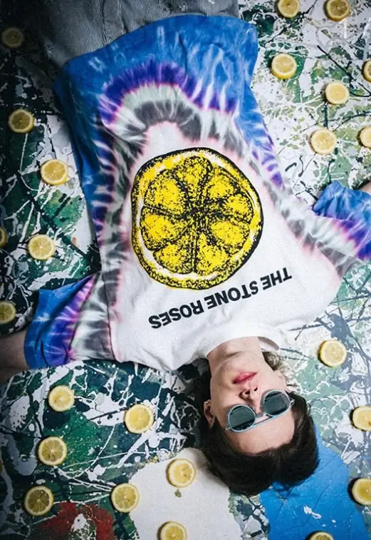
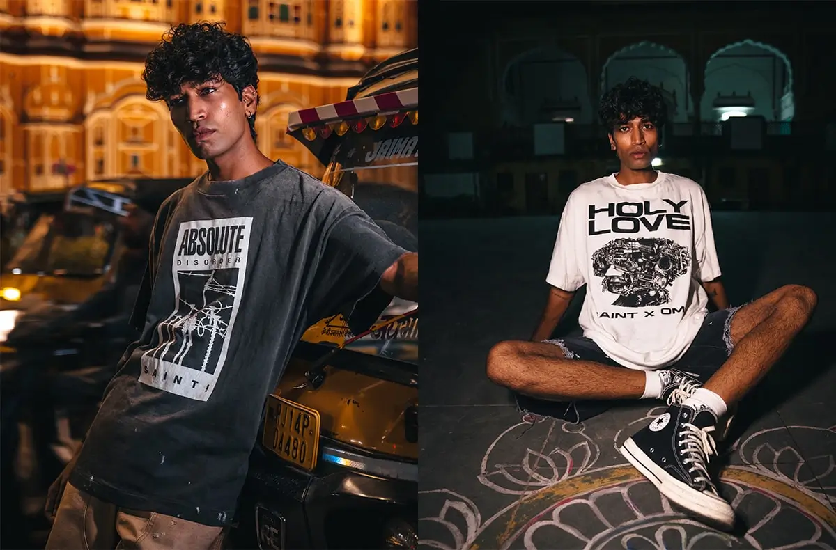
The graphics tied to The Stone Roses don’t arrive intact. They arrive already compromised.
The familiar lemon motifs—normally bright, declarative—are dulled, misaligned, partially erased. Prints look like they’ve been handled too many times before you ever touch them. Ink fractures. Edges ghost outward.
It doesn’t read like official merchandise. It reads like a memory of merchandise. Something you saw once, misremembered, then found again in worse condition.
That’s where SAINT Mxxxxxx sharpens its edge: it removes certainty from things you thought you knew.
Not homage. Decomposition.
imperfect
Sean Wotherspoon doesn’t inject color—he destabilizes uniformity.
The Japan-exclusive tie-dye tees are the clearest signal. No two feel aligned. The dye spreads unevenly, sometimes pooling, sometimes disappearing into the fabric. The palette resists saturation—washed tones, slightly exhausted, like they’ve already been through light, air, time.
It avoids the usual trap of tie-dye as spectacle. There’s no performance here. No forced individuality.
Instead, each piece feels quietly singular. Not because it announces itself, but because it can’t be replicated exactly.
Wotherspoon’s sustainability has always been about attachment, not messaging. You keep something because it feels irreplaceable. These tees understand that instinct without explaining it.
other side
With Kosuke Kawamura, clarity is treated as expendable.
Graphics arrive interrupted. Faces sliced and reassembled incorrectly. Typography collapses mid-word. Layers overlap like they weren’t meant to align in the first place.
But the disruption isn’t random—it’s controlled enough to feel intentional, unstable enough to feel unresolved.
Kawamura doesn’t decorate garments. He stresses them. Forces them to carry tension.
Within SAINT Mxxxxxx’s framework, that tension becomes language. The more broken the image, the more it communicates.
restrain
The Japan-exclusive tie-dye pieces deserve a second look—not because they’re rare, but because they’re unusually quiet.
Tie-dye usually insists. These don’t.
Color sits closer to the fabric. It doesn’t jump. It lingers. Some areas feel almost untouched, others oversaturated, but never evenly distributed. The imbalance is the design.
It reframes tie-dye from statement to condition. Not something added, but something that happened.
And that shift—from decoration to evidence—is what keeps the pieces from collapsing into trend.
flow
Camo in Drop 7 behaves like it’s losing memory.
Patterns blur at the edges. Tones drift away from their usual greens and browns into something less defined. At a distance, it reads familiar. Up close, it stops making sense.
The silhouettes—jackets, pants, sets—stay grounded. Functional, almost standard. But the surface refuses stability.
You recognize the pattern, but it doesn’t hold. It slips.
That instability turns one of fashion’s most overused codes into something slightly disorienting again.
stance
The presence of The Stone Roses, Sean Wotherspoon, and Kosuke Kawamura isn’t pushed to the front. There’s no heavy branding, no insistence that you acknowledge who did what.
Instead, their contributions sit inside the garments:
The Stone Roses distort familiarity.
Wotherspoon destabilizes repetition.
Kawamura fractures image integrity.
Three different manipulations of memory. None of them competing.
It’s collision as layering—not stacking logos, but altering texture.
drive
SAINT Mxxxxxx continues to play a precise game with time.
Everything here is new. Manufactured. Deliberately constructed. And yet almost nothing feels fresh in the conventional sense.
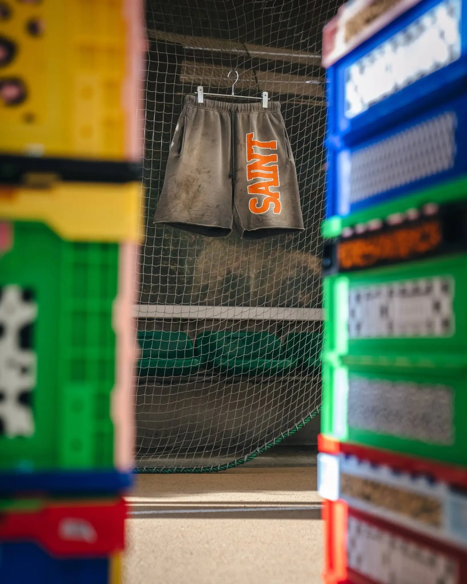
Prints crack. Colors fade. Fabrics look handled before they’ve been handled.
But it doesn’t try to replicate specific vintage references. There’s no exact decade, no archival citation. Instead, it simulates the feeling of something that has existed long enough to lose clarity.
That’s the distinction.
Vintage, here, isn’t chronological. It’s emotional.
A garment doesn’t need a past—it just needs to feel like it could have one.
huh
Drop 7 doesn’t introduce a new idea. It tightens an existing one.
Earlier SAINT Mxxxxxx releases leaned heavier on recognizable references—graphics that still held onto their origins, distressing that read more aesthetic than conceptual.
Here, the brand lets go more.
Images are less legible. Patterns less stable. Techniques less performative.
It trusts the viewer to sit with ambiguity.
And in doing so, the collection feels less like a series of pieces and more like a continuous atmosphere—one where nothing is fully fixed, but everything feels intentional.
theory
There’s no single item that defines Drop 7. No obvious “hero.”
Instead, what stays with you is the afterimage:
A band graphic you can’t fully recall.
A dye pattern that refuses symmetry.
A camo print that dissolves as you look at it.
Individually, they don’t demand attention. Together, they linger.
That lingering is the product.
sum
When Drop 7 lands on April 11, 2026, it won’t arrive as spectacle. It won’t need to.
It operates differently. Slower. More internal.
You don’t buy into it because it’s new. You buy into it because it feels like something you’ve already lived with—even if you haven’t.
And that’s the quiet trick SAINT Mxxxxxx keeps refining:
Not designing clothes.
Designing familiarity—then breaking it just enough to make it yours.