There are mixologies that feel inevitable, and then there are those that arrive with a certain tension—where two distinct visual languages collide and, in doing so, sharpen one another. The meeting of SAINT Mxxxxxx and Attack on Titanbelongs firmly to the latter.
At first glance, the alignment seems intuitive: a globally revered anime defined by brutality, existential dread, and moral ambiguity, paired with a label whose identity is rooted in decay, memory, and the aesthetics of the worn. Yet the success of this bind lies not in surface compatibility, but in how deeply each entity’s philosophy is embedded into the final object.
This is not merchandise. It is translation—of narrative into texture, of violence into material, of animation into something tactile and enduring.
lang/ruin
SAINT Mxxxxxx, co-founded by Yuta Hosokawa and Cali Thornhill DeWitt, has built its reputation on a precise kind of imperfection. Garments arrive already aged—faded, distressed, fractured in ways that feel less manufactured and more excavated. Each piece carries the suggestion of a previous life.
This sensibility finds a natural counterpart in Attack on Titan. The world of the series is defined by erosion—of cities, of bodies, of certainty itself. Walls crumble, alliances fracture, and the line between human and monster dissolves over time. It is a narrative obsessed with what remains after destruction.
By embedding Titan imagery into garments that already appear weathered, SAINT Mxxxxxx doesn’t simply print the story—it extends it. The distressing becomes part of the narrative language. The garment feels as though it has survived the same world it depicts.
flow
At the core of the collide is a technical decision that carries conceptual weight: the use of an unusually high number of printing screens. This is not an incidental production detail; it is a deliberate attempt to preserve the integrity of the original artwork.
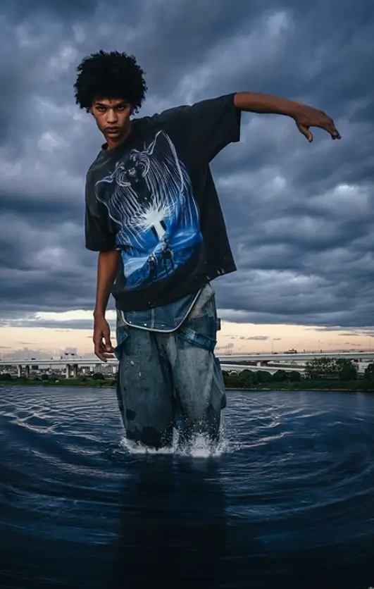
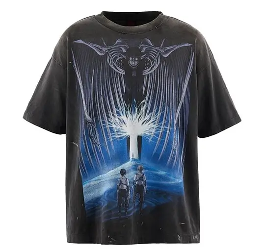
The linework of Attack on Titan—whether drawn from manga panels or anime stills—is dense, expressive, and often chaotic. Shadows are not soft gradients but aggressive strokes, layered to create tension and depth. Translating this onto fabric without losing clarity requires precision.
By increasing the number of screens, SAINT Mxxxxxx ensures that each line remains intact, each shadow legible. The result is a print that resists flattening. It retains the urgency of the source material, allowing the image to breathe even within the constraints of cotton.
In an era where graphic T-shirts often reduce imagery to simplified, mass-friendly visuals, this approach feels almost archival. It treats the artwork not as decoration, but as something to be preserved.
archive
The T-shirt itself is constructed from heavyweight fabric—substantial, structured, and intentionally resistant to the disposable nature of fast fashion. The fabric has been treated to achieve a faded black tone, somewhere between charcoal and washed ink, evoking garments that have been worn repeatedly over time.
Distressing is applied with restraint. Rather than overt tears or exaggerated damage, the surface carries subtle signs of wear: softened edges, uneven fading, slight variations in tone. These details accumulate, creating a sense of history.
This is where SAINT Mxxxxxx distinguishes itself. The brand does not simulate age; it composes it. Each mark is placed with intent, contributing to a broader narrative of use and endurance.
Within this context, the Attack on Titan imagery takes on new meaning. It is no longer a static graphic, but part of a larger surface that speaks to time. The violence of the series is mirrored in the garment’s texture—not literally, but atmospherically.
idea
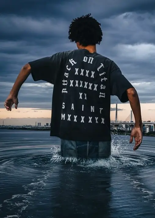
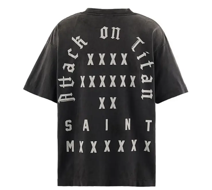
Turn the garment over, and the collaboration reveals itself more explicitly. Branding is placed on the reverse, a detail that feels almost secondary to the front-facing narrative. This inversion is subtle but significant.
In many collaborations, branding dominates—logos enlarged, partnerships announced with clarity. Here, it recedes. The emphasis remains on the image, on the experience of the garment as an object rather than a billboard.
This decision aligns with SAINT Mxxxxxx’s broader ethos. The brand operates within a space where recognition is often coded rather than declared. Those who understand, understand.
show
The release is limited to Japan, a decision that reinforces the collaboration’s cultural specificity. Both SAINT Mxxxxxx and Attack on Titan are deeply rooted in Japanese creative ecosystems, even as their influence extends globally.
By restricting distribution, the collaboration gains a certain gravity. It becomes less accessible, more intentional. For collectors, this exclusivity adds another layer of meaning—transforming the garment into an object of pursuit.
Yet the themes it engages with are universal. The tension between humanity and monstrosity, the weight of survival, the erosion of certainty—these are not confined to a single geography. They resonate across contexts, making the piece legible even beyond its immediate cultural origin.
why
Streetwear has long operated as a site of storytelling, but the SAINT Mxxxxxx x Attack on Titan collide pushes this idea further. It treats the garment not just as a canvas, but as a medium through which narrative is extended.
The wearer becomes part of this extension. The act of wearing the T-shirt introduces movement, context, and time into the piece. The garment continues to age, to fade, to accumulate its own history.
In this sense, the collab is not static. It evolves. The initial distressing is only the beginning; what follows is determined by the wearer.
rare
Within the language of streetwear, the term “grail” is often overused. Yet in this case, it carries weight. The combination of limited availability, meticulous production, and cultural resonance positions the T-shirt within a different category.
It is not simply desirable; it is considered. Each element—from the print technique to the fabric treatment—contributes to a cohesive whole. There is a sense that nothing has been left to chance.
For collectors, this level of intention matters. It transforms the object from a product into a piece of design history, tied to a specific moment and collaboration.
link
What defines the SAINT Mxxxxxx x Attack on Titan collaboration is its refusal to dilute either side. The brutality of the source material remains intact, just as the brand’s commitment to vintage aesthetics is uncompromised.
Rather than meeting in the middle, the two identities overlap—creating a space where both can exist fully. The result is a garment that feels cohesive without being predictable.
It is rare for a collision to achieve this balance. Too often, one element dominates, or both are softened in the name of accessibility. Here, the tension is preserved—and it is precisely this tension that gives the piece its power.
fin
To wear this T-shirt is to carry a fragment of a larger narrative—one defined by conflict, erosion, and survival. It is an object that acknowledges the past while continuing to evolve in the present.
In translating the world of Attack on Titan into the material language of SAINT Mxxxxxx, the collaboration achieves something rare: it makes the intangible tangible.
Not through simplification, but through fidelity. Not through spectacle, but through detail.
The result is a piece that lingers—not just visually, but conceptually. A garment that doesn’t merely depict a world, but feels as though it has lived within it.