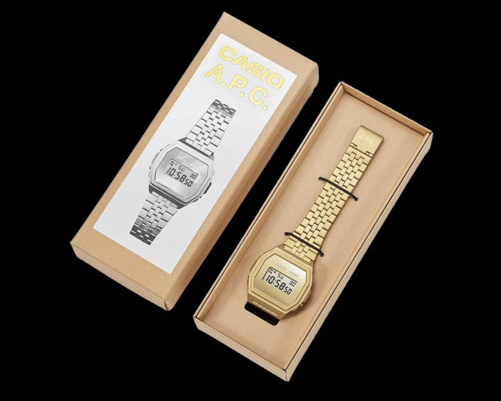
The Casio x A.P.C. A1000 collaboration is particularly appealing due to its minimalistic aesthetic, a defining feature that separates it from traditional Casio models. One standout detail is the dial, which embodies an uncluttered look. A.P.C. has stripped the display of excess labels, colors, and markings typical in Casio’s design, leaving only its own branding and Casio’s logo at the top. This design choice results in a refined, cohesive appearance where the dial matches the case and bracelet, available in either gold or silver.
The Minimalist Appeal of the Dial
The dial’s simplicity enhances the watch’s modern, sophisticated aura. It lacks the often overwhelming text and graphics seen in standard Casio timepieces, making this collaboration perfect for those who prefer understated elegance. A slight mirror effect on the dial adds an extra touch of visual intrigue, catching light subtly for a sleek sheen. This feature shifts the A1000 from a purely functional piece to one that borders on jewelry, blending practical use with a stylish statement.
Design Cohesion and Aesthetic Details
Both the case and bracelet share the same hue as the dial, creating seamless visual continuity. The removal of extraneous color or differing tones keeps the watch’s design unified, resulting in an appealing minimalist look that is both contemporary and timeless. The refined construction is further enhanced by moving the mode labels for the buttons to the caseback, ensuring the watch’s face remains clean and uncluttered. This change amplifies the elegance and makes the watch versatile enough for various styles, from casual to more formal wear.
Branding and Subtlety
A.P.C.’s brand philosophy leans towards minimalism and functionality, and this watch is a testament to that ethos. The branding itself is discreet; two small logos on the dial maintain the collaborative aspect without overpowering the design. The result is an accessory that speaks to both fans of Casio’s reliable, practical engineering and admirers of A.P.C.’s clean-cut aesthetic.
Functional Simplicity
The watch retains its practical functions—common in Casio’s legacy of durable, reliable timepieces—while presenting these features in a way that does not disrupt the sleek look. This merging of style and utility is central to why the Casio x A.P.C. A1000 stands out in the market. It embodies functionality with an artistic twist, ideal for the design-conscious consumer who appreciates subtlety and practicality in equal measure.
A Reflection of Collaborative Success
Collaborations between established brands like Casio and A.P.C. reveal the potential of merging utility with high design. This particular partnership successfully marries Casio’s commitment to technical prowess with A.P.C.’s minimalist sensibilities. It shows how collaborative efforts can result in products that appeal to consumers seeking functional luxury. By forgoing excessive embellishment in favor of a more subtle approach, the Casio x A.P.C. A1000 achieves a refined status that speaks to contemporary trends in watch design.
The Casio x A.P.C. A1000 is attractive not just for what it has but for what it omits. Its uncluttered dial, monochromatic palette, and subtle branding result in a watch that balances classic Casio utility with modern minimalist appeal, making it an exemplary piece for those who value both style and function in their accessories.
No comments yet.


