Jaguar, the luxury British car manufacturer, has long been synonymous with elegance, power, and an untamed spirit of innovation. The iconic leaping jaguar and the sleek, fierce face of the jaguar embedded in the grille of its vehicles have stood as symbols of its identity. These emblems have celebrated a history deeply rooted in both tradition and technological sophistication. However, a dramatic shift has arrived in the form of a completely redesigned logo. A circular emblem now replaces the jaguar’s face, introducing a modern and minimalist approach to branding while aiming to carry forward Jaguar’s legacy. This change is more than cosmetic—it represents an evolution of the brand’s identity and the values it seeks to convey.
A Bold New Look
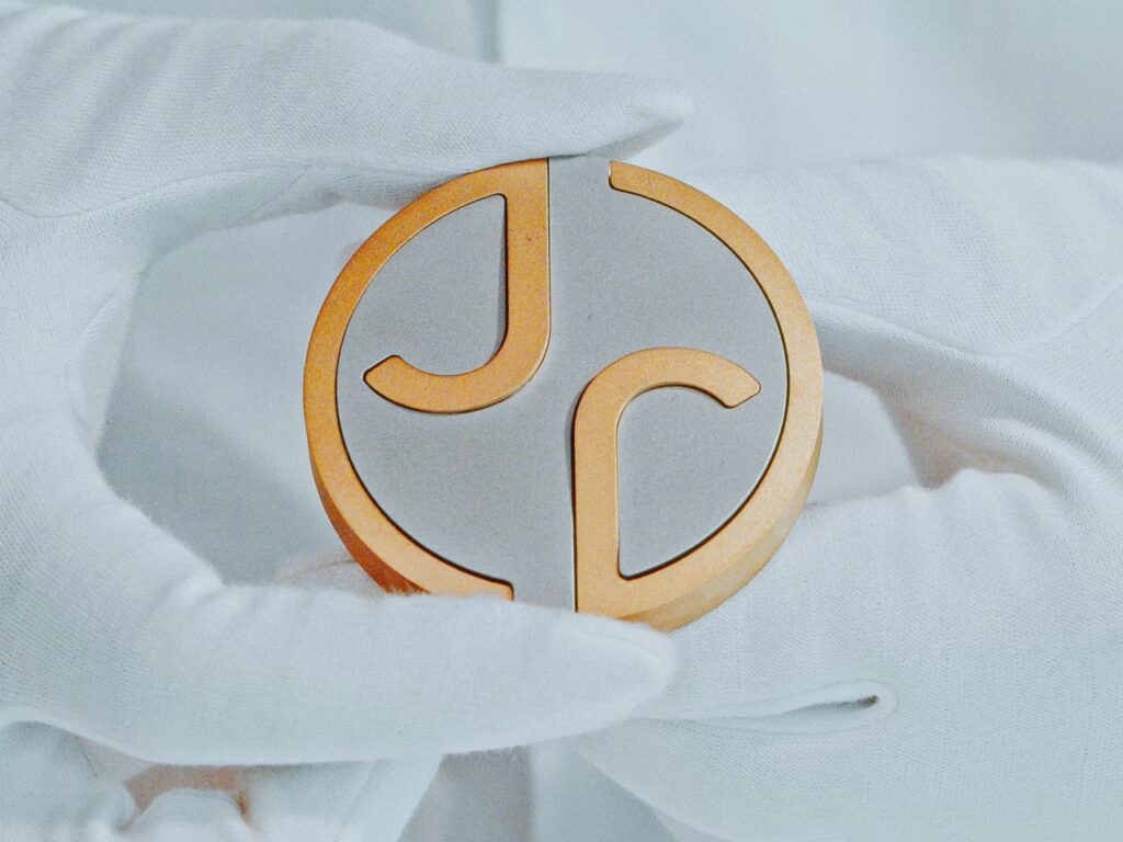
The new logo abandons the familiar snarling jaguar face for a circular badge that centers on an intertwined “J” and “r,” presented in a refined brass finish. This design is surrounded by a curved border, creating a sense of continuity and focus. The gold-and-white contrast of the emblem exudes a contemporary sophistication, with the brass accents serving as a subtle nod to luxury.
The choice of typography and the intertwined letters suggest a shift toward simplicity and versatility. The circular motif offers a timeless and balanced aesthetic that aligns with modern branding trends. It’s clear that Jaguar intends to position itself as a brand ready to adapt to a new generation of luxury consumers.
Embracing Exuberance: A Vibrant Palette
The redesigned logo is complemented by an updated color palette that Jaguar describes as “embodying exuberance.” Red, blue, and yellow will now serve as the primary colors in Jaguar’s branding, moving away from the subdued metallic hues traditionally associated with the brand. This bold departure signifies a reinvention—a strategy to appeal to younger, more dynamic consumers who view luxury as an experience rather than a static status symbol.
The colors are not only bright but also rooted in emotional storytelling. Red conveys passion and energy, blue reflects stability and trust, and yellow suggests optimism and creativity. Together, these primary tones create a visual language that communicates vitality while still retaining a sense of premium appeal.
The Departure of the Jaguar Face
For two decades, the jaguar face in the grille was an unmistakable symbol of the brand’s identity. It evoked the raw, untamed power of the animal and suggested an intimate connection to the performance and agility of Jaguar’s vehicles. The decision to remove such a recognizable element is a bold and, to some, controversial choice.
This departure can be interpreted in two ways. First, it signals a move toward a more abstract identity, allowing Jaguar to redefine itself without being tied too closely to its past. Second, it represents a shift in focus from external flair to internal refinement—underscoring the brand’s dedication to craftsmanship and performance rather than relying on the overt visual cues of a snarling predator.
However, this change may alienate traditionalists who value the brand’s heritage. The jaguar face wasn’t merely an aesthetic choice; it was a statement of power and elegance, connecting consumers emotionally to the brand’s core values. Removing it risks severing that emotional thread for some, even as it seeks to establish new connections with a broader audience.
Why Reinvent Now?
The redesign comes at a pivotal moment for Jaguar, as the automotive industry undergoes a seismic shift. The rise of electric vehicles (EVs), a growing focus on sustainability, and evolving consumer expectations have forced traditional automakers to rethink their strategies. Jaguar’s pivot toward a circular logo and vibrant palette reflects this broader transformation.
The use of a circular design aligns with themes of sustainability and continuity. In the context of EVs, this new identity may also symbolize the brand’s commitment to seamless technology and futuristic innovation. By moving away from the aggressive visual identity of the jaguar face, Jaguar positions itself as a forward-thinking, inclusive luxury brand.
Balancing Heritage and Modernity
Rebranding is always a tightrope walk between honoring a brand’s legacy and embracing change. Jaguar’s new logo and color palette strive to strike this balance, though not without challenges. On one hand, the refined brass accents and minimalist design echo the timeless elegance for which Jaguar is known. On the other, the bold color palette and departure from the jaguar face suggest an audacious leap into modernity.
The new design may appeal to those who view luxury as an evolving concept rather than a fixed tradition. Younger consumers, particularly millennials and Gen Z, are drawn to brands that are willing to reinvent themselves to remain relevant. In this context, Jaguar’s reinvention positions it as a brand that refuses to stagnate.
The Role of Typography
The intertwined “J” and “r” in the logo deserve special attention. Typography plays a crucial role in branding, and Jaguar’s choice here suggests an attempt to communicate fluidity and connection. The brass finish reinforces an aura of luxury while maintaining a modern aesthetic.
The letters themselves appear carefully curated to balance boldness and delicacy. The design’s symmetry and integration within the circle create a harmonious visual that complements the brand’s image of precision engineering. The typeface also lends itself well to digital and print applications, ensuring consistency across platforms—a crucial consideration in today’s multi-channel marketing landscape.
Impression
As with any major rebranding effort, Jaguar’s new logo is likely to elicit mixed reactions. Loyal customers and enthusiasts may view the change as a betrayal of the brand’s roots, while others will appreciate its modernity and daring spirit.
From a business perspective, the success of this rebranding will depend on how well it aligns with Jaguar’s broader strategy. If the new logo and vibrant palette are supported by innovative products, cutting-edge technology, and compelling storytelling, they could redefine the brand’s position in the luxury market. Conversely, if the visual changes are not matched by substantive shifts in the company’s offerings, the rebranding risks being seen as superficial.
A Step Toward the Future
Jaguar’s new logo represents a significant moment in the brand’s evolution. By adopting a minimalist, modern aesthetic and embracing a vibrant color palette, Jaguar signals its intent to adapt to a rapidly changing world. The circular emblem, bold typography, and primary colors suggest a focus on inclusivity, innovation, and optimism.
While the departure of the jaguar face marks the end of an era, it also opens the door to new possibilities. Whether this reinvention resonates with consumers remains to be seen, but one thing is certain: Jaguar is not content to rest on its laurels. This new identity reflects a brand ready to face the challenges of the future with confidence, creativity, and a touch of exuberance.
In the ever-competitive world of luxury automobiles, Jaguar’s new logo may well prove to be the emblem of a bold new chapter.


