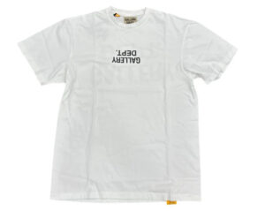
In a world drowning in logos, the Gallery Dept. “Upside Down” jersey tee flips the script — literally. A white cotton t-shirt printed with the brand’s name turned on its head, this piece does more than dress the body. It challenges perception, ownership, and the syntax of status. In the seemingly simple gesture of inverting a logo, it executes a bold thesis on fashion as a communicative act — or perhaps, fashion as a rebellion against communication itself.
Let’s not be fooled by the minimalism. This isn’t just a black logo on a white tee. This is deliberate miscommunication. A kink in the system. A piece of text refusing to be read, or at least not without effort. And that’s where it gets interesting.
The Power of the Flip
The upside-down logo is more than a visual trick — it’s a philosophical stance. Jean-Michel Basquiat once said, “I cross out words so you will see them more.” Gallery Dept., in the same spirit, reverses its branding so you have to work to read it. This tee plays with legibility like a poet breaks grammar. There’s something punk in that refusal. A quiet aggression. Or maybe not so quiet, depending on the room.
In fashion, legibility is currency. Logos are shorthand for wealth, taste, tribe. When Gallery Dept. turns its own name upside down, it both uses and mocks that code. You buy the tee because of the logo — and yet the logo refuses to perform its usual job. It doesn’t advertise. It challenges.
Wearing Resistance
Gallery Dept. has built its brand on a kind of curated destruction — vintage garments, reworked denim, painted-over jackets. It’s a streetwear label with the pithy of a conceptual artist. Founded by Josué Thomas in Los Angeles, the brand exists at the crossroads of fine art and fashion, never settling comfortably into either. This tee is a product of that tension. It’s wearable art. A gallery you wear on your chest. Or maybe a protest sign that doesn’t want to be read by everyone.
By flipping its logo, the tee suggests disobedience not only to mainstream fashion norms but also to the brand itself. It’s an internal rebellion. A brand willing to subvert its own symbol is a brand that understands irony — and maybe even humility, in a strange, high-priced way.
It’s hard to ignore the fact that this piece costs more than a hundred dollars. You’re paying for a shirt that defies clarity. There’s something both brilliant and perverse about that. In the tradition of Duchamp’s readymades, or Barbara Kruger’s slogans, the value comes from the idea — not just the fabric.
Streetwear and Semiotics
We are living in a post-logo era and a hyper-logo era at the same time. Brands like Balenciaga plaster their name across oversized hoodies while others, like Bottega Veneta under Daniel Lee, pulled back entirely. Gallery Dept. splits the difference — the logo is there, but it’s disoriented, scrambled, as if trying to escape its own meaning.
The “Upside Down” tee is a masterclass in semiotics — the study of signs and symbols. It acknowledges that a logo isn’t just a name. It’s a signal. A power structure. And when you flip that signal, you introduce friction. You interrupt the smooth transaction between garment and gaze. You force the viewer to reconsider what they’re seeing — and why.
In literary terms, this is a metatextual move. The text is commenting on itself. The shirt is aware that it is a shirt. It turns the wearer into both participant and critic. You’re not just wearing fashion — you’re wearing a question mark.
The Aesthetic of Effortless Effort
Of course, the shirt itself is simple. White cotton, black print. Soft, lightweight, cut for comfort. It looks effortless, which is part of the effect. This is fashion that performs nonchalance while being deeply calculated. Like a poem that reads easily but took months to write, it hides its labor behind clean lines and sparse design.
But nothing is accidental here. The choice of jersey cotton — classic, American, democratic — anchors the tee in a tradition of sportswear and street style. It’s everyday material charged with conceptual energy. It speaks fluently to Gen Z and millennial buyers raised on irony, internet culture, and the aesthetics of disruption.
Wearing a Statement
Gallery Dept. doesn’t explain itself. The website offers little narrative. The brand trusts the visual language to carry its message. That’s rare in today’s marketing-saturated world. This tee, especially, acts as a litmus test: if you know, you know. It filters the crowd. The flipped logo becomes a secret handshake, a wink.
But even if you don’t “get it,” the shirt still works. That’s the magic. It functions both as a fashion object and a conceptual artifact. You can wear it because it looks good, or because you want to challenge the capitalist mechanics of branding. Either way, it invites a reaction.
And that’s what makes it art.
Impression: T-Shirts as Texts
The Gallery Dept. Logo-Print Jersey Tee in ‘Upside Down’ is more than clothing. It’s a wearable thesis. It asks: what happens when we destabilize meaning? What happens when we turn identity markers into puzzles? Can you resist the system from inside it — or does even that resistance become product?
In the end, the tee doesn’t answer these questions. It simply raises them, and that’s its power. Like good literature, it doesn’t hand you meaning — it demands engagement. And in a culture of fast fashion and faster attention spans, that kind of engagement is rare. And worth paying for.


