The Graphic Design Legacy of Analog Cassette Tapes
September 19, 2024
In a world dominated by digital streaming platforms and cloud-based music collections, it’s easy to overlook the humble analog cassette tape. Yet, from the 1970s through the 1990s, cassette tapes not only revolutionized how we consumed music but also made a significant impact on graphic design. The visual aspect of cassette tapes—its album covers, labels, and packaging—played a crucial role in its appeal. Websites like TapeDeck.org celebrate this rich history, offering an archive of designs that showcases the lasting influence of cassette tapes in the world of graphic art and design.
A Brief History of the Cassette Tape
The analog cassette tape was introduced by Philips in 1963, initially meant for dictation purposes rather than music distribution. However, as its sound quality improved, the cassette tape quickly became a popular medium for albums and personal music collections. By the 1980s, it was the format of choice for everything from major record label releases to home-recorded mixtapes.
While the format’s portability and affordability were game-changers for music fans, cassette tapes also offered a new canvas for visual artists. The compact size of the cassette case presented graphic designers with unique challenges, demanding creativity within limited space. Unlike vinyl records with their sprawling covers, cassette tapes called for precise, eye-catching design that could convey an album’s essence in a very small area.
Minimalism in Packaging: Simplicity with Impact
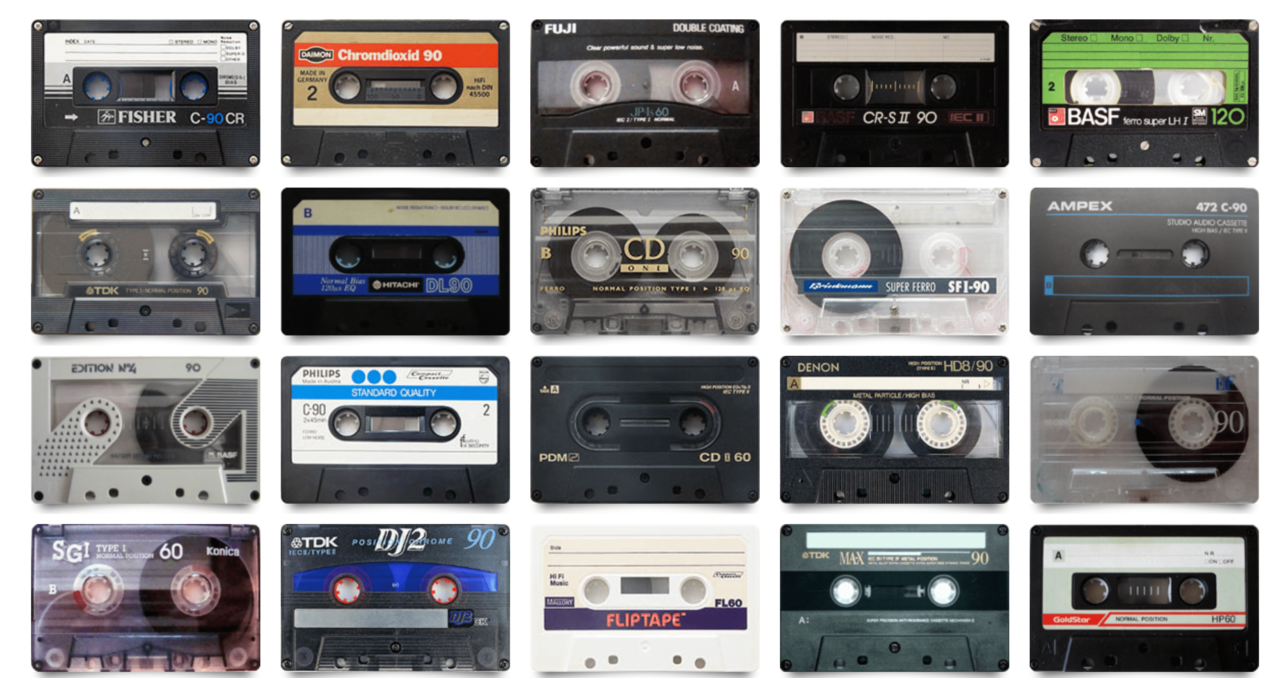
One of the most iconic aspects of cassette tape design was the plastic shell and case packaging. Designers needed to think about how to attract listeners in a crowded marketplace while working with only a small front cover (about 2.75 x 4.25 inches) and a narrow spine. This constraint encouraged an era of minimalistic yet impactful design.
The spines of cassette tapes were often the most critical design element for those browsing a collection, as the tapes were often stored in drawers or racks where only the spine was visible. Designers had to ensure that the title of the album, the artist’s name, and sometimes even a small graphic or logo stood out in a visually compelling way.
This minimalism often extended to the cassette shell itself, which was typically transparent or a solid color. Yet, within this limited space, some of the most memorable cassette designs emerged. Bands like Joy Division and The Smiths became known for their minimalist, iconic designs—especially on cassette tapes, where the small canvas necessitated clear and memorable imagery.
DIY Aesthetic: The Rise of Mixtape Culture
While commercial cassette designs were important, the real innovation in cassette design came from the DIY culture surrounding mixtapes. Home-recorded mixtapes became a form of personal expression, allowing individuals to curate not just music but also unique packaging. The blank labels that came with cassettes offered a creative outlet for homemade artwork, scribbled song lists, and custom stickers. This often resulted in highly personal and intimate designs, imbued with the individuality of the person creating the mixtape.
During the 1980s and 1990s, cassette tapes were also crucial to the punk and underground music scenes, where DIY culture flourished. Bands and independent labels lacked the resources of major labels, so cassette tapes became a low-cost way to distribute music. The DIY ethos extended to the graphic design of these tapes, with hand-drawn covers, photocopied artwork, and rough-edged designs becoming part of the aesthetic. This lo-fi approach to design wasn’t just a necessity—it became a statement, signifying an alternative, anti-corporate attitude.
Cassette Labels as Art
Major record labels weren’t immune to the allure of cassette design, either. Companies like Sony, Maxell, and TDK invested heavily in making their cassette tapes visually appealing, often employing graphic designers to create packaging that felt as innovative as the technology itself. These labels didn’t just want their tapes to sound good; they wanted them to look good, too.
As a result, the packaging of blank cassette tapes became a field of graphic design innovation. The labels on these blank tapes, with their clean typography, bold colors, and futuristic aesthetics, spoke to the idea that this was a medium for the future. Brightly colored plastic shells and carefully designed logos became standard, each brand vying to create the most visually appealing cassette.
Some of the most notable designs came from Sony’s “Walkman”-branded cassettes in the 1980s. The Walkman itself was revolutionary, offering portability and personal music consumption on a scale never seen before. The tapes designed for it often featured sleek, modernist designs that emphasized the cutting-edge nature of the format. Maxell’s tapes, with their minimalist typeface and bold lines, similarly became design icons.
The Art of Album Covers in the Cassette Era
Album covers were always a key marketing tool for musicians, and with the rise of cassettes, these designs had to adapt to a smaller format. Artists and designers quickly embraced the challenge, with many creating highly creative and iconic covers. The compact nature of the cassette case encouraged a focus on bold, striking images that could grab attention at a glance.
Some of the most influential designs of the cassette era were those that became associated with specific genres. For example, hip-hop and rap albums in the late 1980s and early 1990s often featured graffiti-style artwork, reflecting the street culture from which the genre emerged. Meanwhile, metal bands leaned toward dark, gothic imagery, with skulls, flames, and dystopian landscapes dominating the small canvas.
One great example of innovative cassette cover design came from the album “Unknown Pleasures” by Joy Division. Released in 1979, the cassette version of the album featured the same stark, black-and-white design as the vinyl version, with a graph of radio waves on the cover. Despite the limitations of the smaller space, the design remained as iconic and effective on the cassette format as it did on the larger LP.
Similarly, The Clash’s “London Calling”—with its cover art of Paul Simonon smashing his bass guitar—became equally iconic in its cassette form. Designers learned to work with the smaller dimensions by creating covers that emphasized a singular, bold image rather than more complex designs that could lose detail when reduced to a cassette case size.
Aesthetic Trends and Innovation in Cassette Design
The evolution of cassette design mirrored broader trends in graphic design and aesthetics during the late 20th century. The 1970s, for example, saw a lot of experimental design influenced by pop art and the counterculture movements of the previous decade. Cassettes from this era often featured bright, psychedelic colors and playful typography.
By the 1980s, with the rise of new wave and electronic music, cassette designs began to reflect a more futuristic aesthetic. Neon colors, geometric shapes, and computer-inspired fonts were frequently used, in line with the digital revolution that was beginning to sweep the world. The visual language of cassette design was adapting to a new technological era, with graphic designers drawing inspiration from video games, early computer graphics, and sci-fi films.
In the 1990s, the cassette tape was still dominant, but as CDs began to take over, cassette designs became more nostalgic. Designers began to experiment with retro aesthetics, looking back at the designs of the 1970s and 1980s with a sense of irony and homage. This was particularly evident in the indie and alternative music scenes, where cassette designs took on a lo-fi, handmade quality that echoed the earlier DIY ethic.
Impression
While the cassette tape may no longer be a mainstream format, its influence on graphic design has endured. Websites like TapeDeck.org serve as archives, preserving the artistry of cassette tape design and reminding us of the format’s significant impact on visual culture. The site celebrates everything from iconic commercial releases to obscure DIY mixtapes, offering a treasure trove of visual inspiration for graphic designers, music lovers, and nostalgia seekers.
In today’s world, the physicality of music formats is largely gone. Yet, as vinyl has made a comeback, so too has the cassette, albeit in smaller, niche circles. Many modern bands and independent labels have returned to cassette tapes as a way to produce limited-edition releases that offer a tangible, collectible experience in an age of digital music. Along with this resurgence comes a renewed appreciation for the graphic design of cassette packaging, with new artists taking cues from the bold, minimalistic designs of the past.
The graphic design history of cassette tapes is more than just a relic of a bygone era—it’s a testament to the power of creativity within limitations. The constraints of the format forced designers to think outside the box, resulting in some of the most iconic and influential designs in music history. Today, these designs live on, celebrated by sites like TapeDeck.org and cherished by music fans who understand that, sometimes, it’s the smallest formats that leave the biggest impressions.


No comments yet.