The Visual Architect: Julie Peeters and the Sensory Legacy of BILL Magazine
June 5, 2025
In an era saturated with visual content, few creators understand the deep poetry of imagery like Julie Peeters. Born in Belgium and later based in the Netherlands, Peeters is not just a graphic designer—she is a narrative cartographer, someone who constructs stories not with text, but with form, texture, sequencing, and most profoundly, image curation. Her magazine, BILL, has emerged as a genre-defying publication—a tactile, image-forward editorial experiment that challenges traditional media’s reliance on written language.
Having earned both bachelor’s and master’s degrees in graphic design in Belgium, Peeters further honed her craft by attending two advanced programs in Maastricht and Arnhem, eventually gaining formative experience working under Dutch design luminaries Mevis & Van Deursen and Karel Martens. Despite her academic and professional rigor, she cites one skill as the bedrock of her practice: her sensitivity to images. This ability, more intuitive than intellectual, has shaped the editorial framework of BILL, an experimental magazine now five issues deep and lauded for its wordless, sensory storytelling.
Beginnings: The Long Road to BILL
Julie’s vision of creating her own magazine began in her student years. But, like many aspiring editors, she found herself overwhelmed—not by a lack of ideas, but by the daunting abundance of publications already circulating. Particularly within the graphic design field, where visual journals are commonplace, she struggled to identify a distinct entry point.
Even with a crystal-clear internal vision, the execution remained elusive. Securing funding for research allowed her to begin the process, but what followed was over a decade of trial, failure, recalibration, and reinvention. Eventually, this long, deliberate incubation birthed the first issue of BILL in 2017—a breakthrough that reflected more than visual curation; it embodied the essence of artistic perseverance.
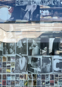
Wordless Worlds: Building Narratives Through Image Alone
What makes BILL remarkable is its absence of textual content. Unlike most magazines, where writing anchors meaning, BILL relinquishes the written word, trusting instead in the semiotic power of visual sequences. Its pages do not tell a story—they suggest, evoke, and provoke.
Julie explains that this editorial choice was deliberate:
“I want readers to engage their imagination. I don’t want to dictate meaning. Instead, I want them to enter their own dialogue with the images.”
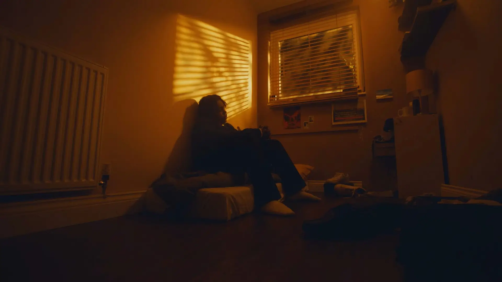
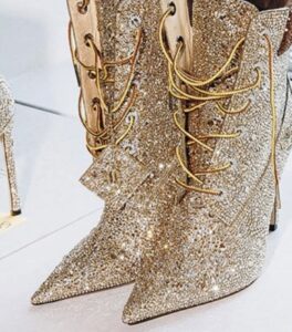
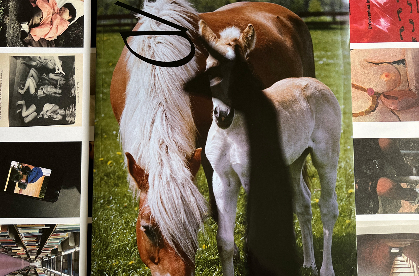
In flipping through BILL, the reader moves through a mosaic of photographs, architectural elements, fashion ephemera, found art, and personal archive material. Each turn of the page becomes an act of authorship for the reader. Interpretation is not assigned—it is inherited. In this way, BILL is less a magazine and more a framework for visual meditation.
Research as Ritual: An Omnivorous Visual Appetite
The illusion of effortlessness in BILL belies an intense and layered research process. Julie’s approach goes far beyond browsing Tumblr or mood boards. She engages with material across disciplines:
- Fine art and conceptual photography
- Fashion campaigns
- Architectural plans
- Vintage magazines
- Uncredited or vernacular image culture
Each image in BILL is chosen not just for its aesthetic, but for what Julie calls “the inexplicable click”—a visceral reaction, a sense of connection that defies logic but insists on presence.
“Sometimes I can’t even explain why I choose a certain image,” she says. “There’s a strange magnetic pull—something magical.”
This instinctive curation is what gives BILL its singular tone. While many magazines seek cohesion, BILL thrives in fragmentation. Julie arranges her content with the skill of a film editor, controlling rhythm, tempo, and contrast. A moment of photographic stillness might be followed by chaotic fashion imagery, or a sterile architectural image next to a flash-lit street shot. The juxtapositions generate emotional logic, not intellectual syntax.
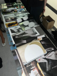
The Tactility of Paper: Storytelling Through Texture
Another hallmark of BILL is its material variation. Julie doesn’t simply design BILL for the eye—she designs it for the hand. Different paper stocks are used throughout each issue: glossy coated pages sit beside uncoated matte sheets, textured pulp next to metallic finishes. These transitions are not arbitrary.
Julie recalls that while producing Issue 1, she couldn’t settle on a single paper. Instead, she let the content dictate the material, allowing each section to be printed on paper that suited its atmosphere. This intuitive decision became a foundational principle of the publication.
“Sometimes I feel this story needs a beige page, and the next one needs a crisp white,” she says. “These shifts help readers feel that they’ve entered a new chapter—without needing to be told.”
The change in paper signals a narrative inflection, giving each sequence its own material identity. For readers, it becomes a subtle yet profound sensory cue—a whisper of transition, a tactile suggestion that something has changed.
Language, or the Lack Thereof: Reading with the Senses
In a world dominated by information, BILL offers a retreat into perception. With no captions, essays, or introductory blurbs, the magazine depends on the reader’s active participation. It’s not passive viewing—it’s a kind of co-creation.
This lack of language invites an almost pre-verbal intimacy. Readers must:
- Feel the tone of an image
- Interpret proximity and sequencing
- Consider mood, color, gesture, and form
Julie’s decision to eliminate text is not about minimalism. It’s about engaging different cognitive faculties—those linked to intuition, memory, emotion. In doing so, BILL becomes an exercise in slowing down, of allowing each page to linger long enough to provoke thought.
“Since I’m not using language, the reader needs to perceive everything sensorially,” Julie explains. “So it’s important to build in moments that subtly ask the reader to reflect.”
Culture
In a time when many print publications are struggling to maintain relevance, BILL stands out for its conceptual clarity and emotional resonance. It has garnered attention not for being loud or polemical, but for its quiet defiance of publishing norms.
Critics have praised:
- Its sensory sophistication
- Its curatorial elegance
- Its redefinition of graphic design as storytelling
For young designers, BILL offers a new template—one where the magazine is not just a container of content but a sculptural, rhythmic, lived object. For archivists and collectors, each issue becomes a capsule of visual language. And for casual readers, it offers something rare: a space to simply feel, without expectation.
Impression
Julie Peeters’ BILL is not just a magazine—it’s a manifesto. A manifesto that asserts the value of visual literacy, intuitive curation, and sensory dialogue. In refusing to explain, it invites the reader to explore. In eliminating text, it elevates image. In varying texture, it guides the hand toward story.
Peeters reminds us that communication need not always be direct. Sometimes, the most powerful narratives are those felt rather than understood. In the pages of BILL, the unsaid becomes sacred, and the unseen becomes unforgettable.
For those seeking a publication that treats the magazine as a living, breathing, experiential form, BILL stands as one of the most thoughtful and emotionally intelligent contributions to print in the 21st century. It is, in the truest sense, a magazine for the senses—an enduring invitation to read with your eyes, feel with your fingers, and think without words.