The Weight of Craft: 10 eyevan NO.5 III FAT RIM “INK” as a Study in Material Integrity
May 6, 2025
There are few objects as intimate, persistent, and rigorously tested as a pair of eyeglass frames. Worn daily, they not only shape perception but become part of one’s identity, leaving little room for compromise. In the world of Japanese optical craftsmanship, no brand interrogates this balance of function and refinement more precisely than 10 eyevan.
With the release of the NO.5 III FAT RIM in the exclusive “INK” colorway, 10 eyevan deepens its reputation for engineering precision through a model that reconsiders density, tonal singularity, and physical articulation—not as a performance of luxury, but as a method of truth-telling through form.
What emerges is not a spectacle of ornament, but a convergence of tactile experience, material quality, and visual coherence. The INK edition, released only through the brand’s direct retail channels, marks a quiet culmination of philosophy and fabrication—a design whose restraint does not deny complexity but locates it within the absolute.
Celluloid: The Weight of the Elemental
To understand the NO.5 III FAT RIM, one must begin with its chosen material: celluloid. In an industry dominated by acetate and injection-molded plastics, the use of celluloid is both radical and reverent. It is a material that demands time, expertise, and vigilance. Highly flammable in its unprocessed state, difficult to form under heat, and often slow to polish, celluloid resists mass production. Yet it possesses characteristics no synthetic rival can fully replicate: a warmth under the fingertips, a dense tactile signature, and a visual depth that develops over time rather than decays.
In this frame, celluloid is not a nostalgic gesture. It is the structural and aesthetic foundation. It lends mass—not just visual, but physical—to the frame. The front carries this density with architectural confidence, while the temples taper to deliver balance. Every edge is polished to a muted, low-luster finish, produced through patient manual labor rather than chemical shortcuts. The result is a surface that feels grounded and certain. Not slick. Not delicate. Certain.
This certainty is embodied most fully in the INK colorway.
INK: A Tone Without Interruption
The term “INK” is not metaphorical. It is a deliberate chromatic statement. This is not a black that reflects—it absorbs. Matte, even, and uninterrupted, the finish appears to eliminate variance. There are no gradients, no artificial lusters. Where many eyewear brands rely on translucent acetate or metallic embellishments to capture attention, 10 eyevan has pursued the opposite: a singularity of tone that commands not by contrast, but by concentration.
Even the frame’s integrated nose pads are color-matched to this surface treatment. It is this commitment to uniformity—not just in color, but in treatment, in tone, in material—that separates the NO.5 III FAT RIM from most modern optical design. No element interrupts the visual flow of the frame. Every component follows the same palette, each form reinforcing the next.
It is here that one understands how the frame’s minimalism is not emptiness but evidence—evidence of intent, of restraint, of mastery over process.
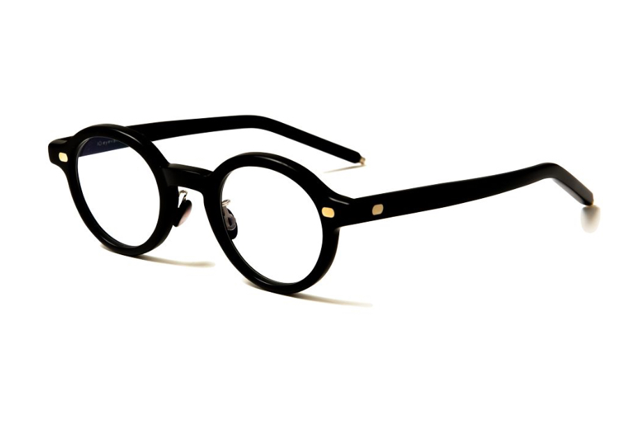
The FAT RIM: Sculptural Mass Without Excess
The FAT RIM designation might, at first, suggest brute thickness. But that interpretation misses the deliberateness of proportion. The rim is not merely thick—it is calculated. The additional width of the frame face is less about amplification and more about anchoring. It grants the lens housing a sense of permanence. One does not imagine this frame bending easily, nor vanishing into anonymity. It is designed to stay in view, not as decoration, but as physical presence.
And yet, paradoxically, it does not dominate. This is the genius of the design. The tapering temples and low-profile bridge offset the weight of the rims, ensuring the frame sits evenly on the face. The distribution of material is engineered, not decorative. Where other frames use ornamentation to mask structural imbalance, the NO.5 III FAT RIM refuses all distraction.
The result is a product that is proportionally correct, aesthetically self-contained, and technically sound—a rare synthesis in an industry often pulled between visual trend and ergonomic neglect.
Artisanship at the Limit
Behind this object’s restraint lies labor. Unlike acetate, which allows for quick shaping and mechanized polishing, celluloid demands patience. Every surface is sanded and smoothed by hand. The matte finish seen in the INK edition is not the result of synthetic coating but of graduated abrasion—a finish that can only be achieved through hours of contact between tool and material. The alignment of components—hinges, temple cores, and endpieces—requires micrometric accuracy, especially given celluloid’s rigidity and lack of thermal elasticity.
The artisans responsible for this frame operate in workshops where knowledge is not written down but handed from generation to generation. The tolerances involved in the NO.5 III FAT RIM’s construction are unforgiving. A few tenths of a millimeter too far left or right, and the entire assembly must be remade. This is not a product of efficiency. It is a product of calibration and precision. It is design by measurement, not mood.
The titanium core wire, subtly embedded in the temple arms, adds reinforcement without visual disruption. Even this internal architecture has been considered: flexible where it must be, fixed where needed. No gesture is unnecessary. No detail ornamental.
The Exclusivity of Method, Not Audience
The NO.5 III FAT RIM “INK” is available only through direct 10 eyevan retail locations. This is not exclusivity for the sake of scarcity. It is a form of curation. By narrowing distribution, the brand ensures that context is not lost. The frame is not just a product but a process—and that process requires explanation.
Customers engaging with this piece do so not from impulse, but from understanding. The limited access is not to exclude, but to protect the frame’s narrative. The object requires discourse. It must be tried on, adjusted, explained—not simply purchased. In this way, 10 eyevan practices a form of retail that is closer to consultancy than transaction.
This approach is consistent with the values embedded in the object itself. It is not a product for display, but for enduring use. It is not for seasonal relevance, but for long-term companionship. It is not for resale value, but for the integrity of daily experience.
Design as Composition
Design here functions less as stylistic invention than as careful composition. Each line is weighted. Each transition between surfaces is considered. The curve of the brow line does not simply follow fashion; it balances the vertical drop of the rims. The bridge does not seek to vanish; it provides architectural continuity. Even the branding is restrained to near-invisibility—etched lightly on the inner temple, a gesture of authorship rather than ownership.
Where many modern optical designs strive for novelty, the NO.5 III FAT RIM “INK” finds meaning in the opposite direction: through refinement, reduction, and deep material awareness. It does not change shape to chase markets. It holds its form with consistency, trusting the inherent strength of its structure.
In this sense, the frame becomes not a signifier of brand but a reflection of the values it was built upon: exactitude, humility, and physical clarity.
On Wearability: Utility Refined
One of the most notable aspects of the NO.5 III FAT RIM is how its presence transforms when worn. Despite its visual density and sculptural front, it rests lightly, evenly, and securely. This is the outcome of both materials and mechanics. The distribution of weight, the elasticity of the temple tips, the tightness of the hinge—all are calibrated for wear, not display.
This is not eyewear made for rotation or replacement. It is built for long use, for integration into daily life. The frame does not require trend alignment to remain relevant. It exists outside of the seasonal churn. In an era obsessed with the new, it offers consistency—a kind of comfort that arises from repetition and durability.
Thoughts
The 10 eyevan NO.5 III FAT RIM “INK” does not aspire to aesthetic excess or performative luxury. It offers something far more durable: the experience of quality in its most unembellished form. It is a frame defined not by decoration, but by the integrity of its construction and the clarity of its material choices.
In an optical landscape awash with synthetic mimicry, where plastic is disguised as horn and fast fashion produces endlessly rotating silhouettes, this model stands apart. Not by proclaiming difference—but by embodying discipline.