Thisisneverthat® × Grateful Dead: Heritage Graphics, Rebalanced
April 9, 2026
2 hours ago
familiar
There is a stark kind of image that refuses to age. Not because it resists time, but because it absorbs it—layer by layer, generation by generation—until it becomes less a relic and more a system. The iconography of the Grateful Deadexists in this space: endlessly reproduced, endlessly reinterpreted, yet never diluted.
With the arrival of thisisneverthat®’s latest collaboration, that system is reactivated—not nostalgically, but structurally. The Seoul-based label, known for its measured, almost archival approach to streetwear, does not simply print the Dead’s visuals onto garments. Instead, it reorganizes them. Adjusts their scale, their density, their rhythm. What emerges is not a revival, but a recalibration.
thisisneverthat® has always operated in a space of quiet precision—less spectacle, more continuity. Pairing that with one of the most visually saturated legacies in music culture creates tension. And tension, here, becomes the point.
View this post on Instagram
archive
The visual language of the Grateful Dead is inseparable from the broader cultural landscape of late-1960s San Francisco—a moment when music, design, and social upheaval blurred into one continuous field. Album covers, concert posters, bootleg tees: each became a vessel for something larger than the band itself.
Among these, the “Steal Your Face” skull, the dancing bears, and the roses motif have endured as shorthand for an entire ethos. Not just music, but movement. Improvisation. Community. Expansion.
In contemporary fashion, these symbols have been circulated widely—sometimes flattened into aesthetic shorthand, sometimes revived with care. The challenge, then, is not access, but interpretation. What does it mean to use imagery that is already so fully encoded?
thisisneverthat® answers by refusing to overstate. The graphics are present, but never overworked. Familiar, but never indulgent.
lang
Founded in Seoul, thisisneverthat® has built its identity on a kind of disciplined restraint. The brand’s output rarely relies on overt storytelling. Instead, it constructs atmosphere through proportion, typography, and material.
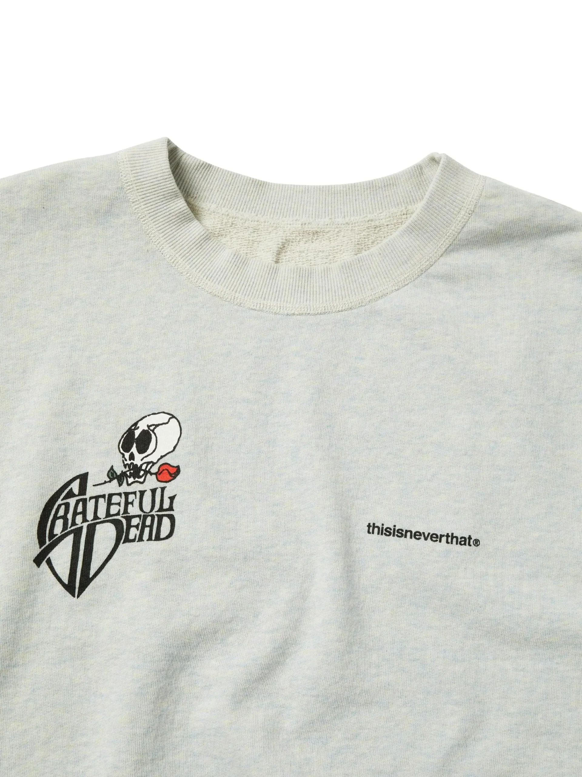
Where many streetwear labels chase immediacy—graphics designed to register instantly—thisisneverthat® often slows the process down. Logos are small. Palettes are controlled. Silhouettes sit somewhere between archival sportswear and contemporary ease.
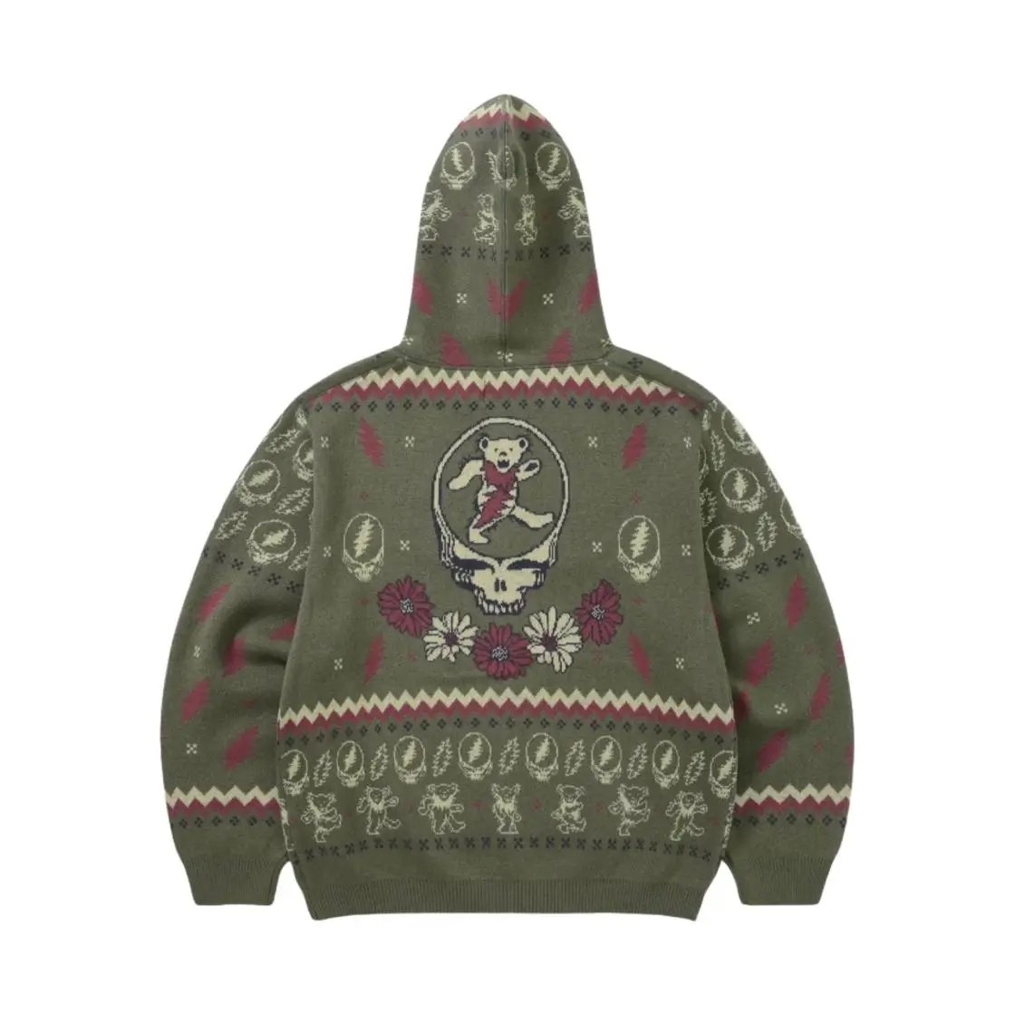
This approach becomes particularly significant when applied to something as visually loud as the Grateful Dead archive. Rather than amplifying the psychedelia, the brand compresses it. Colors are often subdued. Graphics are repositioned into quieter zones of the garment—chest hits, back panels, sleeve placements that feel considered rather than explosive.
The result is not a clash, but a negotiation.
flow
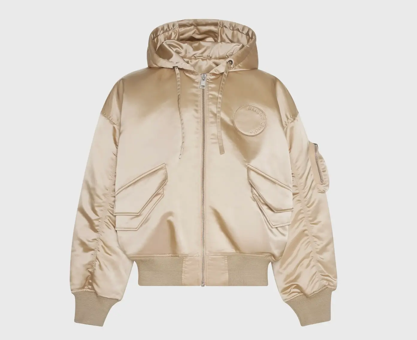
At first glance, the collection reads as a familiar spread of streetwear staples: hoodies, graphic tees, crewnecks, outerwear, and accessories. But the distinction lies in how these pieces behave.
They do not function as blank canvases for graphic overload. Instead, they operate as carriers—structures designed to hold and regulate imagery.
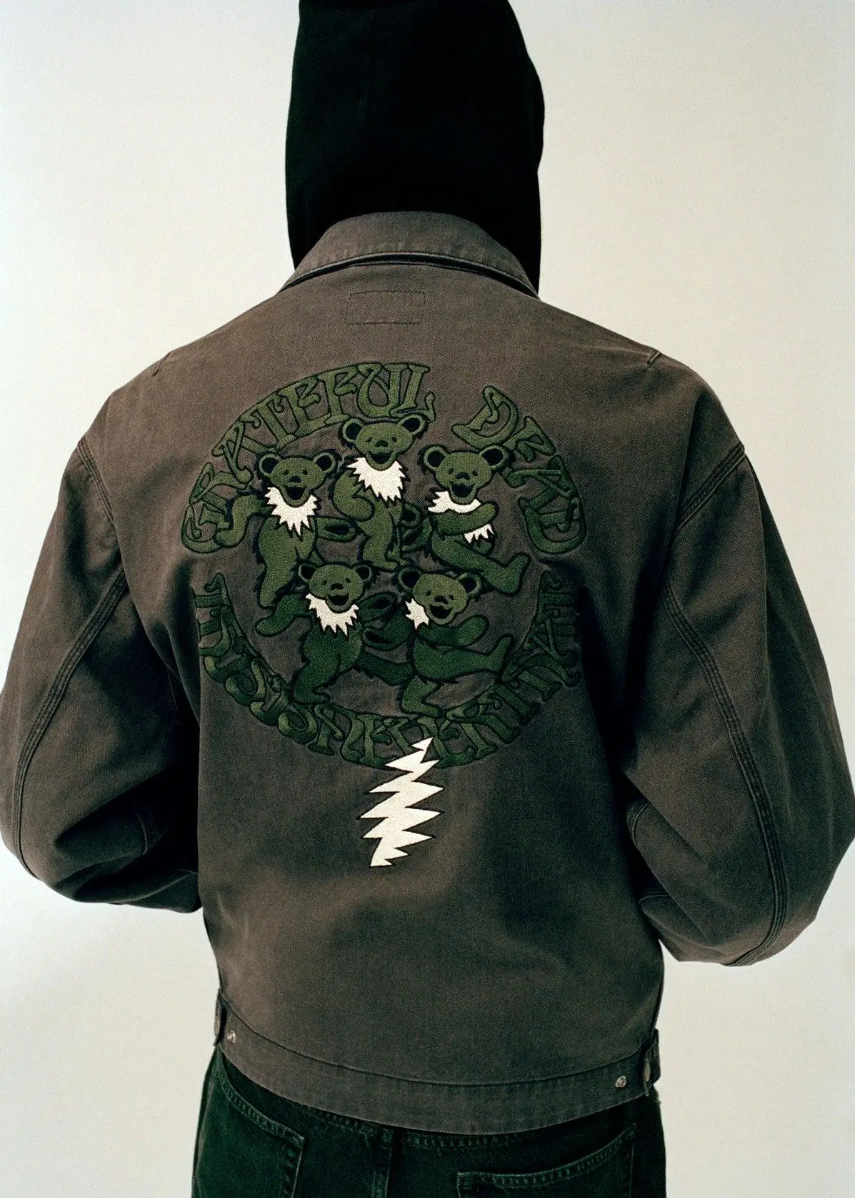
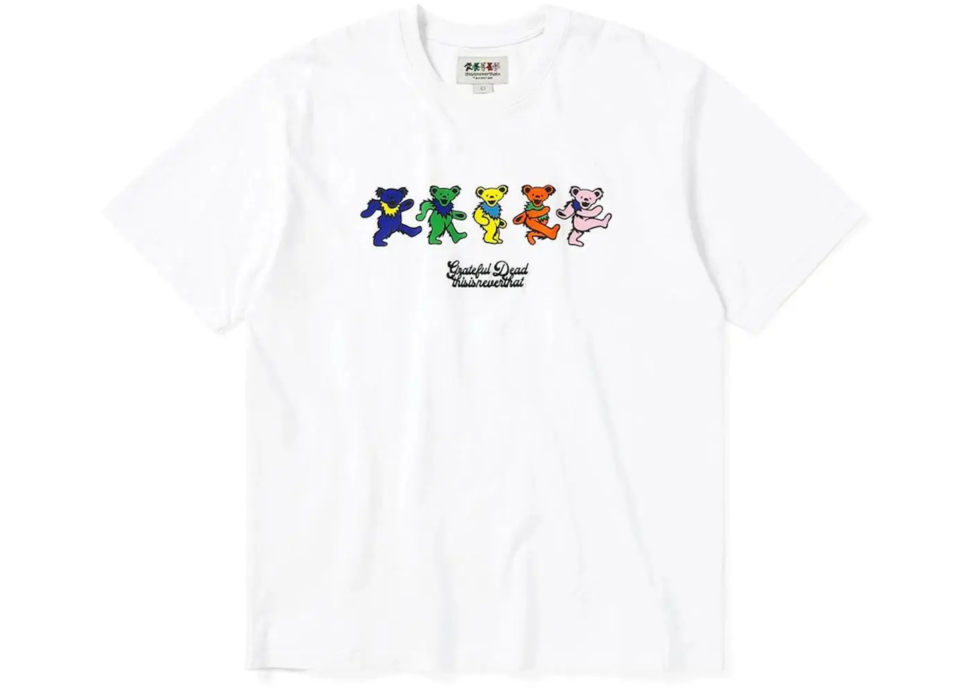
A hoodie might feature the dancing bears, but scaled down, aligned with a typographic system that anchors the image. A T-shirt may carry the skull motif, but offset, partially obscured, or rendered in a palette that softens its immediacy. Even when the graphics are bold, they are rarely allowed to dominate the entire garment.
This restraint shifts the dynamic. The wearer is not overwhelmed by the imagery; instead, the imagery integrates into the overall composition of the outfit.
It becomes wearable in a different sense—not just physically, but visually.
stir
One of the defining characteristics of the Grateful Dead’s legacy is repetition—not in the sense of sameness, but variation. Live performances were never identical; songs stretched, contracted, evolved.
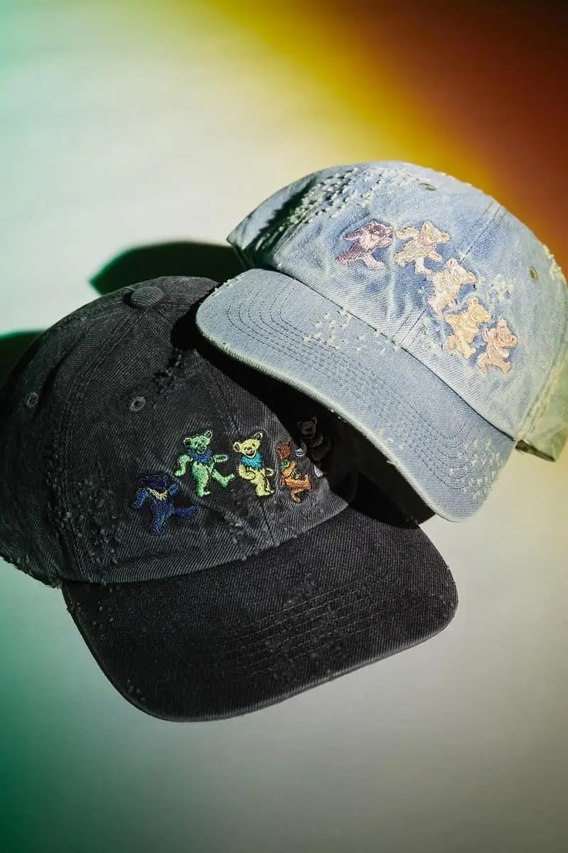
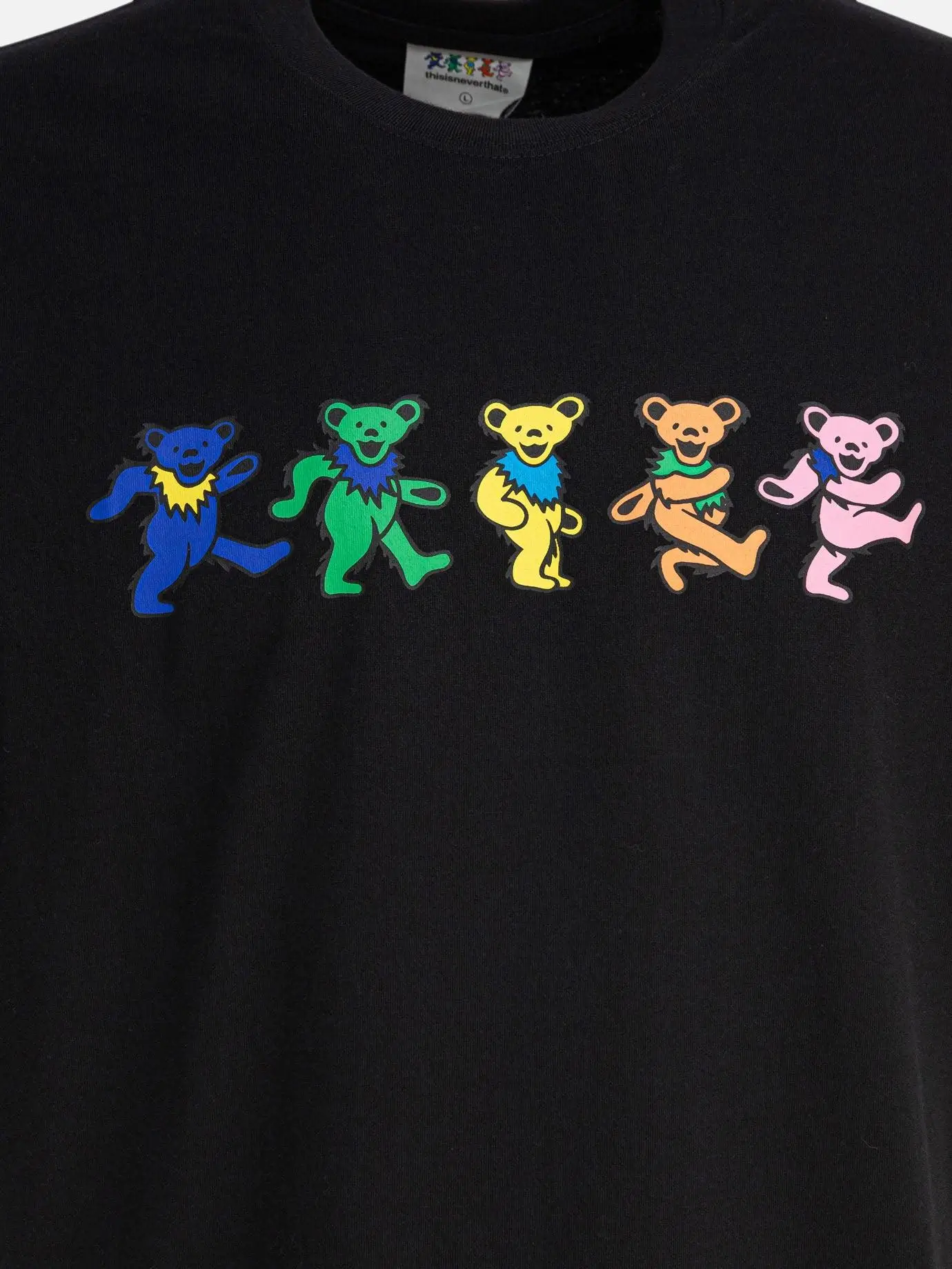
thisisneverthat® mirrors this approach in its treatment of graphics across the collection. The same motifs appear multiple times, but each iteration shifts slightly. A different colorway. A different placement. A different scale.
This creates a rhythm across the capsule. Instead of a single defining piece, the collection operates as a sequence—each garment a variation on a theme.
It encourages accumulation rather than singularity. Ownership becomes less about the standout item and more about the system of pieces working together.
show
Psychedelia is often associated with excess—vivid color clashes, saturated gradients, visual intensity that borders on overwhelming. Yet in this collaboration, color is treated with discipline.
Bright tones appear, but they are balanced by neutrals: washed blacks, muted greys, off-whites that ground the collection. Even when the palette leans into the Dead’s signature vibrancy, it is often filtered—toned down, slightly desaturated, or paired with restrained silhouettes that prevent visual overload.
This balance allows the graphics to breathe without dominating. It also aligns the collection more closely with contemporary streetwear sensibilities, where versatility often takes precedence over spectacle.
Color, here, is not an event. It is a parameter.
culture
There is always a risk when revisiting legacy iconography: the possibility of reducing it to aesthetic surface. But thisisneverthat® approaches the collaboration with a degree of cultural awareness that avoids this trap.
The Grateful Dead represents a specific historical and geographical context—1960s American counterculture. thisisneverthat®, by contrast, operates within a contemporary Seoul framework.
Rather than attempting to replicate the original context, the brand translates it. The graphics are not presented as relics, but as elements within a new system—one defined by global streetwear, digital circulation, and contemporary design language.
This translation acknowledges distance. It does not pretend to collapse it.
culture
Beneath the cultural layering, there is a clear understanding of how streetwear functions today.
Collaborations like this operate within a highly competitive landscape, where attention is fragmented and product cycles are accelerated. To succeed, a collection must balance recognizability with distinction.
The Grateful Dead provides instant recognizability. thisisneverthat® provides distinction through execution.
The graphics draw the eye; the design holds it. This duality ensures that the collection can exist both as a cultural statement and a commercial product.
It is not just about being seen. It is about being worn.
idea
Perhaps the most compelling aspect of the collaboration is its potential longevity. Unlike collections that rely on novelty, thisisneverthat® × Grateful Dead feels designed to integrate into existing wardrobes.
The pieces do not demand a complete stylistic shift. They adapt. Layer easily. Sit alongside other garments without friction.
This adaptability suggests a different kind of lifecycle. Instead of peaking at release and fading quickly, the collection has the potential to persist—worn repeatedly, recontextualized over time.
It aligns with the ethos of the Grateful Dead itself: continuity over climax.
fwd
The return of psychedelic imagery in contemporary fashion is not accidental. It reflects a broader cultural moment—one defined by a desire for depth, for systems of meaning that extend beyond surface.
In an era dominated by digital immediacy, the layered symbolism of the Grateful Dead offers something different. It invites interpretation. Encourages engagement.
thisisneverthat® taps into this shift, but filters it through a contemporary lens. The result is not a revival of 1960s aesthetics, but a reconfiguration of their underlying principles.
Improvisation becomes variation in design. Community becomes shared visual language. Expansion becomes reinterpretation.
sum
There is a tendency to view collaborations like this as intersections—two entities meeting briefly before moving on. But thisisneverthat® × Grateful Dead feels less like a crossing point and more like an overlay.
Two systems, operating simultaneously. One rooted in historical counterculture, the other in contemporary streetwear precision.
The success of the collection lies in its refusal to resolve this tension completely. It allows both systems to remain visible, to interact without collapsing into one another.
In doing so, it creates something that feels both familiar and newly structured. Not a reinterpretation that replaces the original, but one that extends it—quietly, deliberately, and with a sense of continuity that mirrors the legacy it draws from.