You Wouldn’t Steal a Typeface: Irony, Ownership, and the Font of Cultural Memory
May 1, 2025
A Reflection on the Piracy PSA’s Typographic Controversy
In the peculiar theatre of internet irony, there are few scenes more richly layered than the resurgence of public ridicule aimed at the Motion Picture Association of America’s infamous anti-piracy campaign. More than two decades after it first flickered across movie screens and DVD menus—backed by pulsing synths and moralistic declarations like “You wouldn’t steal a car”—the campaign has once again captured public attention. But this time, the campaign’s own rhetorical weapon has turned against it. The font used in the campaign materials? A pirated knockoff of a commercial typeface.
The revelation, unearthed by a curious user on Bluesky and later confirmed by Sky News, opens a wormhole of contradictions. The PSA that sought to vilify theft in the digital age now appears to have committed the very crime it condemned—albeit with serifs instead of software. It is an almost poetic twist in the annals of digital media ethics: the font believed to be FF Confidential, a moody, noir-esque typeface released in 1992 by Dutch designer Just van Rossum, was not the official version but a bootleg mimic from 1996.
Van Rossum’s reaction? Amused. “I find it hilarious,” he told TorrentFreak. And rightly so. The moment is rich with satirical flavor, not simply because of its hypocrisy but because of what it reveals about the unstable terrain of intellectual property itself.
The Piracy PSA: A Cultural Flashpoint
To understand why this news feels so resonant, one must revisit the cultural context in which the MPAA’s campaign was born. The early 2000s were the Wild West of digital content. Platforms like Napster, LimeWire, and BitTorrent transformed college dorm rooms and suburban bedrooms into hubs of unauthorized downloads. Music labels and film studios panicked, scrambling for ways to stem the tide. What emerged was a series of moralistic campaigns intended to guilt, shame, and warn consumers.
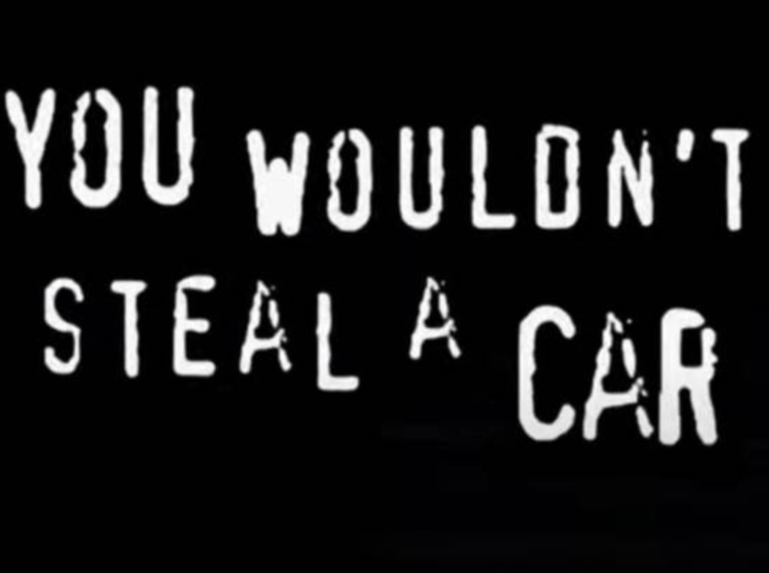
Among them, none was more memorable—or memeable—than the “You Wouldn’t Steal a Car” PSA. It was heavy-handed and melodramatic, juxtaposing street crime with digital downloading. “Downloading pirated films is stealing. Stealing is against the law. Piracy. It’s a crime.” The voiceover’s self-serious tone and the dramatic montage of criminal acts made it a cultural punchline even then. The PSA was spoofed endlessly—in comedy sketches, parodies, remixes, and even modified DVD rips that mocked the message they were forced to precede.
Yet for all its theatricality, the campaign reveals an underlying anxiety: cultural institutions were grappling with the erosion of physical ownership. The MPAA saw piracy not just as a threat to profits, but as a threat to control—over distribution, over access, over perception. The PSA wasn’t just warning against illegal downloads; it was trying to assert moral clarity in an increasingly ambiguous digital world.
Typeface as Trojan Horse
The irony that the campaign’s materials were created using an illegally cloned typeface is almost too rich to script. Fonts, after all, are one of the most overlooked territories in intellectual property. They are everywhere, shaping our visual world, yet most consumers give them little thought—until a controversy like this arises.
FF Confidential, the typeface in question, was never a blockbuster font. Its aesthetic called to mind crime dramas and pulp thrillers—appropriate, then, for a campaign that aimed to dramatize piracy as a cinematic offense. Released in 1992 by Just van Rossum, the typeface carried the distinct fingerprint of a designer steeped in both visual and code-based innovation. (His brother, incidentally, created the Python programming language—a curious familial synergy of design and syntax.)
By 1996, however, a knockoff of FF Confidential had begun circulating freely online. Whether the MPAA’s designers knowingly chose the clone or simply grabbed what was most accessible is unclear. What is clear is that the same ethos the campaign was trying to extinguish—free, frictionless access to copyrighted content—was operating within the walls of its own production.
The Legal Fog of Fonts
Fonts exist in a strange liminal zone of intellectual property law. In the U.S., the visual representation of a typeface—the design itself—is generally not protected by copyright. Instead, font creators rely on software licensing, trademark protections, and end-user agreements to enforce rights. This makes them vulnerable to cloning and unauthorized use.
This is precisely what happened to FF Confidential. Despite being a commercial typeface, the existence of free imitations blurred the lines between original and duplicate. In that sense, the MPAA’s mistake was not entirely surprising. They weren’t the first to assume a freely available file was fair game—and they won’t be the last.
Yet the timing of this revelation—unfolding in the era of hyper-vigilant design attribution, digital fingerprinting, and license-conscious creative culture—makes it especially resonant. What was once a fringe concern of typographers has become a battleground for legitimacy, especially in an age where brands are expected to “know better.”
The Aesthetic of Authority
Why does this matter? Because fonts are not neutral. They carry cultural weight. They signal tone, intent, legitimacy. A campaign that aims to lecture the public on legal behavior must project an air of authority and refinement. Every visual element, including typography, becomes a vessel of that authority.
In using a pirated font—wittingly or not—the MPAA inadvertently destabilized its own rhetorical structure. It’s the visual equivalent of a lawmaker caught plagiarizing a speech on copyright. It undermines the very ethos the message is built upon.
It also reveals how design elements, often dismissed as cosmetic, are in fact integral to the scaffolding of persuasion. In using FF Confidential (or its knockoff), the campaign sought a specific atmosphere: menace, suspense, consequence. The typeface was chosen precisely because it carried cultural memory—like the titles of Scream movies—that the audience would subconsciously recognize.
Digital Irony as Cultural Literacy
This isn’t the first time a moral campaign has been hoisted by its own design petard. In 2023, Shake Shack was sued for its use of a custom font allegedly based on a licensed design. The suit failed, but the case drew public attention to a world of rights management few knew existed. And in many ways, this growing awareness is a byproduct of digital irony culture—the same meme-fueled reflex that revived interest in the MPAA campaign.
The internet is not a kind place for sanctimony. Campaigns that come across as preachy, outdated, or technically hypocritical are quickly dismantled by the forensic wit of digital users. What would have once gone unnoticed—an obscure font file uploaded to a DVD menu in 2004—can now become a viral spectacle.
In that sense, the revival of this controversy isn’t just about a pirated font. It’s about power, accountability, and the way our cultural institutions navigate their own contradictions. The MPAA’s anti-piracy video wasn’t mocked merely for being hypocritical—it was mocked because it underestimated its audience. In an era of aesthetic literacy and media skepticism, design decisions are no longer invisible.
The Piracy Paradox Revisited
There’s an even deeper irony here: the internet culture that the MPAA once saw as a threat has become its archivist. The only reason this story persists is because the PSA—intended to disappear into the pre-roll ether of DVD menus—was ripped, remixed, and preserved by the very pirates it was meant to suppress.
Its legacy lives on in YouTube parodies, TikTok edits, meme formats, and, now, forensic typographic takedowns. What began as a tool of moral enforcement has become a totem of internet humor, endlessly deconstructed and reassembled.
This is the central paradox of digital enforcement: in trying to suppress piracy, the MPAA inadvertently created a viral cultural object. And in doing so, it ceded control of its own narrative. Today, the PSA is remembered not as a deterrent but as a relic—one that speaks more to the anxieties of a bygone media era than to present-day realities.
Conclusion: Who Owns the Message?
In the final analysis, the question isn’t merely whether the MPAA used a pirated font. It’s about who gets to define legitimacy in the digital age. Who owns a typeface? Who controls the message? Who polices the boundaries between theft and tribute, between inspiration and infringement?
The “You Wouldn’t Steal a Car” saga has, in its ironic revival, offered more than just a laugh at the MPAA’s expense. It has reopened critical questions about design ethics, legal ambiguity, and the performative dimensions of authority. It reminds us that the things we overlook—fonts, credits, visuals—are often the most telling indicators of institutional ethos.
And it leaves us with one final, delicious inversion: if downloading a movie is theft, then what do we call using a stolen font to tell people not to steal?
Perhaps, at long last, the tables have turned—serif by serif.